Quantcast
Channel: The Silent Cartographer
Viewing all 64 articles
Browse latest View live

Another Chilikan Sail

$
0
0
Coordinates              19°43′N 85°19′E
Lake type                   Brackish800px-Chilka_lake
Primary inflows           35 streams including Bhargavi, Daya, Makra, Malaguni, Nuna
Primary outflows        Old mouth-Arakhakuda, New mouth-Satapada to Bay of Bengal
Catchment area          3,560 km2
Countries                    India
(Source: Wikipedia Commons)

A scorching mid-summer morning buttressed with a subtle yet pervasively lethargic demeanour in addition to a limited extravagance of time; lost all odds to a rather willful birthday wish, setting six of us on course to a memorable visit to Chilika Lake, the brackish water lagoon along the eastern coast of Odisha. As per web sources, it is the largest coastal lagoon in India and the second largest on the entire planet after Laguna Ojo de Liebre on the Pacific coast of Mexico. Serving as a summer resort to over a hundred and sixty species of migratory birds from plethora of faraway stretches, ranging from Caspian Sea, Lake Baikal, Aral Sea to other remote parts of Russia, Kirghiz steppes of Mongolia, Central and Southeast Asia, Ladakh and the Himalayas; it subsists around one hundred fifty thousand fishermen. Also, home to around a hundred and fifty rare and endangered Irrawaddy Dolphins, a few of which, did catch our eye during their magical jump to glamour and glitz.
                                                                  The journey towards the new mouth of Lake Chilika better known by the name of Satapada, from the temple city of Bhubaneswar comprised a distance of 106 kms by road, through the holy shrine of Lord Jagannath’s birthplace i.e Puri. The road was lined with lush green outfields on either side with remarkable golden sheen of fresh paddy harvest. Embraced by high and elegant coconut palms akin to sentries standing guard, along its perimeter the path appealed majestically. We made a brief stop during the journey, to relish some freshDSC_2577 coconut milk from one of the roadside vendors who was still disappointed with the bargained sale. Seasonal flowers adorning the path throughout the curvature, emphasized the mystic elegance of a sojourn in more colourful ways than the rainbow itself. The scenic landscape kept evolving with the grazing of cows, the ablution of buffaloes in roadside canals and the solitary activities of farmers tending to their crops. It took around three hours to reach the region of Satapada, which actually signifies convergence of Chilika with the Bay of Bengal. It was once a modern human effort to improve the estuarine eco-system of the lake.

Having historically significant antecedents for being a major harbour for maritime commerce (around 209 – 170 BC), when Kharavela, the King of Kalinga was also known as the Lord of Sea. Wonder what people would have called him, had he ruled Sri Lanka. Brahmanda Purana, also mentions Chilika Lake as an important part of trade system where ships set sail to kingdoms of Java, Malaya, Singhala and China among others. The people even in the cities adjacent to Chilika Lake still observe an annual festival called Bali Yatra commemorating the symbiotic relationship of trade and commerce with neighbouring countries through nautical routes. These days, it commemorates mass appetite rather than just commerce and you can do a ‘window-gorging’ on the nearly infinite array of diverse food being sold and served on this occasion.
DSC_2605On reaching the quay in Satapada, we pre-ordered lunch for everyone in one of the restaurants and hired a family-type boat for Rs. 1800. Later, we found that the lunch would cost us even more. These family boats have a typically native wooden construct, with coarse and unfinished planks of wood, both for keeping the boat afloat and making passengers sit. A leather cushion may have been provided on the plank, so that it hurts a little less once you take your place, unless of course you have completely overwhelmed the BMI barriers. And yes, that little flimsy piece of cushion sways with the breeze. The only thing that has some machinery on the boat, is a small cantankerous diesel engine which can break all sound barriers within moments of ignition. The rotor blades are the only companions which make the boat go a wee bit faster than normal human swimming speed. And also with some persistent request, the boatmen did bequeath us with a torn and shiny tarpaulin to create a shed against the glare of the afternoon Sun.  Aesthetics of these boat might have crazy shortfalls in almost all aspects, but once you embark it, the icy breeze and the pulsating water will make you forget everything else. And believe it or not, the ride was wonderful.
                                                             The second part of the journey was on water, with brief and enjoyable halts at different places. Small islands, famous for sightings of bright red crabs, which were nowhere to be found; different speciesDSC_2730 of birds that swayed with the wind, seagulls with their usual acrobatics and Great Egrets with their unusual concentration to carry on with their eternal activity of aiming, catching and eating fishes. The Great Egret has its sole destiny centered on, standing still for hours and allowing some unfortunate fish to come within striking distance of its bill, which it will then use as a spear to kill and devour the underdog. Through the mists of the breathless wind, the boat crossed stretches of small hills, small independent settlements of fishing-folks and thousands of birds including the greedy Great Egrets. Then it advanced towards a stretch of a lake, which somehow appealed to Irrawaddy Dolphins, in particular. Only one or two of the one hundred and sixty did care to show theirDSC_2748 flat-nosed mocking face after a still water wait of around 20-25 minutes and after shutting down the cankerous engines. Then we advanced on our voyage towards the sea mouth, where the lake plunges into the Bay of Bengal. The high tides at the dusky horizon gleamed with an amazing epilogue which is quite impossible to capture with even a powerful lens. This was a conclusive part of sojourn with six weary travellers growing impatient with the available potato chips and finally disembarking the boat to hurry towards the overpriced restaurant for having the pre-ordered overpriced lunch. Hunger improved the taste and presence of close ones made it fun. A day which engendered pure fun and frivolity, made us feel content and joyous with a sense of adventure, discovery and merriment.

Heisenberg’s Paradox

$
0
0
A German theoretical physicist known by the name of Werner Heisenberg, sometime in 1927 espoused one of the primal principles of life, the unparalleled axiom of Causality, in the sphere of sub-atomic matter. And he was finally seen walking out with the Nobel Prize for Physics, that too, within half a decade. Though it was not as easy as it seems here. You do not get awarded with a Nobel Prize for doing nothing, for that you do have Annual Awards at your workplace. 

Coming back to Heisenberg, for a lazy mind like myself, there is a prevailing inclination to think, “Why on earth or hell, do I need to know the speed or position of a particle, which I can’t even see in this or any other lifetime!” and maybe “You little quark, to hell with you.” And as for the latter, my guess is that, my boss thinks the same of me. The theory is causal both in its nature and intent. To measure the position of a particle, you have to affect its speed (you hit it with a photon and God knows what else) and thus the speed you would measure would be the post-collision one. The cause in question is locating the particle and the effect is a change in its velocity. 

                       Newton had applied this philosophy in his third law of motion and mango people like us knowingly or unknowingly apply this principle daily in our lives. Especially in Mumbai, auto-wallahs and taxi bhaiyas can be hailed as supreme masters of Newtonian physics. By applying any or all of his three laws sometimes simultaneously in any given interval of time (also called delta t), these Newtonian masters register a yet greater rate of application than their own respiration rates. Had they studied these laws a bit further upon, they would have most probably ended up in some lonely cubicle, applying the same set of laws but in a different manner with a perhaps higher degree of sophistication like silent incantations under breath, commenting and liking blogs without any legible content and sometimes even daring to dream beyond IIMs, thanks to ponytail. And in the latter case, the general populace and more importantly their kinfolk would have been mercifully spared from the Effect set, promptly replaced by their bosses and by people who do not have to sit in cubicles but have the long nose to make others sit. 

Even at-first perplexed freshers from various graduate and post-graduate streams, who chose the haven of Bollywood over lesser known cities, to catch one glimpse of a certain Bollywood diva,imbibe these laws pretty quickly. They would be seen in local trains, deftly whistling and kissing around (only flying ones, stationary ones can still land you up at the nearest police-station), which is usually taken as a semaphore for letting sub-atomic movement in a crowd. The intensity read desperation and the cadence of whistling/kissing can be directly proportional to the time by which one thinks one is late to work. Therefore at most of the workplaces, the early bird award usually goes to the person arriving at office just before noon, which otherwise cannot be shared with the office boy. Going by departments, it seems that the HR department (barring a few losers who have a quite pervasive presence across continents) follows the laws of thermodynamics rather than the laws of motion. Here the exception is the absence of any effect but a whole lot of causes. Yes it does defy many laws, but you see causes engender further causes and it goes on and on. People who are usually so busy, that it becomes difficult impossible for them to locate even themselves in their own cubicles after 5:00 pm. And they share the lion’s share of organizational work. Organizational Change and Development, Leadership Programmes and all such gingerly designed programmes take bulk of their working hours both in designing and implementation. In consonance with the zeroth law of thermodynamics, these designs remain in equilibrium with each other and also with their heads, probably later with their graves too. If one of those designs on a rare occasion tries to spout itself out, it’s made to delve into another form of energy as per the first law of thermodynamics. It’s called process improvement and it’s cost can exceed the next five years of remuneration of the entire department.

There is yet another department which closely resembles the thermodynamics department but is elementally very different. Even Erwin Schrodinger’s equation with all his partial derivatives, cannot completely explain the laws governing this one. For they are neither particles nor waves. They are admin. From your flights abroad to your flights to the loo, they cover the entire spectrum. They research on your telephone calls, coffee, conveyances and even the amount of tissues that you could have used in the loo. Given these grounds, most of them would have got a Nobel Prize for welfare economics. They manage costs, not just the checks and balances but the allocations and de-allocations too. You would probably have loved them too.

Love thy neighbour and thy colleagues even more.

The Pilot Custom Heritage 92 Review

$
0
0
I am not sure whether you too will get a Custom Heritage 92 (CH92) after falling intensely in love with a Custom 74 model. Many reviews do reveal this graduation of Pilot Love. Although my love for pilot pens can be absolutely blamed on genes. Initially, the CH92 were released as clear demonstrators around October 2010, sporting a #5 rhodiated nib. Since it was 92 years after the company’s inception (i.e. 1918), it does carry the first two digits of the model number as ‘92’ and the third digit which is by default ‘1’ usually refers price at launch of a pilot pen (i.e 1 X JPY 10,000).  However, there is a minor deviation here, the price at launch was JPY 15,000, since the Custom 74 was already priced at JPY 10,000. The coloured versions were released two years later in 2012. 

The CH92 (for the Asian market) comes packaged in a standard pilot gift box (Z-CR-GN) which may not be able to draw any attention, but the pen definitely does. I just fell in love with the ocean blue colour. The simplistic yet elegant design sustains the traditional functionalities in a modern garb. Definitely with the times, the ‘asa-gao’ ocean blue transparent body says everything about itself. Asagao refers to a bluish flower which is more commonly known as Japanese Morning Glory.  It also comes in Sunset Orange (Yu-yake), Smoke (Kirisame) colours. The box carries a user manual for a Type S fountain pen. 


DESIGN - THE COLOURED DEMONSTRATORS (6/6)


The CH92 comes in four standard designs of transparency - Blue, Orange, Smoke and Clear resin, all in silver trims. The resin material feels strong though not substantial like the Custom 823. Initially I went for the Asa-Gao Blue with medium nib which wrote beautifully, and I could not resist getting another. The second one was another Asa-Gao then a Yu-Yake Sunset Orange.


The demonstrators given their lightness, are capable of refracting even a tiny bit of light, while a silver shimmer running across the centre band along with the clip creates a photogenic contrast. The smoky finials at the cap along with the piston knob conclude its design.


The cap is light and unscrews with little more than a turn, revealing the dazzling nib. The grip section is moulded from the same smoky transparent resin as the finial (cap) and knob, with a metal ring segregating, the grip from the barrel. The transparency does reveal the inside works of its piston mechanism.


The cap does mention a few things etched across a lower centre band, including the model name CUSTOM HERITAGE 92 and PILOT JAPAN. I somehow miss the stars in the other custom series pens. An apparently segregate band above (although its part of the centre band only), renders some differential aesthetics to the overall design. The clip is tension-fit and has the shape of the double-edged Japanese sword Tsurugi.


The subtle gradient created by the transparent body, along with the smoky black grip, finial (cap) and piston-knob sections converge the rhodium sheen to render a well-orchestrated symphony of colours. No component individually would seem as stupendous as the complete pen.

FILLING SYSTEM (6/6)


A small but remarkably efficient piston knob unscrews from the metal ring to a quick end stop. And it does go the distance when the knob is screwed back on by filling the barrel upto a volume of 1.2 - 1.3 mL. The outer connector of the piston mechanism consists of a metal unit fastened to a inner plastic unit, and it can be disengaged with a TWSBI wrench (7mm) as shown here by Hari. This  helps add weight to pen and ensures that a metal wrench meets metal and thereby does not cause undue damage.
Cleaning the pen is a similar ritual accompanied by some shake. If there is some remnant ink left at the end of grip section, it’s an easy clean. You can repeatedly fill and flush the pen with the grip section dipped inside a bowl of water, or you can just remove the friction fit nib-unit and clean the insides with a soft damp cloth.


NIB - ALL THAT MATTERS (6/6)


The nib is friction-fit and comes in a standard 14k rhodiated design across four stock widths - F, FM, M & B. The nib has the standard pilot design.

 The tail end of the nib specifies the month and year of manufacture. An elongated hexagonal imprint separates the design from the outer shoulders and tines with an arabesque decor running inside its circumference, encompassing the circular breather hole in between. 


The branding and nib specifications of PILOT, 14k-585 (58.5% Au Alloy) along with the nib size and width, which are imprinted below the breather hole.


A standard bluish grey plastic feed with moderately spaced fins and a decently sized feeder hole delivers the amazing ink suction.


PHYSICS OF IT (5/6) – RELATIVELY SPEAKING


With a translucent resin body in form of a truncated cigar, it does give a comfortable feel of posted length. The cap weighs 8 grams. It’s a comfortable grip section with around 1 cm diameter.  Un-posted, its gives a lacking feeling of both length and weight. 

Uncapped Length ~ 12 cm
Posted Length ~ 15 cm
Nib Leverage ~ 1.9 cm
Overall Weight ~ 20 g

Capped, uncapped and posted comparisons with a few similar pens like the Custom 74 and the Pelikan m605 go below for your reference.


ECONOMIC VALUE(6/6)


The CH92 retails at around USD 220, and as usual it’s available at lower street prices towards a band of USD 130-140. I had bought the first pen at a cost of USD 130, and the subsequent ones at lower prices. Since pilot has stopped production of these coloured versions for some time now (as per two Japanese retailers), online retailers are selling off their leftover stock quite cheaply, getting as low as USD 110, to clear off old stock. May be Pilot is coming up with a new piston filler, who knows!

OVERALL (5.8/6)


This 14k nib has a smooth and wet flow. The nib is sturdy and does not have any line variation. It may lack the bit of softness and spring of a Custom 74 nib, but that’s purely my experience. There is absence of any significant variation among the horizontal and vertical strokes. These wet lines take almost 15 secs to dry a Visconti Blue Ink on MD paper.


Here are the adorable articles on Pilot CH92 which I referred: Hari & Losepus
Thank you for going through the review. Hope you enjoyed it.

More pen and paraphernalia reviews here.

Another Himalayan Trip

$
0
0
BOM-NDLS-KLK-SML-DEHURI-MANDI-REWALSAR
This Saturday afternoon was not a lazy one after all. We had to pack our bags with necessities other than food, enough to last at least for ten days, board the evening flight to the capital and then, embark the northerly journey.  The flight arrived later than scheduled at Delhi Airport (T3) and there was a connecting train (HWH-KLK Mail) to catch from Old Delhi Station (Chandni Chowk) within an hour. Thanks to Aerocity Metro and some quick decisions, we could dodge the big queue in NDLS (Delhi Metro) to arrive at Old Delhi-Chandni Chowk, from where there was this train to Kalka (Haryana). As usual for Indian Railways, HWH-KLK Mail was not so express after all and it did arrive two hours late entering the station like a sloth. It took six to seven hours to reach Kalka, from where there runs a toy-train (narrow-gauge) to Shimla. However, being unable to book two tickets in any of the connecting toy-trains, we had to content ourselves with a cab till the Mall road in Shimla. The cabs till Shimla usually cost around 1500-1800 rupees for 90 kms, but one has to check with hotel reception about the proximity point where the cab can drop you, else there might be a longer climb uphill on foot. DSC_0231The advantage was that a cab can save around two and half hours from the journey time. The toy-trains run in excess of five hours to reach the point from where one has to take a taxi and then a public lift to reach the mall road. Cars are not allowed until certain points in Shimla. However, the cab ride from Kalka to Shimla with two brief tea-breaks took us through scenic mountains, copious amounts of unadulterated air, a bit of drizzle, a surprisingly speeding yellow Nano ascending through the mountain roads  and lush green slopes everywhere else. An ensemble of motley of colours of the trees did fill our hearts with wonder. Having booked our stay at a hotel we found it quite frequented by British tourists. The climb towards the hotel was a bit steep till the ground level from where one has to take a lift till the 4th level, where the reception was located. The people at reception could understand our fatigue due to the arduous journey and promptly took us to the waiting room, till our allotted room was checked-out and cleaned.
Shimla
After breakfast and a brief nap, walking along the mall road sometimes climbing a few uphill diversions, we reached the ViceregalLodge, Shimla. DSC_0288The walk took us around an hour and a half through many army cantonments, shops, buildings and streets. Passing the market places, The Gaiety Theatre, The Town Hall, it seemed as if we have waded right through history, as in Rudyard Kipling’s stories. The Viceregal Lodge did house the Viceroys of British India, Mountbatten being the last. The Shimla Agreement was signed there. It looks splendid in size, construction and design perhaps since the British era, with the tri-colour fluttering above it instead of the Union Jack. Next was a guided tour through history, inside the giant mansion and we were introduced to walnut ceilings, 100-year old piano, ambitiously high chairs of the Viceroys among other things. The German switches and the wax-sealed fire-sprinkler system are said to work till date, since the 1880s. The architectural flamboyance seemed to be centred upon English Renaissance intertwined with the construct of Castles of Scotland. Interior designs of the mansion constitutes of dark Burmese Teak supplemented with walnut and cedar wood. As the tour-guide told us, post independence it was renamed to Rastrapati Niwas (Presidential Residence) and later made IIAS (Indian Institute of Advanced Study) dedicated to academic research in the field of humanities and sciences. However, the most difficult part was of course the return walk. With some dinner, I did drop dead on bed and didn’t wake up until 9:30 am on the next morning.
This was the second day at Shimla and the plan was to go downhill to buy some woollens in the chilly Shimla wind, for we did not carry any. Then we took a local tour to nearby Kufri Valley and other places. It was around 15 kms from the Mall Road. Booking an independent cab cost us 600 rupees, instead of taking the local bus tour. DSC_0311Realizing that a lot of money could be saved and the independence of choice of places and duration of visit, made us take a cab. We paid short visits to Kufri, Fagu Valley and a local zoo near Fagu. While climbing up a small mountain in Kufri, it gradually unveiled a sequence of mountains till the snow-capped Shivaliks, with a splendid assortment of vibrant wildflowers down the green valleys. The white snow-caps, were preceded by brown mountain ranges with minimal vegetation and in turn ran the green ones with dense vegetation of pine and cedar trees, like the one on which we were standing. Clouds could be seen drifting beyond the valley, kissing the snow-caps as if the mountains were breathing white smoke. Taking some snaps we then took the car towards Fagu valley, the actual spot being at a distance 3.5 kms upslope, off the main road. Either you can brave the muddy terrain of 3-4 kms on foot, else you take a pony ride. Two ponies cost us around 800 rupees, but the ride through mud and mountains was worth it. The only intimidating part of the pony ride was that these Himalayan ponies preferred ledges in the mountain slopes rather than the main road. So, if you come back alive, you might be able to fight acrophobia with panache. 
Once we reached the top, there was a plethora of activities going on starting from sliding down the rope-way, photo-shoot with garments custom to hill-folk, taking ‘On the Yak’ pictures while holding a unloaded airgun (which some even held in a sniping stance) on awfully bored animals with minimal emotions to walking down quietly up and down the slopes and taking pictures, which we did. It was amusing to watch people posing for a world-war soldier portrait on the back of a yak, sometimes with that of a sniper’s eloquence. Had people really done this in the past wars, the side that would have used yaks as transport would have definitely lost.  In a span of an hour with some maggi noodles, it was time to return downhill, again on those two ponies. The ride was like intermittent jumps on the ledges and it seemed that the ponies were more eager to come downhill than us. After the bumpy ride, it seemed like Petrificus Totalus, a full body bind curse of Harry Potter eminence. The village boy handling the ponies shouted, “Keep leaning backwards, else you might reach downhill before your pony.”
Later on, there was a nearby zoo (in Fagu valley) having some Himalayan deer, leopards, bears (both black & brown) and pheasants among others. It was on our way back to the Mall Road, when we went through the famed Lakad Bazar of  Shimla, where beautiful handmade wooden-crafts are available at throw-away prices. Once these reach cities like Mumbai, the decimal point usually erases itself. From there, we went to Ladakh handloom & khadi shop where varieties of shawls, stoles made out of Pashmina wool were available at quite decent rates. The salesman explained some rent-a-blanket with exclusive gifts concept to us and showed us a few newspaper articles on the killing of the Chingu goat, the goat that rears pashmina wool. We got a stole with some pashmina wool in it and thankfully post the pashmina ring-test. Somewhere else, having heard the concept of rent-a-blanket being fraudulent and fake, so we didn’t want to take a chance on it. Then it was time to go back to the hotel and get some rest for an eventful morning, for the next destination was a remote village in the Himalayan valleys.
Tirthan Valley
A very hasty breakfast, a hurried cab-ride to the bus-stand with only 30 minutes to spare, and finally boarding the bus that kind of has a precise departure time the country, got our day started. It was a Tata AC bus run by H.R.T.C. The drive was northwards to a place 20-25 kms from Mandi. The way to the village Dehuri, was connected by a side-road near the tunnel of Aut, which is incidentally the longest road tunnel in India (NH-21, 3 kms).  The bus journey lasted around 8 hrs through places like Bilaspur, Sundernagar, Mandi and Pandoh with a fleeting tiredness perhaps induced due to the freshness of pure-air. Then, from the start of the Aut tunnel, we took a tourist vehicle which was booked by the Riverside Resort at Tirthan Valley. The journey made us muse through everything associated with the wild mountains and valleys – the mountain goats, the cow-herds, the fire-wood collecting girls with their big straw baskets, the quiet landscape, the gushing crystalline water of Tirthan river below and finally we could believe our luck. Everyone seemed to be at peace carrying our their chores with a pleasant smile, even the Sun was gentle and the wind was kind. Amazing is the illusion of success, which can turn even kindred spirits into demons of avarice and vanity. After around two hours, we reached the resort right in the lap of Himalayas in the middle of nowhere but mountains. Between the resort and the road, surged the pristine water of Tirthan river, and the two sides were connected by a rope-way carrying a small basket. Manually operated through nylon ropes and iron loops from both sides, the basket could carry at most one adult person at a time. DSC_0533The slow but gradual basket ride, the chilling breeze, the  flood of swift pristine water below did stimulate a sense of unwavering calm.
Ropeway Travel at Riverside Resort

A fling of cheery weariness did creep in later, once we had satiated our mouths and hearts with soupy maggi noodles and spice-tea, sitting beside the gushing water of Tirthan, a sound resonating with innocence. The faith of Hill-folk on the Hindu Trinity of Brahma, Vishnu & Shiva pervades the entire atmosphere, right from those images in buses to the numerous small temples among the hills, and perhaps the basis of entire lives of these men and women.  And these people do seem quite resistant to ageing without using any of our anti-ageing creams.
                  The caretaker along with his wife managed the resort. We had delicious home cooked dinner prepared by Bhuvan’s wife. Night had crept in silently, our tired muscles got relaxed into a world of dreams, when the outer world had already painted an exquisite portrait for our eyes.  Next morning, we decided to take a trek to a nearby waterfall, which would be around 4-5 kms uphill. With a comfortable pace, one can reach the waterfall in two hours. Quite surprisingly a mountain dog followed us at first and then afterwards, led the way to the waterfall through a major part of the trek.DSC_0475 As we climbed up towards the source of the waterfall, the village settlements diminished gradually unveiling clusters of amazing settlements which vividly complemented the scenic mountains, the background view of Jalodi snow caps, the curvaceous roads and intermittent herds of white furry goats and sheep. Various birds like Himalayan swifts, russet sparrows would materialize and vanish instantaneously, leaving their twitters echoing among the trees.

DSC_0529Sometimes we had to cross a series of houses by narrow plain dirt roads, sometimes jump between ledges to go uphill. The views seemed to be taken right out of an artist’s canvas, the colours seemed to be vibrant and the pristine air dismissed tiredness without much pomp. DSC_0497As the images would say for themselves, you might  end up yearning for a house among these mountains. Once we reached the waterfall, spending some time on the nearby rocks silently gazing at the radiant flowers, the fall of the stream and listening to the sounds of those little birds, evoked a sense of longing for the life in the hills. Then around 3:00 pm we started our descent and reached the resort in an hour. Energy is one’s friend during ascent but when one descends down the slope, one has to adopt caution. Once we reached the resort, lunch was served which included home-made chappatis, yellow dal, aloo-gobi fry. Aloo-ke-paranthe breakfast was perhaps the best thing one could have up there. Meanwhile, it had already started to drizzle with a chilling breeze and a greyish shade started enveloping the area. For the next morning, we had a cab-booking till Mandi and Rewalsar, post which we had to reach Chandigarh or Kalka. (The cab cost till Rewalsar was Rs.2500)

Rewalsar
A three-hour journey from Tirthan Valley began with an ineffable coloured chaos among the white-studded mountains along the breezing sound of the meandering river Tirthan. Rain had stopped and the Sun had started taking steady command. Passing by places where an occasional waterfall complemented the mountain-decor, series of lively houses stepped up along the mountains, we finally reached Mandi in two and half hours. Rewalsar is a hill city at a scaling of 24 kms from Mandi. The whole city is like a fort built around a lake known by the name of Tso Pema LotusLake which is abundant with both fishes and reed. There are three Buddhist monasteries, Temples of Lord Krishna and Lord Shiva and a Gurudwara among the hills surrounding the lake. The lake is said to be mystically created from ashes when the great teacher Padmasambhava also known as Guru Rimpoche among Buddhists, had been put through the flames of a pyre along with King Vihardhara’s daughter Mandarava. From the flames, he was seen dancing on a lotus flower that had emerged out of the newly-created lake along with Mandarava.DSC_0570 Guru Rimpoche’s spirit is said to reside in a tiny island of floating reed.  It’s said that wishes of the one who circles around the lake comes true, due to the grace of Guru Rimpoche. We found an ensemble of colourful Buddhist prayer-flags hung beside the lake, which are said to represent each of the Five Pure Lights. (Blue - sky and space, White - air and wind, Red - fire, Green - water, and Yellow – Earth). DSC_0566
Later, we entered one of the monasteries, but the doors were locked for lunch session. One of the monks compassionately opened the doors when he saw us waiting in front of the door, and thus allowing us to have a gratifying glimpse of the Buddha. Two monks were kind enough to explain us the forces revered in Buddhist philosophy, in an adjunct praying area. DSC_0573After having lunch at a local restaurant in the lake-town, we finally journeyed back to the town of Mandi through a majestic view of snow-clad Shikari Devi mountains dancing among the clouds.
From Mandi, we took a rickety H.R.T.C bus to Chandigarh at 4:30 pm which reached at around 1 am in Chandigarh bus-stand. And it was the end of our beloved Himalayan trip and time to come back to mortal senses.

Time and ‘Alka Aunty’ wait for none

$
0
0

It’s been quite a while now, in real terms say around nine hundred and forty six million seconds, since it all began. That is about the time I have been serving on this planet or it might as well be the other way round. spacecloudsstardustFrom the nine hundred and forty six million seconds, it takes a normal human being less than thirty one million seconds to understand the nature of life and its materialistic incongruence, once he or she is able to apply Pythagoras Theorem in school. However, for me it took around two hundred and thirty million seconds, which is about the time in which one would have reached Uranus starting on a normal space shuttle from Earth, cruising along at a constant speed of 28000 mph. That’s about 100 times faster than the Volkswagen groups’ Bugatti Veyron Super Sport (Originally French), the fastest production car till date. Production car means you can actually sit on its seat, supported by gravity on your bum, while its wheels are turning and travel from Mumbai to New Delhi in less than three and a half hours over a perfectly deserted freeway sans any potholes or bumps without seeing any death angels. The absence of potholes is completely theoretical since it would render around ten million citizens jobless, and many more contractors and city municipal corporations penniless at the same time. And as someone had said, even the moon is envious of potholes in Mumbai roads. Pardon me for my mathematical analogies, for my dreams most certainly pertain to John Von Neumann types whereas outside the matrix it’s a cubicle with a dizzy screen to stare at and do whatever I am told by an assortment of Weasels#.  And that dizzy screen is also my own laptop’s, since we had byod (brick bring your own device).

From the classical Indian context or say rather from the kaleidoscopic perspective of an Alka Aunty, a perfect life mandatorily constitutes of the following: Engineering from an IIT or NIT (by Alka Aunty’s exceptional mercy NITs were allowed to be on the list since 1990s via a special amendment) , MBA from an IIM (No other B-schools are approved by Alka Aunty within India, even if they feature within Top-10, MSc/PhD from the I-Bhee League was added later) OR a Hard-bard in US, an intra-caste marriage to a good-natured girl belonging to a decent family (Special approval may be sought for intra-caste love marriage against arranged ones), having kids who would always top from Pre-nursery to Post-Graduation and finally landing up with a aaMaNCee job, till death takes you apart. Pre 1990s, it was perhaps cracking the UPSC examination ending up with a high-profile government job instead of a MNC one, with other factors unchanged. Kids still had to stand first in each and every grade. All these things would be materially and spiritually fulfilling for the rest of one’s life. Social life in school should be pursued with like-minded people excelling in various fields and people aspiring to be a Dhoni or Sehwag (Tendulkars were alright though after he had won the Opel Astra[MoS] in Sharjah in 1998) neglecting studies lacking even the mild potential of a Gagan Khoda, are strictly untouchables. Boys looming behind girls are destined to end up as beggars or possibly lepers, in distant future and are worse than untouchables who have to be dealt with a poker-face insulting their intellect or rather the lack of it. This was about the idea.

This formulae is probably what Alka Aunty has seen succeed throughout her life. There might have been many others who would have been done things very differently and still would have done as well if not better in their lives. Limited to middle class towns, belonging to middle class families, these outliers or rather aliens like someone’s uncles’ sister’s son are simply ruled out by frame of reference, sometimes as myths and other times as lucky ones. Dinku has been voting for last ten years but is still living off his father’s pension at his father’s place, because he was hitting the cricket ball when he should have been reading books. And yes he could not equal Gagan Khoda forget a Sehwag or a Dhoni. Even worse, Dinku was composing love-letters to Dinki when he should have been solving quadratic equations. Dinki ignored those, thankfully to Dinku’s poor English and is now a successful and well-settled doctor. Had she not, she would have been selling vegetables after eloping with a vegetable seller on a bicycle which again would be a borrowed one, as her staunch father would have refused her any help. Though theoretically, she could have simply lived off Dinku’s father’s pension.

After performing the rituals one has to look higher up in Maslow’s pyramid for a challenging job. For someone like myself, both the person and the need is beyond comprehension. Something monotonous might require a change, but challenges beyond challenge is abominable. Long ago, our class-teacher asked the class to name of the tissue in the human eye where the image is formed. Amidst the chorus, one lanky bespectacled fellow firmly stood up and confidently answered it as “rectum”. The teacher almost fell off her chair in mirth, before correcting it as retina. That day he was probably written off from Alka Aunty’s books and possibly her alluring daughters’ too. Even that guy craves for a challenging job today, with incessant updates of his facebook status with thought-provoking latin maxims, either on world cup matches or during anything that is being broadcasted to two or more people. Even the concept of ambition is so abstruse, one frequently confuses with what someone wants to do and what others want one to do. My childhood ambition was limited to being a traffic cop, since you get to see all the cars from the front side. Gradually, giving in to my friends and relatives constant disapproval, I upgraded that to an engineer where I would still get to see those cars. Now, that was a secret till now. I am told that my next childhood ambition was to become a truck-driver, and my guess is that it might have been true. It must be fascinating to have a moving front view from a height of 8 to 10 feet. But it is not so fascinating for the people around me.

Lack of ambition for doing an MBA post engineering landed my friend in pre-marital affairs of a completely different sort. (Note - From Alka Aunty’s books, he is already written off) Although, post-engineering  he was doing great in his life in the US, he was bombarded with similar questions related to his ‘doing an MBA’ ambitions, whenever he met a prospect. The questions were either direct or carved out in utterly ingenious ways starting from, “my friend’s father’s uncle who is CEO of Y Company thinks that this world requires an advanced management degree to deal with todays business problems, so what is your opinion on that” to “all my other pretty friends are married to b-school grads, so will you please do it later ?”.  We learnt that this happened invariably when three conditions were met : (1) The prospective wife was very pretty (2) This was their second meeting (3) Third meeting never happened. So, his logical response should be to avoid meeting very pretty girls or just meet them for the first time and keep the memory. Being human, that too in the male format in late twenties, both were difficult and second response was possibly catastrophic. And in two to three weeks time, he would deluge himself with both gloom and Royal Stag, once he could see the engagement album of the earlier prospect in his facebook feed, till news of meeting the next prospect arrives. How did this happen ? Was it due mere lack of ambition for learning or simply a social cost ?

In contrast Learning seems to be the new buzzword to crack interviews. Even if you are sure that you are roughly ending up with a similar set of weasels, almost doing the same thing but with a pay hike, you have to emphasize on the steep learning curve the new weasels group would have for you,  ascending to newer heights of Weaselry. They all need a go-getter, self-starter ambitious little hog who would takeaway all the weasel work from them and yet stay motivated till the end.  What you do will perhaps never match with what you felt you were supposed to do.

Feeling mystified by ambitions, interest and social costs, most of us would keep thinking rather than working on newer things, keeping everything in eternal abeyance.

#- Weasel is synonymous with office workers who can/will project your work as their own, It’s a Scott Adams inventionhappy_weasel_day_th

Pelikan Souverän M 400 Review

$
0
0

BACK IN TIME


An 180 year old maker of fountain pens and their paraphernalia, coupled with the fact that your collection is rather incomplete without a Pelikan, was enough to provide momentum for my first purchase. Pelikan had launched its first fountain pen back in 1929. As for me, having already witnessed the writing finesse of a steel nibbed M 205, which I had to trade off, it was time to witness the real 14K Gold nib. And of course, these Swiss-incorporated German pen makers are credited with the genesis of piston filling mechanism with a differential spindle gear. It means that the piston knob is also threaded so that it unscrews a bit when the piston moves outward, thus delivering a greater ink-suction. Hungarian engineer Theodor Kovacs is credited with the invention of the original filling mechanism before selling off the patent to Günther Wagner (the man who established Pelikan) in 1927.

The M4XX is usually considered to be a logical next step to M2XX. As with the model numbers, there is a general increase in nib size & specs, in addition to overall dimensions, when you move from M4XX to M1XXX. Brass piston fittings in 8XX/1XXX series, render additional weight. The designs of the striped 400/600/800/1000 are pretty linearly recurring over the entire writing range except for several special editions. 405/605/805/1005s refer to the similar pens with silver accents, plated with noble metals (like Palladium or Rhodium), unless it’s a special or demonstrator model. The other model numbers refer to special/limited editions. One such alluring model is Souverän M 625 with sterling silver fittings (Ag 92.5%). And the green-striped M400 embarks the 1929 classical design with a translucent striped barrel. 

The logos have changed over the years starting from a mother pelican with four chicks to a one-to-one correspondence from 2003 onwards.


PRESENTATION


The pen comes in a standard G15 gift box, constituted of thick cardboard with dimensions in the range of 20 X 9 X 5.5 cm, in a top-bottom slider configuration. 


On opening the box, you would at once notice a white synthetic-leather pouch, secured by a brown strap with a plastic emblem, which mimics a wax seal. The pouch contains your pen and there is a separator holding the warranty and catalogue beneath.


DESIGN - THE STRIPED TRANSLUCENCY (6/6)


The m400 comes in five standard designs, four striped translucencies - Green, Blue, Red, Tortoiseshell White and one Classical Black with a Green Ink Window, across four different nib widths - EF, F, M and B although a custom grind is offered for a italic nib by some of the authorised sellers. The m405s now come in silver trimmed versions of Striped Blue and Black/Ink Window with monotone rhodiated nibs. Personally, I prefer the earlier two-tone nibs on them.


A touch would unveil the subtle craftsmanship associated in building the writing instrument. Through its light-weightiness, it apparently belies any effort for transforming thoughts into words. The black and green striped shaft has stood the test of time since the 1950s. The barrel made up of extremely smooth pelikan famed ‘cellulose acetate’ with its diamond cut contours, partially revealing the necessities like the piston end or ink level, while concealing the irrelevant ones.


Light and dark play differently with the barrels, which dazzles your eyes, rather than the lenses. 


The striped transparent sleeve gleams in gold with ambient light and these effects proliferate with sunlight. The golden radiance is matched throughout the pen starting from the famed finial and the pelican beak (clip) through the concentric bands in the cap, finally converging with the concentric piston rings. 


The cap feels light and unscrews with a single turn, revealing a dazzling two-tone nib. The grip reveals another knot of glitter, towards the nib end. The transparency does reveal the inside works of its piston mechanism.


Two concentric golden bands with a gold plated crown embossed with the pelikan logo, adorn the cap with a signature pelican beak-shaped clip (with a face!). The thicker one carries the brand imprint of PELIKAN SOUVERÄN GERMANY. A high degree of polish gives it a gleam which can coax the lustre of the gold plated bands. The logo on the finial is the one embraced by Pelikan post 2003, that of a mother pelican and its chick, gleaming in brushed gold or brushed palladium.


The significance of these bands is that somehow they seem to be intrinsically associated with the design rather than just differentiating the aesthetics. 


FILLING SYSTEM (6/6)


A piston filler with a sturdy knob is embellished with two concentric golden loops. Apart from their enchanting looks, like any other pelikan, it's an easy and hassle-free mechanism. The piston end unscrews with three to four rotations and ink is sucked in, with quite a gush, once the piston is screwed back on. And of course, you can observe the thing in action through the striped windows. A plastic spindle connector in the m4XX/6XX limits weight. M4XX fills upto 1.5 mL of ink. However, given the wet flow of the flock, it does not get a long time to use this 1.5 mL.

One thing to note here is that these piston mechanisms are not supposed to be dismantled using a wrench. In case of problems other than lubricating the piston seal, it’s better to send the pen to Pelikan Germany/Country Authorized Service Center. Pelikan does have an excellent customer service.


NIB - ALL THAT MATTERS* (4/6)


The nib/feed section is screw-fit and comes in a standard 14k two-tone design across four stock widths - EF, F, M & B. It has the standard pelikan design with the usual convenience of a screw-fit section.

Like all its cousins, the nib is exquisite and efficient. With a standard m4xx feed, the nib-section is an ensemble of efficiency and art. And this two-tone finish does converge with the golden/silver trims in terms of both glitter and glimmer.


The tail end specifies the nib-width and composition (14 C, 58.5% Au) of the gold-alloy used. Three arabesques diverge along the shoulders of the nib with two of them converging near the circular breather hole. The third curve runs across the tines towards the shoulders ending with the tail end of the nib, outside of which a golden decor runs along the shoulders across the outer tines, before converging onto the iridium tip. There is of-course the dazzling golden mother-baby pelikan logo, resting above the tail. 

This one in the picture is an Extra-Fine nib and writes smooth out of the box.

A standard black plastic feed (earlier ones had ebonite feeds) with closely spaced fins allows a good buffer capacity to hold ink with ambient pressure and temperature fluctuations.


*My first green striped M400, had a wet yet scratchy nib. No doubt, it drained my entire emotional elation all of a sudden, when I started writing with it. Upon close inspection with a 20X loupe, I found tines misaligned by a considerable extent. But still due to wet flow, it laid a broader line than a pilot 14k medium nib, concealing most of the scratchiness, unless I wrote a looped ‘r’ or ‘s’. The next day, taking the loupe I did spend two hours, routinely lifting the right tine from the middle with my fingernail to align it with the left, although it kept coming back with amazing flex. An hour and a half later, the loupe showed both the tines to be more or less aligned and yes the scratchiness was almost gone. But the inertia of scratchiness still carried on the back of my head. Finally, I sent the nib back for a free replacement. The next m40Xs were gliders right out of the box and needed no such effort. But I did expect a better QC from Pelikan.


PHYSICS OF IT (5/6) – RELATIVELY SPEAKING


It does give a comfortable feel to write with the pen with the cap posted. The overall capped length is around 12.5 cm. The total weight of m400 has a third of contribution from the cap and it feels very light without posting the cap. The pen does get some heft from the ink inside the barrel.

  • Uncapped Length ~ 12 cm
  • Posted Length ~ 15 cm
  • Nib Leverage ~ 2 cm
  • Overall Weight ~ 16 g (Cap Weight ~ 6 g)

Capped, uncapped and posted comparisons with its cousins - m605 and a m805 go below. A m20X with a steel nib shares the same measurements as a m40X.


ECONOMIC VALUE (5/6)


The m400 retails at around USD 300 - 400, though it might be available at lower street prices. I was able to get the pens at a good discounted price in an online action at the bay, however the subsequent custom duty was high. I would not undervalue this rating by much, because in the end, I do consider the pen a workhorse.


OVERALL (5.2/6)


These 14k nibs have a smooth and wet flow. The nibs have a slight bit of spring and softness in them, without any noticeable line variation. Being extremely wet writers out of the box, the Fine nib puts a line which takes around 40 seconds to dry on MD Paper (for the Extra-Fine one, it takes 30 seconds to dry a line-width falling between a pilot 14K Fine and Medium nib)


Thank you for going through the review. Hope you enjoyed it.

More pen and paraphernalia reviews here.

No Greek in the Pro Gear - The Sailor Pro Gear 2 (Sigma) Slim

$
0
0

PRELUDE


After bidding adieu to my only Sailor fountain pen - a stunning 1911 Profit Standard in Navy Blue colour, dazzling with golden accents with a broad 14k nib, I was constantly missing a Sailor. It was not that there was a dearth of good pens. For all good reasons, I believe that these Sailors are a great piece of workmanship as far as design, build and quality of materials are concerned. However, my romance with Sailor Pens was rather an one-sided affair, as far as their nibs were concerned. Not once but for five consecutive times, I had gone for a return. Thanks Raul & Engeika. With a strong feeling for a sixth luck since it corresponds to my birth number, the urge for a Sailor was getting bolstered with each passing day. And then, giving in to my temptation, I went for the newly launched Pro Gear 2 or Sigma ∑ Series, which kind of fulfilled my criteria of being a Sailor as well as having a two-tone nib.


THE SAILOR STORY


In 1911, Mr. Kyugoro Sakata, an Engineer from Hiroshima, Japan, was introduced to the fountain pen by friend, who was a British sailor. He was so intrigued by the design and function of a fountain pen that he started a company to craft fountain pens among others. In honour of his British friend, he chose to name the company as Sailor Pen. Henceforth, the Sailor nibs carried an imprint of 1911, the foundation year. Today, the Sailor pens come mostly in a classic cigar design (KOP, 1911) or a tapered cigar cut (Pro Gear), excluding a few like Reglus, Somiko among others.

In 2013, Sailor changed the classical Pro Gear design to appeal to modern tastes of the 21st century folks, at least this is what their marketing campaigns said. There was a visible change in design of the clip and the logo on the finial. And I admit, I never could find a connection of Pro Gear ‘Sigma’ with the eighteenth letter of the Greek alphabet. Finally when I asked Sailor, it seemed their intent was to create another luxury segment out of their already successful Pro Gear/ Sapporo Series, with an enhanced nib/design. The Sigma nomenclature was originally aimed for the domestic Japanese market. For the international markets, Sailor renamed it as Professional Gear II when Sigma did not gain enough foothold.


PRESENTATION


The pen comes in a beautiful blue gift box, packed with two black cartridges, a converter and a user manual. 


DESIGN - THE TAPERED CIGAR (5/6)


The Pro Gear II (or Sigma) Slim comes in two standard designs - Gold Accents and Silver Accents. They also feature a corresponding ballpoints and mechanical pencils. 


The build is remarkably sturdy without addition of weight. It is made up of PMMA resin or Polymethyl Methacrylate which was developed by a group of scientists in 1928. PMMA is easier to mould with heat. It’s actually transparent when synthesised from petroleum and therefore dyes are added to impart colour. Besides, it’s resistant to normal scratches with a hardness of around 4 in Mohs scale. So you would probably need iron or steel to make a bad enough scratch on it.

The pen is 0.6 cm longer compared to the Sapporo Slim, with an increased taper at either finials. The lustre of the pen is rendered chiefly by nickel-chrome plated accents (it’s not rhodium), though the resin does have a gleam of black shine. A thin layer of chrome plating over bright nickel coat makes the surface resistant to common corrosion by air or water. The rings at either ends along with the clip and cap bands deliver the dazzle. Apart from the thick clip, the pen does have an understated look.


The cap feels light and unscrews with two complete turns, revealing a grand two-tone nib. There is a loop of glitter coming from the metallic threads, which marks a start for the grip section.


The cap band carries an imprint of SAILOR JAPAN FOUNDED 1911 and has a thin loop just above it for the pure aesthetics part. The finial carries a distinct anchor logo within a dome of transparent acrylic. A much-debated anchor embedded inside its tension-fit clip, has also got wider proportions in terms of size when compared to the earlier clip.


FILLING SYSTEM (4/6)


As a CC filler, the supplied convertor is limited by a volume of 0.6 mL. It does give an advantage to frequent ink-swappers or you can use cartridges. The barrel unscrews from the grip section with eight turns with an usual metallic thread section for the grip. The resin barrel is directly threaded on its insides.

The nib and the font part of the grip have to be completely immersed inside ink, to get a proper suction.


NIB - ALL THAT MATTERS (5/6)


The nib/feed section is friction-fit and comes in a 14k two-tone design across three stock widths - F, M & B. Sailor does make absolute stunners here. The silver accented one carries a rhodium coated nib adorned with a band of gold and it's vice versa for the gold-accented one.

The tail end carries the brand imprint of Sailor with the traditional elongated S and the nib-composition (14 C, 58.5% Au) rests above it. 1911 and the Anchor logo are embossed above towards the circular breather hole. A band of golden decor runs in between the body and its shoulders which enhances the decor. The size H-M (Hard Medium) is imprinted on one of the faceted shoulders. The nib lays a wet and fine line writing quite smoothly for its sweet-spot. While writing, it does produce a distinct sound. A slight rotation changes the tip angle and makes it toothy. Between, I have never seen any Soft nibs from Sailor (S-M or S-F)!


A standard black plastic feed with closely spaced fins allows a buffer capacity of ink and even with the cap open for a while, it does not take any effort to lay a nice wet line.


PHYSICS OF IT (5/6) – RELATIVELY SPEAKING


The cap needs to be posted, else the pen seems to lack both length and heft. The grip section is about 1 cm thick and provides a decent level of comfort, while writing. 

  • Uncapped Length ~ 11.3 cm
  • Posted Length ~ 14.5 cm
  • Nib Leverage ~ 2 cm
  • Overall Weight ~ 17 g (Cap Weight ~ 7 g)
Capped, uncapped and posted comparisons with a pelikan m405 run below for your reference. The pelikan m4xx appears shorter when capped.


Uncapped or posted m4XX is a good 0.5 cm longer than the PG 2 slim.


ECONOMIC VALUE (6/6)


The Pro Gear Slim retails at around US$ 200, though it might be available at lower street prices. I was able to get the pen at around $ 145 from Engeika’s Indian arm. I feel that it’s a good value for money pen.


OVERALL (5/6)


This stunning 14k nib is smooth at a normal angles with a pretty wet flow. There is no noticeable line variation between the horizontal and vertical strokes. A slight rotation changing the tip angle makes it feel toothy and a little more change makes it scratchy. The nib is a H-M (Hard Medium) nib and is like a nail. There is a slight bit of spring and an absence of any perceptible softness with this nib. 

Even being a wet writer right out of the box, the Sailor Medium nib puts a line which takes around 15 seconds to dry on MD Paper. Ink used was Sailor Sky High. 


REFERENCES


Thank you for going through the review.

An Ambitious Review: The Faber-Castell Design Ambition

$
0
0
Long ago during school days, I had used some of the not so expensive Faber-Castell ballpoints, pencils, highlighters, rulers, mechanical pencils and geometry sets. They used to be a bit scarce in India then, as they came with a ‘Made in Germany’ tag. Though there was little or no price difference with other Indian brands like Camlin or Omega, these were not widely available as such. Years later one fine day, while randomly searching for pens made by Faber-Castell, I bumped across the Ambition/Ondoro/e-motion fountain pens which were placed in a premium segment with Graf-Von Faber Castell Anello/Intuition in luxury segment. In India, a few models were available in Shoppers Stop Online and some of the other known e-com sites. I finally ordered an Ambition (then an Ondoro) from Pensavenue, as they were running a discount sale on all Faber-Castell products. I added a converter since it was clearly mentioned that a Faber-Castell Design (FCD) converter was not included with the gift package. 

A BIT OF FABER-CASTELL HISTORY 


Around 1660s Kaspar Faber was one of the pencil makers in Stein, Bavaria, Germany. Later Kaspar’s son Anton Wilhelm Faber took over the business and the initials A.W were added from his name in 1839. Later on in 1898, when Ottile Von Faber (sixth generation of Faber family) married Count Alexander zu Castell-Rüdenhausen, A.W Faber-Castell was born. Count Alexander modernised the company and introduced the jousting knights logo. Faber-Castell started manufacturing fountain pens in 1951, after acquiring the Osmia Company and produced fountain pens till 1975. They had carried the Osmia logo [diamond-within-a-circle] till the 1960s, given Osmia’s high brand recognition in the fountain pen industry. Later under Anton Wolfgang von Faber-Castell, Faber-Castell started expanding their factories & offices across the globe and also started manufacturing fountain pens under two banners of Design and Graf von Faber-Castell (introduced in 1993) from the 90s. 

These Ambition range comes with a fountain pen (with 4 different nib widths), a roller ball, a propelling pencil (0.7mm) and a ballpoint pen with various barrel designs constituting of resin, wood or brushed steel. 

PRESENTATION 


Within 3 days, the pen and a converter were delivered in a moss-green cardboard box. The colour reminds me of lush green cricket outfields and the Australian Baggy Green Caps
The box has a slider and the pen is secured with an elastic band on a felted bed, along with a warranty card. 

DESIGN - THE CYLINDRICAL MOTLEY OF RESIN & METAL (4/6) 


Held in hand, the pen will feel somewhat heavier towards the cap end, with a relatively lighter brushed barrel made of up black coloured resin (Like MB, Faber-Castell also calls it ‘precious resin’, I feel it has comparatively lower density). 

A convergence in its minimalistic design of chrome plated accents is achieved with another piece of metallic finial at the end of the barrel, which also serves as the click-lock for posting the cap. 

And yes, the chrome accents are prone to fingerprints. Very much!
The cap is substantially heavy with a snap-on locking mechanism. Once you pull it, it comes off with an audible click, and you can see a chromed metallic section attached to the non-differentiated grip, at the end of which rests a shiny nib. Absence of any taper in the singular cylindrical section, introduces a steep step for holding the pen.
A mirror finish on the chromed cap etched with the Faber-Castell logo of two jousting knights will immediately gleam with the slightest amount of light and it is also embossed with the traditional statement preserving antiquity of A.W Faber-Castell - Since 1761. The clip is spring loaded and is shaped like an arc with a concave end. To generate friction with fabric, there are multiple grooves on the insides of the clip’s concavity, where it touches the cap. There is also a plastic insert inside the cap gives the snap-on friction. However, it seems to lose grip with time. 


FILLING SYSTEM (5/6) 


The small metallic section at the end of the barrel unscrews from the resin barrel with less than three turns and it disengages the section containing the nib and CC filling system. The nib has a screw fit, and inserts into a metallic sleeve like most of the Faber-Castell fountain pens, which I have seen. The nib sleeve has threads which synchronize with threads on the insides of the resin barrel. 
The converter says SCHMIDT on its piston along with a brand imprint of FABER-CASTELL Germany on the metallic sleeve. It has a reasonably high capacity of 0.8 – 0.9 mL, and the ink does last for quite a while! I am usually biased towards piston fillers, but I like the capacity offered by Faber-Castell or Schmidt converters. In case of GvFC Converters there is no mention of Schmidt on the converters themselves. 


NIB - ALL THAT MATTERS (6/6) 


The nib is made of stainless steel alloy with an iridium tip. The initially available nib sizes featured F, M and B nibs, though an EF was made available later. I went with an M sized nib. Right out of the box, this was a butter-smooth nib

The nib has a perforated imprint of dots which cover a third of its surface area. Had these been real perforations there would have been an opulence of breather holes. And in fact there is not even a single breather hole. The nib-size is embossed above the traditional Faber-Castell Design logo of two jousting knights near the tail. Nib section is screw-fit and thus easily removable from the steel sleeve for cleaning or replacement. 
The feed is standard grey plastic, with a big filler hole for ink suction, which is incidentally also used across the GvFC Intuition Series. 

Faber-Castell Design (steel) nibs are sourced from JoWo whereas the GvFC nibs are known to be sourced from Bock

PHYSICS OF IT (3/6) – RELATIVELY SPEAKING 


Without the cap, the pen measures around 12 cm, which might not be comfortable for people with medium or large hands. Posting the cap is easy and it seems to be secured with a click-lock at the finial section. Although the posted pen exceeds a 15 cm scale, the steel cap makes it pretty top-heavy. In addition to weight, the cap freely rotates once it’s click-posted. While writing posted, the beautifully arched clip later becomes the pen’s arch-nemesis for top weight imbalance, with free rotation around the metal section. A girth less than 1 cm might be inadequate for the shorter uncapped length. 

  • Uncapped Length ~ 12.2 cm 
  • Capped Length ~ 14 cm 
  • Posted Length ~ 15.8 cm 
  • Nib Leverage ~ 1.9 cm 
  • Overall Weight ~ 28 g (Cap Weight ~ 15 g) 
Capped and uncapped and posted with a GvFC Intuition, Pelikan m400/2XX and a bigger MB146 run below for your reference. The Intuition has a wider grip than the Ambition. 


ECONOMIC VALUE (5/6) 


It retails at around USD 70 and I got a converter included at the same price, because of the aforementioned discount. I believe it’s a good value for money pen, given you too end up with such a nib, which defeats many of the gold ones. 

OVERALL (4.6/6) 


This nib is wet, runs wide and smooth like butter, without giving even a hint of feedback. I purposely used a less wet ink, but the pen did quite well against a drier pelikan 4001 ink. There is a bit of line variation with relatively thicker verticals. The nib has some spring and a touch of softness. In fact it lays a wetter and wider line with a little pressure. If you hold it from the metal section, the pen might feel slippery after some time and it might even rotate a little between your fingers. I instinctively hold the pen just above the metal section. 

Being a wet writer out of the box, the Medium nib puts a line which takes more than 20 seconds to dry on MD Paper with a relatively dry Pelikan 4001 Brilliant Black ink. 


REFERENCES 


Thank you for going through the review. 
You can find some more pen and paraphernalia reviews here.

TWSBI Diamond 580 Review

$
0
0
My sole motivation behind getting a TWSBI was to disassemble the pen and have all the fun, which I missed. And I got a clear demonstrator, packaged with a nice-looking wrench.

THE TWSBI STORY


TWSBI (called Twiz-Bee) refers to San Wen Tong, i.e when TWS is spelled backwards and it means Hall of Three Cultures as per their website. BI at the end refers to writing instruments. Ta Shin Precision manufactured everything from toy lego parts to high-end writing instruments for several luxury brands (both American & Japanese) for well over 40 years. So that’s plastic, metal & precision, precisely what’s required to make and sell a nice writing instrument, under your own brand name. Which luxury brands? They don’t reveal those due to privacy agreements. I have reasonable doubt from various reviews, that one of them is Levenger. And TWSBI Nibs are said to be sourced from JoWo (earlier it was Bock & Schimdt), Germany (same as for Faber-Castell Design Pens).

THE FPN CONNECTION


An FPN member by the name of speedy started a post with a prototype development for an inexpensive piston filling fountain pen somewhere around late October, 2009. He clarified that he was a pen-maker and shared pictures of TWSBI 530 prototypes in this post. It showed a metallic piston system. And it became a popular brand within a short time-span.

PRESENTATION


That’s probably one of the great aspects of marketing. Inside a brown cardboard box, you will find the pen residing within a clear plastic case. You will instantly fall in love with the presentation part of it. For the lack of a better word, I call it The Apple packaging.
There is an instruction sheet on disassembly of the pen, highlighting the pen parts. Below the white pen-holding shelf, you will find the 7mm TWSBI wrench and a vial of silicone grease in two slots.


DESIGN - THE GEOMETRICAL TRANSPARENCY (4/6)


The build looks sturdy without adding much weight. Plastic economizes both cost and weight of fittings. This pen endorses practical utility rather than art with which you will probably associate a Pelikan or a Visconti. I do find an element of industrial look with the pen.
Most of it is visible engineering, while use of plastic is quite evident in its piston-system. The barrel and cap are made of thick polycarbonate, with a protective heat treated layer for increased resistance to scratches, along with the crystal transparence. The overall fitment is still an area of improvement. One of my experiences is with the piston knob, which does not tighten itself well, as the piston head is pulled back in.
The cap feels substantial and unscrews with a single turn, revealing a rather dagger-like nib. There is a metallic insert for the nib unit, supplying necessary chrome accents for the aesthetics. The piston knob has a rather broad ring making the mark for disassembly. Multiple polygonal planes orchestrate light effectively within, dazzling both the pen and the ink inside the barrel. The decagonal geometry also prevents an open pen from rolling away.
The cap has a wide chrome band carrying a laser engraved TWSBI on one side of it and DIAMOND 580 TAIWAN on the other, in three separate lines. Two concentric circles run on this band in the form of imprints. The finial carries a vibrant red & silver TWSBI logo of three pillars within a dome of transparent acrylic. The clip is spring-loaded within a visible system having a chrome tassie and it has a geometrical pyramid-like cut. The cap is heavy and has a smooth circular cross section which can roll the entire pen easily with its weight, until the clip restricts it. You can also observe the relatively greyish inner-cap, which prevents the nib from drying out.

FILLING SYSTEM (5/6)


As a piston filler, it does have a good ink capacity around 1.8~2mL. The knob unscrews with three complete turns and manages to draw ink quite efficiently from the bottle. The feeder hole is rather a channel to enable efficient ink suction. One of the improvements could be with the piston knob, which should increasingly tighten itself, as the piston head is pulled back in. Mine stays loosely fastened (after I applied some silicone grease on the piston head) and is directly proportional to the friction at the piston head.

DISASSEMBLY


For this phase, rather than learning from the manual, you can have a look at a 580 disassembly video. I like the one with gouletpens or srebrown. Make sure you thoroughly flush the pen with water before disassembling it.

  • Rotating the piston end-cap (knob) counter-clockwise, the piston seal (head) is lowered to a hinged stop inside the barrel. 
  • Fit the wrench on the connector threads, just below the metal ring on piston end-cap (knob) & it can unscrewed in a clockwise direction from top.
  • The piston mechanism has five different parts as you can see in the picture, though it’s not necessary to remove the rubber piston seal (or head) from the piston rod (spindle). The fittings of the mechanism can be made from higher grade material.
  • The nib unit can be easily removed by first unscrewing the grip section from the barrel
  • Since, nib is friction fit, you may remove the nib and feed from the unit, in case there is some heavy cleaning required (in case of a bad flow, sometimes the feed is coated with grease which restricts ink-flow). 
  • Make sure you apply an adequate amount of silicone grease to the sides of the rubber piston seal (you may ignore the bottom surface) before reassembly.


NIB - ALL THAT MATTERS (4/6)


The nib/feed unit can be taken out or apart for cleaning purposes. The nib is stainless steel and has a rather small dagger-like design. It comes with four stock widths - EF, F, M, B and two special widths of Stub 1.1 & Stub 1.5. 

The tail end specifies carries the nib width while the name TWSBI along with the logo rest above the tail. There are some curves adorning the inside symmetry of the tines. To be honest it’s kind of a plain design with limited nib leverage. A black plastic feed with a feed channel for ink suction and the thin fins on the other side ensures a good buffer capacity and prevents hard-starts.
Earlier, TWSBI used to source its nibs from Schmidt and then Bock (it's now JoWo), which is incidentally the nib-supplier for Faber-Castell too. But it’s the alloys and then post-processing that can make a lot of difference even with steel-nibs.


PHYSICS OF IT (6/6) – RELATIVELY SPEAKING


The pen filled with ink, does have a good balance in terms of both weight and length. The pen is not meant to be posted. The grip is quite comfortable with a section around 1 cm thick. 

  • Uncapped Length ~ 13 cm
  • Capped Length ~ 14 cm
  • Nib Leverage ~ 2 cm
  • Overall Weight ~ 28 g (Cap Weight ~ 14 g)

Capped and uncapped and posted with a pelikan m805 runs below for your reference. A capped 580 looks similar to a m805.
Uncapped it obviously lacks the nib of a m805, although the lengths are well-matched.


ECONOMIC VALUE (4/6)


It retails at around Rs 5,500 ($ 86) here and I got it from a local store at around $ 70. The problem with ordering it from TWSBI’s website directly is that apart from heavy shipping charges, there are unseen duties to be paid for. Given the fact that you could get one of the usual butter-smooth and more responsive steel-nibbed Faber-Castell pens at a similar or even lesser price, it’s rather a decision of piston vs converter. I hope that the retail prices will get evened out with demand.


OVERALL (4.6/6)


This nib is wet with a hint of feedback which is expected of fine nibs. I purposely used a less wet ink, since the pen runs smooth with wet inks. There is some line variation which is evident with thicker vertical lines. A complete absence of any perceptible softness in this nib, kills the responsiveness part. The fine nib lays a line which runs between Japanese Fines and European Fines.

Being a wet writer out of the box, the Fine nib puts a line which takes around 16-17 seconds to dry on MD Paper with Pelikan 4001 ink.

INNER CAP - INK RESIDUE


In case you find any ink trapped between the inner cap and the cap, a wooden pencil fitted with attached eraser, can help clean it. I have experienced this kind of leakage during air-travel. 

1. Take the wooden pencil (Standard #2) and insert the eraser-end into the cap.

2. Bend the cap in one direction, while putting pressure on the eraser in the opposite direction.

3. Slowly use the friction created by the eraser to pull out the inner cap.

4. Wash the ink out (Plain water is fine).

5. Re-insert the inner cap, and screw the pen back in, and it should friction-fit back into its original position.


REFERENCES


Disassembly - gouletpens, srebrown

Thank you for going through the review.
You can find some more pen and paraphernalia reviews here.

Review of Pilot S20 & Rotring 800 Mechanical Pencils

$
0
0
A mechanical pencil was a totally utilitarian thing during my engineering days, be it for drafting engineering drawings or making graphs. Shortly after, their utility started diminishing when AutoCAD and other drawing software could address most of the design elements, although their luxury value started beaming. Like fountain pens. Sparsely used but heavily sought after. That reminds me that I am still typing this post on a laptop rather than using one of my FPs. Mechanical pencils can delve from cheap plastic to rugged metal to precious wooden designs. In my view, metal designs seem to showcase more of modern industrial utility whereas wooden designs foray more into the aesthetics part of it.
Mechanical Pencils  A brief history in time
According to wikipedia, the earliest form of a mechanical pencil was found in a ship-wreck (British ship HMS Pandora) in 1791. However, the first patent was filed in 1822 by Mordan & Hawkins in Great Britain. Later Mordan started manufacturing mechanical pencils under the company – “S.MORDAN & CO”. Leads upto 0.9 mm wide became popular by this time. By 1915, Japanese were into it and Tokuji Hayakawa started a company to manufacture mechanical pencils, which later came to be known as  “Sharp” due to its first product – ‘Ever-Sharp mechanical pencil’. After the entire pencil division was destroyed in 1923, by the Great Kanto Earthquake, Sharp relocated to Osaka  and forayed into electronics industry.
Pilot S20 – 0.5 mm
The S20 came in a old black Z-CR-HN pilot case. A refreshing black faux leather case with a felt layer to host the pen.
IMG_2814
A maple wood contoured design with a deep brown colour renders a very natural feel with a classical wooden look. The entire end cap section is made out of aluminium with a steel lead sleeve, till the seamlessly finished wooden grip section comes up. The grip section gradually gains diameter going upwards from the end-cap (0.8 – 1.1 mm) till it reaches a small aluminium band which says ‘S20’ and ‘JAPAN’ on opposite sides of the band. Then, it narrows down towards the push-button section, till it comes across a pilot branded aluminium clip and finally ends up with the aluminium(+ plastic) push-button.
DSC_1089
DSC_1093IMG_2806
There is a lead-indicator in the push-button. To set the lead indicator, you have to remove the push-button which reveals an ubiquitous mechanical pencil’s eraser and rotate the pipe end of the push-button. The eraser section once removed shows a hosted clean-out rod. Design does seem minimalistic with a subtle emphasis on simplicity. The weight feels quite evenly distributed and the length of around 15 cm is quite comfortable to write or draw for extended periods. Sweaty slips at the grip section should be quite rare or even a non-occurrence. The grip section feels very firm.
The pencil itself comes in two wooden variants – Red and Brown.
The mechanism operates with a audible click sound at the push-button and is quite error free. It’s quite comfortable to use for long writing or drawing sessions. As per my experience, putting additional 4-6 leads inside the lead reservoir tube will not cause any blocking problems at the sleeve end. The S20 ends with comfortable aesthetics.
For the disassembly part, the end-cap with the sleeve can be easily unscrewed from the barrel and the push-button and eraser-sections can be pulled out easily. I did not attempt any further disassembly, as the parts of the barrel seemed tightly fixed.
Rotring 800 – 0.5 mm 
 
DSC_1100
 
DSC_1102
As evident from the above picture, the lead sleeve does not come out unless you rotate the top knurled section which rests just below the gold-trim of the push button. So a completely retractable mechanical pencil with an all metal construction. Mostly constituted out of coated brass, the 800 has a weight of around 25 g compared to S20’s 18 g. To draw a comparison, both of them will be heavier than a Pelikan M400 or a Sailor-Pro gear slim fountain pen. It is available in two themes – silver and black.
rotring800
Design seems utilitarian, industrial with a subtle emphasis on its high-end design. It’s somehow evidenced by the gold trims to differentiate it from a 600. The sleeve comes out smoothly on half a rotation of the knurled switch. With a feeling of balanced heaviness and assurance, the pencil seems superior to many. The hexagonal cross section of the barrel prevents it from slipping from inclined planes and the knurled grip does the same for your fingertips. The tip apparently can wiggle a bit compared to other fixed sleeve-pencils (like 600), but does not really do so while in use.
DSC_1096
Very uniform yet very attractive to use. The pencil can be disassembled easily by removing the knurled grip section to reveal the inner tube. Cleaning can be done if required. The eraser cap and eraser section can be pulled out. The clip mentions ‘rotring’ while the backside of the hexagonal body says ‘JAPAN’ quite elusively.
IMG_2805
 
In Conclusion
A mechanical pencil will typically cost around 50 cents in my part of the world. But these two are beyond just mechanical pencils, perhaps a work of art and even a draftsman dreamSleeping half-moon.
 
Writing
 
DSC_1103
 
Feature
Pilot S20
Rotring 800
Additional Comments
Length
Fixed Sleeve ~ 14.6 cm
Retracted Sleeve ~ 13.5 cm
Extended Sleeve ~ 14.3 cm
Quite Comfortable with respect to both length and weight
Weight
18 g
25 g
Design
Maple wood and aluminium construction with Lead Grade Indicator at top cap
- Red and Brown Variants
Brass construction, Gold Trim, Matte Finish with hexagonal anti-slip faces on barrel, Knurled grip
- Black and Silver Variants
- Both are ‘Made in Japan’ by the way
Barrel
Contoured Wood – 0.8 – 1.1 cm
Knurled brass – 0.8 cm diameter
- Both engage the writer in a non-slip(y) way
Tip
Fixed Sleeve, Loud Click, Aluminium/Steel lead sleeve
Retractable Sleeve, Gold trimmed sleeve
 
Mechanism
Hard Click
Soft Click
 
Lead Capacity
~ 6 -8 without blocking
~ 10 without blocking
 
Economic Value
Retails at $33, can be obtained at around $ 20-25 with ship
Retails at $70, can be obtained around $60 from ebay-sellers
- You can get a mechanical pencil at 50 cents!!
- However, these are more than just mechanical pencils, perhaps a draftsman’s dream
Box
- Pilot Box
- A triangular cardboard box

Thank you for going through the review.

Visconti Homo Sapiens Bronze (Maxi) Review

$
0
0

THE HOMO SAPIENS

Somewhere around late 2009, Florence-based luxury pen maker Visconti announced a nib made out of 95% Palladium (23k) alloy, in a press-release. Most of the nibs that were commonly available were 18k/21k Gold with a few exceptions (Sailor, Danitrio among others), and this was the first of its kind. The other side of the snippet showcased a pen christened with the name of ‘Homo Sapiens’ (HS), forged from an almost equal mix of basaltic lava and resin, adorned with bronze and protected from competitors with a patented formulae. The lava came from Mt. Etna (an active volcano) on the east coast of Sicily, Italy. I came to know of this pen three years later while watching a bay sale. Visconti (estd. 1988) promised the HS lava to be unbreakable, flameproof (upto 100°C), with a slightly hygroscopic body, fitted with bronze parts with a corrosion-resistant titanium power filler. The versions available these days are  HS-lava/bronze or steel, a lava/bronze (by Mazzi) 388-limited edition (LE) and a 1000-LE crystal swirl (made up of Acroloid/Sterling Silver). Besides, fountain pens there are also roller-balls and ball-point pens in the HS range, but those, of course do not concern our primary course of interest.

DESIGN (6/6)

AN ITALIAN JOB


Visconti does pay a gentle homage to the evolution of mankind by attaching significance to our Bronze Age, predating by around five thousand years. That’s the period when humans began smelting and mixing of metals like copper and tin, to produce alloys like bronze. Also during this period, a system of writing had gradually evolved, however it was majorly through symbols used to convey information. The trim-fittings including the clip are all made out of bronze, for this version of the pen. The trim-variants are steel or sterling silver for the other Homo Sapiens (HS) pens.

Out of the well-protected box, this pen comes out with a spring-loaded clip made of bronze, holding a paper-flyer, which tells you the nib specification on one side (23K Pd – 950) and expresses ‘dreamtouch’ as – ‘Do not press! The nib will follow your dreams’. This being the Maxi model flaunts a larger nib.

The next thing, one would notice is the unique locking system of the cap. The quick-locking grooves enable disengaging the cap with a slight counter-clock twist (almost one-fourth of a turn). The little twist will of course reveal a fabulous 23 karat Palladium nib and an almost earthly grip section.  A click sound is heard, once you correctly twist-lock the cap.


The finial on the cap mentions VISCONTI with the company logo of mirrored V. It is customizable via Visconti's My Pen Systemwith either your initials, a zodiac sign or even a gemstone. The name of the company VISCONTI is embossed on both sides of the clip on a black earthly background. The bronze in my case had a slight patina developed over its rose-gold sheen, and I am happy with its dated-look. Alternately, there is a deep yellow bronze polishing cloth provided along with this pen to clean the surface-oxidation. For carrying it in your shirt pocket, you might have to lift the spring loaded clip by a bit, as the raised end does not slip easily. Two spaced bronze rings adorn the middle of the cap, with a mute semblance of another bronze-age.


A large bronze centre-band at the start of the grip section with an earthly HOMO SAPIENS imprint is followed by the cap-lock threads and subsequently the grip section.  I would rather say that this pen is quite very intelligently designed, apart from wielding materials that could be hard to master.

FILLING SYSTEM (6/6)

As you can see, there is a bronze ring separating the power-filler knob from rest of the barrel. Once you rotate the knob counter-clockwise till an end-stop, you will be able to pull out a plunger, like a tethered sword from its sheath. The rod is made of Titanium, a metal which has proved to be phenomenally resistant to the most corrosive of fluids. Titanium rods are often placed as support inserts by dentists, in order to rebuild broken tooth structures. 


                  Coming back to the HS-Bronze, once you push in the knob with the nib dipped inside an ink bottle, you can feel a surge of ink inside the pen. A high ink capacity of at least 1.1 - 1.2 mL makes sure that the ink lasts for a while! The Steel one comes with a piston knob instead of a power-filler (vacuum-plunger). 

THE PALLADIUM NIB - ALL THAT MATTERS (5/6)

The giant two-tone nib with an usual iridium tip comes in four main sizes – EF, F, M & B along two special widths – BB (double-broad) & Stub (S). The nib has an leverage of around 2.6 cm and is a #6 Visconti nib. There are many discussions that these dreamtouch nibs being manufactured by Bock, but I am not certain of that. Made up of palladium and adorned with gold, the nib of HS-bronze makes a singularly distinctive statement. 
The tail end of the nib specifies the size and below it rests the composition (23k, Pd 95%) of the palladium-alloy used. Palladium is the dazzling silvery white metal while the golden ones are simply plating. A golden decor runs along the shoulders of the nib and it converges across the outer tines onto the iridium tip, while the rhodium silvery finish diverges from the lunar-eclipse breather hole across the inside of the tines and over to the tail. The name VISCONTI lies below the moony breather hole, with splashes of golden diamonds, droplets and half-moons to ornament the nib body. This one is a fine nib and writes smoothly with a slight hint of feedback. At the tail end of the nib, lies the nib width, above which imprinted are the specifications of ‘23k Pd 950’ and a word FIRENZE. Firenze refers to Florence, Italy which is the birthplace of both Italian Renaissance and Visconti Pens, thereby its tagline - The Writing Renaissance. 


The feed is a standard visconti feed with closely spaced fins, carrying the V logo at the delta region. The nib is screw-fit onto the grip section and can be swapped with ease, provided you take care of the flexible tines. It has quite a bit of flex, although there is not much difference for an EF or F nib when it comes to line variation due to pressure. My nib was originally was  of EF width and it was a QC-victim. I went for a F-nib replacement.


PHYSICS OF IT (6/6) – RELATIVELY SPEAKING

With a cylindrical body forged out of basaltic lava and resin with  bronze rings, it does give an earthly repose  when held for writing with nearly of length with mass. The overall weight has got a significant contribution from the cap which itself could be heavier than an entire Pelikan m600 fountain pen.

  • Capped Length ~ 14.4 cm 
  • Non-posted Length ~ 13.2 cm 
  • Non-posted Weight   ~ 25 - 26 g
  • Nib Leverage ~ 2.6 cm 
  • Overall Weight ~ 45 g
Comparing capped lengths, the HS Maxi does seem to be longer than a m805/MB146 although it's a tad shorter when compared to a pilot custom 823.
Uncapped all of them have a similar length, though the heft of the HS Maxi seems more.


ECONOMIC VALUE (5/6)


Although the Homo Sapiens Maxi retails at between USD 450-595, it is available at lower street prices. With end of season clearance sale, I was able to get the pen at a good discounted price. I would not undervalue this rating by much, because in the end the Homo Sapiens is a kind of masterpiece in itself.


OVERALL (5.8/6)

The adorable matte black finish complements an anachronistic appeal of the Homo Sapiens Bronze, given the lava finish along with oxidizable bronze rings. This pen is blessed with a smooth fine nib which delivers a relatively wide but a very wet line. The line width closely resembles with an Pelikan/MB Fine nib. For a saturated Visconti Blue ink, it takes around 18 seconds to dry. I could not find any line variation with horizontal and vertical strokes for this one. The flex is quite evident for the nib, which even with a little pressure delivers thicker strokes and the range increases with higher nib-widths.

EF nib

F nib


I guess the problem with ink-sweating at the grip-edges has been fixed and there is no need to grease the nib-threads anymore. I did not notice any sweating of ink.

Hope you enjoyed the review. Thank you.

More pen and paraphernalia reviews here.

A tale of the lesser flagship of Montblanc

$
0
0
My holidays rarely match with others’ in the family. So, last afternoon, while I was staring at the chessboard to play yet another game, I thought of putting the board to a better use than just moving the pieces against myself. So, why not take three big nibs out of their temporary resting places and give them a try. In this fast-paced world, fountain pens have most certainly embarked the sail of luxury, consistent with properties of both time and money. These days, keyboards – physical, on-screen or speech-engine ones have taken over a Pen’s traditional space-time. Thankfully, notebooks and writing pads are still there to keep them alive, even if people have started to take notes in their tablets, phones or phablets. 

Not being a fan of very big pens, I usually go for the nearer to flagship models. They seem to be appealing from both perspectives of economy & convenience. 

A BRIEFER HISTORY IN TIME


MONT BLANC


I came across a real Montblanc pretty much later in life, though used to love a pen called Camlin Premier during school days. It came with a 1-pen leather pouch, an additional screw-fit nib and it did have those striped ink windows. I say I loved it, but never wrote with it since it belonged to my dad and I was a small kid. Back in 1999-2000, it cost around USD 5.00 and it was a hefty price tag for a locally made fountain pen. Later I did realize that it was yet another MB 146 inspiration, when I went to a pen store in Calcutta. 

As most of you would know, Montblanc was started in 1906 a Hamburg banker, Alfred Nehemias, and a Berlin engineer, August Eberstein as Simplizissimus-Füllhalter which means Simplistic Fountain pens, after they learnt about fountain pens with ink tanks from the US. By 1908, three other people by the name of Wilhelm Dziambor, Christian Lausen and later Claus Johannes Voss had taken over the business and the company took the name “Simplo Filler Pen Co.” which referred to a fountain pen design with a built-in ink-tank. 

In 1909, a safety fountain pen made up of hard rubber called “Rouge et Noir” was launched, which actually means Red and Black. The pen consisted of a red cap and a black body, perhaps inspired from a card-game. You can also find a limited edition of the same. In 1910, the company became Mont Blanc, inspired by the highest peak of the Alps (4810 m) and a pen called Montblanc was introduced with a white tip (which would later evolve into a white star in 1913). In 1926, the Meisterstück was launched. By 1929, the nibs were engraved with 4810, the official height of Mont Blanc peak, as an allusion to supreme quality and craftsmanship. The flagship Meisterstück 149 was launched in 1952, evolving from celluloid & brass mechanism to resin & plastic mechanism over the years. For the Meisterstück 146, the ink windows were modified to striped version somewhere around the 1970s from clear blue window and the the two-tone nib was introduced in 1993-94.

As far as the model numbers XYZ (146) are concerned, MB did traditionally follow a naming convention, although in a loose manner
X or 1: Tier of pen,  1 - Top class or Meisterstück 2 - Medium range & 3 - Economy
Y or 4: 0 - Safety filler, 2 - Button Filler, 3/4 - Piston Filler
Z or 6: Nib size, 9 being the largest

They eventually stopped production of all economy pens in 1992.

DESIGN (4/6)


The pen is made of glossy 'precious resin' (a variant of Polymethyl methacrylate) and is adorned plated rings and bands. Glistening golden with the subtle shine of black preserve a culture while adding modern luxurious touch. This is in-fact a cigar shape, which was later copied around the world over so many decades. It also comes with platinum plated trims. The resin feels substantial to hold, but it does scratch if due care is not exercised. 


With a minimalist piece of design,  the clip does start with a tiny piece of elevated ramp. The cap bands and the rings follow the same equation till a ring separating the piston end concludes both dazzle and design. The clip is tension fit and carries a serial number and GERMANY along the ring. On its underside it may or may not carry the engraving of Pix, depending upon the year of manufacture. Montblanc included the trademark post 1997. There are a lot of Chinese fakes flooding both online and offline channels, which is why Montblanc has to come up with newer and innovative trademarks with every model. 


The cap unscrews with a single turn revealing a dazzling two tone nib along with a striped ink window. I like the ink-windows very much.


The cap does mention MONTBLANC - MEISTERSTÜCK etched across the broader of the concentric golden bands, in a cross-hatched font while two thinner bands above and below render  the differential aesthetics. The finial carries the white-star.


FILLING SYSTEM (6/6)


The piston is distinguished by a golden band and has an easy and a hassle-free mechanism. The piston end unscrews with less than three rotations and as the white piston head moves along the ink-windows, ink gushes into the barrel. A brass connector gives the necessary weight to the barrel.


NIB - ALL THAT MATTERS (5/6)


The dazzling two-two nib is tested by hand, and it comes in eight different widths including the common widths of EF, F, M & B. And this silvery rhodium finish provides both glitter and glamour. 

                         A golden decor runs along the shoulders of the nib and it converges across the outer tines onto an iridium tip, while the rhodium silvery finish diverges from the breather hole across the inside of the tines and over to the tail. A bounded layer of arabesques & curves segregates the rhodium and gold decors. Then, there is a dazzling white M logo resting inside the encircled star, above which rest the height of Mont Blanc peak, 4810. This one is a fine nib and writes quite wet and smooth. The tail end specifies the composition (58.5% Au) of the gold-alloy used. Above it rest the specification 14K and brandname of MONTBLANC. There is no width specified on the nib itself, unlike others. 


PHYSICS OF RELATIVITY (6/6)


It does give a comfortable feel to write with the pen without posting the cap. The overall capped length is around 14.2 cm. The pen can be used posted without any feeling of top-heaviness as the weight of the cap is less than a third of the total weight.

  • Uncapped Length ~ 12.4 cm
  • Posted Length ~ 15.6 cm
  • Nib Leverage ~ 2.4 cm
  • Overall Weight ~ 31 g (Cap Weight ~ 9 g)
Below are the pictures along with a Pelikan m805 and a Pilot Custom 823 for your reference.


ECONOMIC VALUE (3/6)


This one defies both logic & gravity and the pen retails at more than USD 750. The price puts most of the fountain pen people off, while getting a pre-owned one from your uncle (or buying it at less than half the MRP) can save some money. However, one has to be careful regarding the abundance of fakes in the online marketplaces and the best fakes are costly and are quite difficult to identify without experience. Value for money? I doubt.
Heritage Value? High. You can probably pass on the pen to your next generation and they would recognise it as a brand. Can I do the same with a a pilot custom 845, outside Japan? I doubt. This will probably need some internet searches, before one realizes.

OVERALL (4.6/6)


The writing experience is quite good, although I do find the pilot custom 823 and m805 being equally good when it comes to non-flex nibs.  There is a hint of spring to the nib and an absence of any line variation between the horizontal and vertical strokes. On a smooth MD paper with stock pelikan 4001 inks, it took more than 30 seconds to dry the lines put by the 146 (as well as the m805). 

As expected, a custom 823 with a medium nib, draws a line, thinner than both 146 and m805 fine points and dries quickly. 


REFERENCES


A LAMY 2000 story (with a little zen tale of maintenance)

$
0
0

MOTIVATION


This might sound pretty clichéd.. but it is actually true. If you love fountain pens, it is difficult to stay away from the Lamy 2000 for long. The 2000 is often quoted to have a timeless design, a masterful construction and a rather envious efficiency. And, it comes with a small 14k platinum-plated gold nib. The first of the Lamy 2000s are said to have been launched in 1966 and have well succeeded to become the flagship product of the company. To get the 2000 designed, Lamy had drawn a joint-project with a free-lancer (a top designer in the industrial space during the 1960s), Gerd Alfred Müller– of Braun fame. Incidentally, he was one of the first salaried designers of Braun and one of the advocates of the Bauhaus movement (‘form follows function’ maxim). And that project ended up with a piston-filler fountain pen made out of rigid fiberglass-reinforced makrolon polycarbonate and brushed stainless steel along with a gold nib. 


PRESENTATION (6/6)


The L2k arrived in a small tri-folded black cardboard box (with a thick paper outer-sleeve), that locks the third fold on a silver colour plate bearing the ‘LAMY’ logo. These folds reveal the pen resting on a zig-zag felt-like paper floorboard along with a leaflet/manual.


DESIGN – CAPPED (6/6)


The pen in its final elements apparently bestows a fluidic design. Even though it is often quoted to have an understated appearance with the brushed black makrolon matter, I feel that that’s the way the pen truly differentiates itself from others. The spring loaded clip made out of brushed-steel, is both efficient and stunning at the same time. 


DESIGN – UN-CAPPED (5/6)


Then there is LAMY embossed on one of the mount-sides of the clip, with GERMANY 2 written on its underside. As per some FPN posts, the GERMANY 1 or 2 could refer to the cavity number of the die in which the clip was made. Once uncapped, the pen depicts a engineering marvel, the one without boundaries. Concealing all the seams of individual parts starting right from the piston knob and ending with the nib, the lamy 2000 plays an effortless symphony, from the blackness of makrolon body through the subtle set of glassy ink windows (0.25 cm) towards the silvery brushed-stainless steel grip section ending with a hooded metallic nib (14k – Gold: Platinum plated). And that’s when you do realize a splendid piece of industrial design, by Müller!


I do find the snap-cap a blessing, when it comes to taking quick notes. Once uncapped, the pen becomes quite susceptible to rolling and falling off from smooth surfaces even with a little hint of slope. [That’s why probably a Minus – 1]


There is a stainless steel disc adorning the end of piston knob, ending the sweet sonnet of an eternal design with a silvery look which once started with the steely grip and clip. 


FILLING SYSTEM (6/6)


The piston knob is adequately large and quite comfortable to operate. The brushed surface ascertains a firm grip. Initially, the piston knob was too snug for my comfort, but it worked like a charm after lubricating the piston seal. Infact, it now is apparently smoother than the nib itself. More on it later. 


The pen draws and expels ink through its breather hole (below pic), located on the underside of the hood. Rather, the mechanism gushes ink in or out with remarkable efficiency. The ink capacity is said to be around ~ 1.4 – 1.5 mL. 


PHYSICS OF IT - RELATIVELY (6/6)


From the perspective of writing comfort, I would prefer the whole 25 grams and keep the pen posted. For short notes, I am comfortable to use the pen un-posted. 

            Dimensionally, it is quite similar to a Pilot Custom Heritage 91/92 and is rather a medium sized pen. The hooded nib seems small but an elusive unification with the metal grip gives the pen an unexpected leverage with a somewhat bottom heavy design. So you might never feel the absence of a big nib. 

  • Capped Length ~ 14 cm
  • Uncapped Length ~ 12.5 cm
  • Posted Length ~ 15.4 cm
  • Nib Leverage ~ 0.75 cm
  • Total Weight ~ 25 g
  • Body Weight ~ 15 g


NIB - ALL THAT MATTERS (5/6)


Below, is the complete nib-section which is hidden under the hood. It’s a rather small nib but to reiterate, it’s a supremely efficient and an effective design. And thanks to Müller, apart from the most elegant of appearances, LAMY also managed to save some costs on the gold part of the nib. 

                          Mine was an EF nib and was yet another QC victim [Minus –1]. I did smoothen it up, but again the angularly-varying nib widths were not pertaining to my taste. But thanks to Lamy India Customer Service – by William Penn, they replaced it with a F nib in three weeks, totally free of charge. I was assured by them, if any Lamy is within a year of purchase (from anywhere across the globe), William Penn will happily service the pen at zero cost. The replaced nib is quite smooth and I believe it’s one of the older pieces in their service stock. It does draw a line quite similar to a pilot FM nib or a pelikan EF.


DISASSEMBLY (5/6)


The best part of the pen is the ease of dis-assembly without a need of a tool. (The only part in which you would probably need a tool is probably pushing out the piston rod and seal out of the barrel)

The steel grip section can be unscrewed off from the barrel in a clockwise manner, with the piston end on top. Be careful when you push out or push in the nib section, for I had used a cloth to hold the nib + feed, while gently pushing out the nib. While putting it in, I would suggest making sure that the convex opening of the grip section is well-aligned with the nib and feed faces the breather hole. It should smoothly fit-in, else it’s not aligned. The nib can be easily damaged during this exercise and secondly, there are multiple o-rings – metal (grip section) and rubber ones (nib section) to take care of. [Minus –1] I recommend staying away from the force (forcing the nib section in), even when The force is with you!

The piston knob can be screwed off in a quite similar manner of operation. After a stop, once it’s rotated anti-clockwise from top a few clicks are heard and it comes out completely revealing a plastic internal end cap for this version. 


Since, my piston knob was quite snug from the beginning, I took the liberty of disassembling the pen to apply some silicone grease on the interiors of the barrel, with an ear-bud. After turning the piston knob in and out for a few times, it was magically butter-smooth to operate. I referred to this video by Brian Goulet.


ECONOMIC VALUE (5/6)


I was able to win the pen at USD 120 on an online auction. I am not sure whether I could have got it for less. It probably sells at a street price of USD 150-160 and retails at USD 200+ in India.

And, post the nib-replacement I am pretty happy with the pen. 


OVERALL (5.5/6)


Know what! If you haven’t already, you must get it. 
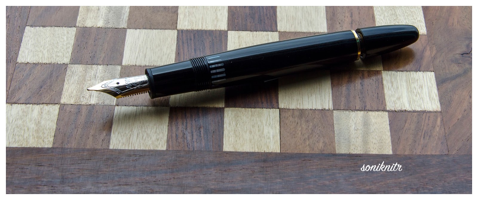
It deserves a place in your collection. PS – It was 1966 not 68


An Adorable Set of References


The Lamy 2000 Bible by Brandon
Applying Silicone Grease Video

Thank you for going through this review. I hope you enjoyed it.

A dialogue with the Lamy Dialog 3

$
0
0

MOTIVATION

A collection of fountain pens is never complete without the retractable ones in your armoury. And the ones, which immediately strike an already covetous mind, are of course the Pilots (VPs, decimos and the fermos). Then there are pens like lamy dialog, visconti pininfarina among a few others each with a relatively small sized non-hooded nib. Somehow, the idea of yet another hooded nib became quite less appealing, when I saw the dialog 3. I knew it was quite a heavy pen of the capless clan, and so was the fermo. The Dialog 3 was launched by Lamy back in 2009 designed by one of the contemporary designers, Franco Clivio. The Lamy Pico is another pen by the same Swiss designer. As per LAMY, Franco innovates with basic shapes – circle, square and triangle, foregoing anything superfluous in the process to achieve technical necessity. 

                          As you would have already discovered, there is no dialog 1 or 2 in fountain pens. Dialog 1 refers to a ball-point pen whereas Dialog 2 is a roller-ball pen, and interestingly they belong to different designers.

PRESENTATION (6/6)


How do you ensure minimalism with luxury? By establishing extravagance incrementally, in little steps. A paper sleeve encases a much more attractive black cardboard box etched with the LAMY logo. With the usual papers and a cartridge outside, a thin sheer cloth then encloses a beautifully polished gift box made out beech wood, with a magnetic closure.


The beauty of the beech-wood box is that it’s alluringly small enough to slip inside your pocket, the pen still dreaming inside with a soft cushion under her head. PS: It could be heavier than your cellphone with the pen inside. 


DESIGN (6/6)


A twist-action fountain pen with an advanced design, it comes with two variants – matte-black and palladium finish, with six nib sizes – EF, F, M, OM, B & OB. 


The silvery palladium finish with chrome polished clip reflects its immediate environmental colours. An etched pair of parallel lines running along the barrel & grip pieces represent the final nib retraction point, when in sync. LAMY is etched between the lines at the end of the barrel. Half-a-twist clockwise from the barrel top-end will open a ball-valve at the nib end of the grip and the nib extends to a click-stop, keeping the pair of parallel lines at diametrically opposite ends. Anticlockwise, post the parallel sync, the barrel can be unscrewed from the grip+clip section, to take out the nib + filling system. There might be an odd slippage in the twist mechanism, but once I tightened the barrel and grip section, it did not occur again. Simply Elegant!


A chrome ball-valve at the nib-end of the grip section protects the nib from damage of dust and drying-out, acting in sync with the twist-mechanism. Secondly, the clip lifts and rescinds with the twist to either facilitate an easier grip or enable clipping it on your pocket. 


From the aesthetics of design, the dialog 3 is really majestic. 

FILLING SYSTEM (6/6)


The sum of parts for me is greater than a whole. It’s fun taking the pen apart, because it’s meant to. Once the barrel is unscrewed anticlockwise beyond the synced parallel lines, it separates out to reveal the nib & fill system. The nib/fill system can be unscrewed anticlockwise from the grip section. You will find a standard Z26 converter fitted into the nib section. Again like the 2000, the design elements appear to be fluidic in both nature and function. The standard capacity is around 0.7-0.8 ml for the Z26 converter, as per various FPN reviews, which is quite good for a retractable one.


Once you fill her up, you can put the pen together and then there is of course the wow moment. 

NIB (6/6) - ALL THAT MATTERS


The 14k two-tone nib comes in four standard sizes (EF, F, M, B) and two special sizes (OM and OB). Elegantly, designed although in a modern fashion, the white rhodium decor occupies the tines and the tail parts of the nib, while a golden streak runs from the breather hole and diverges itself at the tip end of the nib. Embossed near the tail end are the usual specs of nib size (F), content - 14k-58.5% and of course the LAMY logo. 


One thing I did observe, is the difference between the tipping sizes of 14k-fine nibs of lamy - a lamy 2000-F in this case, which is in my current rotation. Though, the 2000 had its nib replaced with a somewhat older-service stock of Fine nibs, you can clearly see the difference between their tipping sizes, even without using a loupe. I am also told that a recent lamy 2000 fine nib may have a similar tip. FPNer maverink can confirm this, since we had bought the pens quite recently (an he went with an F). 


PHYSICS OF IT (4/6) - RELATIVELY


A cylindrical body with a 1.3 cm diameter having around 50 grams of weight, might seem to be a somewhat heavy proposition to wield it as a pen, rather than a weapon. The length of the fully extended pen is similar to a posted MB146. Taking these into account, this pen might not be comfortable for extended writing sessions. However, as far as short note taking sessions or signatures are concerned, believe me it could be a dream to write with. The illusive weight, the copious flow and the buttery nib will ensure a silky glider. 
  • Retracted Length ~ 13.8 cm 
  • Extended Length ~ 15.7 cm 
  • Nib Leverage ~ 1.8 cm 
  • Weight ~ 50 g 


ECONOMIC VALUE (4/6)


With a street price of USD 250-260, it falls right into a category where you would probably think thrice or may be more, before buying the pen. There is always some discount running on MRP of USD 385 in local stores, which brings the price closer to the street price.

OVERALL (5.3/6)


A flawlessly efficient pen as far as the vital parts of the pen are concerned. It has never skipped and all the twist mechanisms operate with a firm intent of functioning. The d3 fine nib is a stiff one and it lays a broader line than a 2000-fine. A wet and intense line, it gives the paper 15 secs, to dry itself, each time it writes. Line variation between horizontal and vertical strokes seems non-existent. 

A pen you cannot ignore, if you wish to have a retractable one with one of the smoothest nibs.


I hope you enjoyed the review.

An Intuitive conversation with the Graf von Faber-Castell Intuition

$
0
0

THE INTUITION


With a covetous eye on this pen, since the time I had got my FCD Ambition and then an orange coloured Ondoro fountain pen, it indeed required lady luck's blessings to get this one at a steeply discounted price. I must say, that there was already a strange sense of loss of colours, after I had parted with both of my orange coloured fountain pens - Ondoro and later a Pelikan m205. And this seemed to be an appropriate treatment for my colour blindness. Coming to the Faber-Castell Design (FCD) and the rather luxurious Graf von Faber-Castell (GvFC) line of pens, I must say that they have been able to splendidly highlight the art of convergence of design and utility. The Intuition pen comes in six lines of resin-based designs and two (earlier three) lines of wood-based designs. The wooden designs are called Intuition Platino Wood which is an enhanced intuition design altogether, be it the fluted wooden barrel or the platinum plated cap or an extra-large and more exquisitely designed bi-colour nib. And, it naturally places them in a more premium segment. You can find a review of the GvFC Elementohere, which shares its dimensions with the wooden Platino designs.

     These lines come with a fountain pen (with 6 to 7 different nib widths), a roller ball, a propelling pencil (0.7mm) and a ballpoint pen.

PRESENTATION (6/6)


It’s a chamois-coloured gift box with top and bottom wooden linings,  which secures itself by a magnetic catch within the two folds. There is the pen resting in a cardboard box within a chamois-coloured linen bag, which carries the Graf Von Faber-Castell name and their coat-of-arms logo.


I someway like the linen, bag because of its differentiated appeal, though not from an utilitarian perspective. There is also a warranty leaflet-cum-manual, which states a lifetime guarantee against manufacturing defects and assures services, in case any need for repair arises. Then, it also illustrates refilling the entire range of GvFC pens and other stationery.


DESIGN (6/6)


The Intuition rangecomes in six variants (terra - orange, ivory – off-white/fluted, black - black/fluted/metal cap) with six different nib sizes – EF, F, M, B, OM and OB. Only one of these variants comes with a platinum plated metal cap with a shiny black barrel.
             
Coming back to the pen, once you take it out, it surely looks like a compact enchanting piece of art. A high gloss sheen of the of the barrel and the cap reflects back quite a bit of light. Complementing this sheen, are the dazzling platinum plated trims of the pen.


On pulling the cap off, you would initially notice the singularity of the barrel, a section sans joints. It’s made out of a single piece of resin, in this case reflecting the colour of earth or ‘terra’,  gleaming with an orange smile. At the top end of the barrel, is a twist-metallic crown, which disengages the bi-tone nib section and converter system, from the rest of the body. I just love this element of design! The knob is embossed with the coat-of-arms logo, on the finial. Usually the coat-of-arms logo is used in GvFC pens and FCD pens (Ambition, Ondoro, e-motion) carry the jostling knights logo. Traditionally coat-of-arms is said to represent full-achievement in a heraldic tradition. GvFC has quite a bit of design superiority over the other FCD pens. Towards the nib end, the singular barrel narrows down to a slightly concave section to form a comfortable grip. Despite the glossy and smooth finish, the pen has a subtle but non-slippy grip section. The cap (snap-on) secures itself to the barrel with an audible click.


The cap is engraved with GRAF VON FABER – CASTELL, encircling the metallic finial insert which again bears another coat-of-arms logo with its platinum sheen. The cap band says GRAF VON FABER – CASTELL on one side and on the other end it's HANDMADE IN GERMANY. ‘Handmade’ because there are over a hundred steps in the entire manufacturing process of this pen, a majority of which are carried out by hand. The clip on the cap carries the gleam of platinum with a highly efficient and visible spring loaded system.


The finial at the barrel end carries a coat-of-arms logo.


FILLING SYSTEM (6/6)


Once the crown of the barrel is rotated anti-clockwise to disengage the nib & filling system, you would notice a rather classical CC filler system. The nib has a screw fit, and inserts into a metallic sleeve like most of the Faber-Castell fountain pens which I have seen. The nib sleeve has threads which synchronize with threads on the inner barrel, both ending up with an octagonal cross section. The converter has a metallic premium band which friction-fits into the nib section though it does not fit a FCD Ambition section. However, the Ambition converter fits in the Intuition nib section. The converter has a reasonably high capacity of 0.8 – 0.9 mL, and the ink does last for quite a while! I usually have a bias towards piston fillers, but I do appreciate the capacity offered by Faber-Castell converters.

The nib section carries a six-digit number which denotes the date of manufacture, which I did confirm with the Faber-Castell team. Mine says 011210, which would mean it was manufactured way back on 01-December-2010.


NIB (5/6) - ALL THAT MATTERS!


The 18k bi-tone nib comes in four main widths – EF, F, M & B and two special widths – OM (left) & OB (left). The tail end specifies the nib size and composition (75% Au , 18 ct) of the alloy used. A white rhodium decor occupies the outer tines converging with the iridium tip, while the inner part circumscribing the breather hole gleams golden with engraved stripes. There is a dazzling white coat-of-arms logo resting just above the tail-end. This one is a fine nib and writes quite smoothly with a 'minutely minute' hint of feedback when I use relatively drier inks. It lays down a wet albeit fine line, which will be covered in the last section of this review. With a rather curved shoulder, the nib does portray an apparently smaller size even if it’s quite similar to the size of the relatively flat Ambition nib. [minus 1]


The feed is standard grey plastic, with a big filler hole delivering an amazing ink suction, which is also used across the Faber-Castell Design series.


Below is a comparison to the FCD Ambition (non-premium) sections. You can check the differences between the two converters, the Intuition has got some metallic embellishment. Both use the same feed.


PHYSICS OF RELATIVITY (4/6)


With a cylindrical body of 1.2 cm diameter, it does give a comfortable feel without adding much weight. The capped length of 12.5 cm is quite similar to a Pelikan m400. In short, it is quite a compact pen when compared to an MB146 or even a thinner Ambition, for that matter. And a compact pen, can have its advantages along with some disadvantages. The weight of this pen has a significant contribution from the resin cap.

  • Uncapped Length ~ 12 cm
  • Posted Length ~ 15 cm
  • Nib Leverage ~ 2 cm
  • Overall Weight ~ 29.4 g

Uncapped, it’s quite similar to the m400 but slightly shorter than the Ambition. The loss of weight and length is somewhat balanced by the wider grip section, if not completely.


Alternatively, you can post it and it’s similar to a posted m400 with a slightly top-heavy configuration. However, I feel comfortable to use it both posted and unposted, although I never have shared the same feeling with Ambition.


ECONOMIC VALUE (5/6)


Although this pen retails around USD 600, it is available at much lower street prices. With end of season clearance sale, I was able to get the pen at a good discounted price of around USD 210.

OVERALL (5.3/6) 


I feel loved by the design and exquisite appeal of this pen on an overall scale, whenever I write with the intuition. No skipping or hard starts right from the beginning, it turned out quite smooth out of the box. With a stiff nib, it delivers a wet line, with this fine nib. The line width closely resembles a Lamy 2000 Fine/ a Japanese FM nib. For a pelikan 4001 brilliant green ink, it takes around 12-13 seconds to dry. There is no noticeable line variation with horizontal and vertical strokes for this one. Below goes a written review of the same:


It was fun reviewing the intuition. Hope you enjoyed reading it.

A bookish review of the Midori Traveler’s Notebook

$
0
0
Lately, along with a fair bit of travel, my focus has shifted towards acquiring various paraphernalia, genetically consistent with the core fountain pen ecosystem, while the pen themselves are in transit. Having used parker notebooks with the usual ivory coloured paper, for my travelogues; I was fascinated by the idea of a notebook  enclosed in a traditional manner within a leather jacket. To my limited knowledge and much elation, the Midori Traveler Notebook came out to be much more than that. I came in touch with the Midori brand, when I had got myself an aluminium multiple ruler. As per their website, Midori is a 65-year old Japanese company specializing in paper products and creative design stationery. You may also bump into MD Paper, while searching for quality paper products across Asia. 
From the perspective of paper, the company also makes stitched notebooks along with the flagship Traveler Notebook. And the core part of the notebook i.e paper manufacturing remains with Midori, Japan. Traveler Notebook comes in two different sizes – Passport & Regular acorss two standard colour variants – black & brown. (Additionally a blue - special edition is being released in April - 2015). The one being reviewed here is a regular sized traveler notebook.


PRESENTATION (6/6)

One of the enchanting parts of the notebook is the multi-tier packaging. Nothing expensive, but enticingly ‘differentiated’! A polyethylene plastic wrap, diaphanously enclosing a package wrapped in traditional brown paper, increases the excitement for unwrapping the gift. A note on the Traveler’s notebook in traditional Japanese paper, reveals a consistent purpose and description. It does reveal that the brown leather jacket is handmade in Chiangmai, Thailand, whereas the notebook is manufactured in Japan, thus referencing and embellishing quality.
mdn 001
At the backside of the package, rests some information regarding manufacture of the notebook and the leather jacket – from the countries of JAPAN and THAILAND respectively, along with product/bar codes and other compliance details in Japanese script. The brown package is fastened with a reddish-brown elastic band.mdn 002
Opening the package, unveils a notebook enclosed in a white cotton bag. Additionally, one spare elastic band (orange) is provided in a poly-pack. You can also remove the reddish-brown elastic band from the outer enclosure.
mdn 005
I had also ordered a 64-page refill along with the notebook (Refill#001), which has a simple wrap with a coloured stamp conveying the details of it.
mdn 003


DESIGN (6/6)

A leather enclosure secured by a single brown elastic band going through a perforation at the back of it, expresses the sense and simplicity part of it. The cover is made from cowhide leather, with an elemental texture and it acquires grace with time. It’s supposed to scratch, acquire colour over time to transform into your signature companion.
mdn 007
The enclosure carries one single stitched notebook with blank pages (Refill#003). There is a series of two strings running across the notebook and the leather cover through multiple perforations on the it and those are anchored by a small tin clasp placed at the top-left end of the notebook system. The elastic band fastens the notebook while the rather loosely held non-elastic one is meant to be a bookmark. The only embossed mark on the leather jacket is at the botton-left side of the back cover, which states MIDORI & MADE IN THAILAND.
traveler ends
The design of the notebook is primarily based upon an Add-On model: base + spares like the Gillette razor-blade model. But again Sony too sells the PlayStation at a loss and makes up for the same with the entire gaming ecosystem.
So, the primary ecosystem for the traveler notebook consists of two categories of refills – notebook and accessory. Notebook refills come in 64 pages (both sides) across blank (003), lined (001), grid (002), monthly planner (005), lightweight paper (128 pages, 013) and kraft paper (014). Accessorizing your traveler with sticky notes (022) or film album (023) or a pen-holder (015/016) is pretty easy once you purchase the refills and they may be priced between $4 to $10. There are several other inserts that are available for the traveler from Midori. You can find a complete list here.

PERFORMANCE (6/6)

The enclosing elastic band can be replaced with another by pulling it out from the inside of the back-cover. 
Adding a notebook is easy, by using one of the spare elastic bands to connect the new notebook with the existing one, which needs securing the band around the spine of both these notebooks. I have covered the writing part of it in the last section.
mdn 014

UPDATE 2.0

Off late, I did add a blue Midori PAN AM pen holder refill, which can keep a pen or a pencil with diameter less than 1.2 cm. Though it’s meant to go with MTN’s blue special edition, I ordered it specifically for my regular brown MTN. I kind of like the contrast.
md 003

PHYSICS OF IT (4/6) – RELATIVELY SPEAKING

A very portable one, the dimensions (13 X 21 cm) match closely with the standard parker notebook. However, given the availability of pages (192 in parker) and an absence of a pen-holder, the parker does score some brownie points here. If you are looking for pure table-top writing experience, then parker can be more appealing, given its solid frame. The leather cover does offer a lot of flexibility when you are travelling and it’s meant for the traveller.
mdp comp

ECONOMIC VALUE (4/6)

The traveler notebook and a 64-page refill cost me around USD 35, with free shipping from Japan. While the price might still be low for a comparative analysis (with other shops), the economic value of the notebook does not do very well against the likes of competition - parker costs less than one-fourth of the same. Then again, you have to purchase refills typically costing anywhere between $4 to $10. That’s midori’s ecosystem for making money. The Add-On model!

OVERALL (5/6)

The design and vogue part of the traveler is exquisite. And yes, the MD paper is nice, thick and smooth for all your beloved fountain pens. Since, it was another Japanese product, I tested a Sailor Pro Gear Sigma Slim (Medium) with it. And it did run like a dream, laying quite a fine wet line. The thickness and texture of the MD paper makes even a relatively wet ink dry up pretty fast (sailor jentle ink dried within 6 seconds). However, that again comes with an little although unnoticeable bit of feathering, unlike the parker notebooks. However, there is no bleed-through for the MD paper.
mds 001
It was fun reviewing the Midori Traveler Notebook. Hope you enjoy the review and find it useful.

Bhutan : Old Path White Clouds

$
0
0
MUMBAI – BAGDOGRA – PHUENTSHOLING – PARO – THIMPU – PUNKAKHA – SILIGURI

21/Mar/2015 0430 hrs – mumbai – BAGDOGRA – PHUENTSHOLING

Having wrapped up all office work on the previous night, it was indeed a challenge to pack our bags and then leave for the airport, well before sunrise, on a 9-day long trip. The things that were already in place were return flight tickets(inside India), tourist permits and hotel bookings at 4 cities. The rest of the logistics were to be managed at the world’s happiest nation itself. We had obtained permits from the Royal Bhutan Consulate, well before reaching Bhutan.

Permit

Indian tourists do enjoy some kind of luxury when it comes to a Bhutan visit. You can get a tourist permit either at Paro Airport or Phuensholing Immigration Office (We found the office open till 07:00 PM on a Saturday) or the Royal Bhutan Consulate in India (Kolkata/Delhi). Documents that need to be submitted along with the form, at the Consulate/Phuentsholing Immigration Office constitutes of: 1) Passport Copy/ Voter ID Copy 2) 2-Passport Sized Photographs (keep 4 handy) 3) Completed Bhutan Permit Application Form, along with original documents, for proof.

Secondly, a vehicle permit along with a driver permit can be made with the tourist permits, while you are travelling inside Bhutan. You can rent either an Indian or a Bhutanese Cab. If you wish to visit places beyond Thimpu or Paro, there might be additional permits required from the Immigration Office at Thimpu (Working hours: Mon-Fri), for which usually the cab drivers will coordinate.

CURRENCY

Indian currency is widely accepted across Bhutan along with currency notes of Rs 500/1000 denominations, now. The Bhutanese Ngultrum remains pegged to the rupee with a 1:1 conversion ratio. For credit card transactions, an additional fee of 3.5-4.5% is generally levied by the hotels. Additionally, be mindful of the fact that there is a government tax of 20% levied on hotel bills, over and above the final amount. So you might prefer to carry enough cash with you. (There is a limit on carrying cash - Rs 25000 per person)

After making the lazy ladies get up including my sister and my wife, we could finally manage to leave for Mumbai airport at 05:30 AM, to catch a 07:00 AM flight to Bagdogra (IXB) via Guwahati. It was one of my longest domestic flights (around 5 hrs), and we would be meeting my friend and his wife who were flying from Kolkata.

It was around 1 pm, when we finally landed at Bagdogra, Siliguri (West Bengal, India) and we booked an Innova to take us to the border town of Phuentsholing, Bhutan. We had a delicious lunch at Sinclairs Siliguri on the way, thanks to the couple’s suggestion. I am not entirely sure if it was due to extreme starvation or awesome food preparation, but the chicken manchow soup tasted like heavens there. The drop to Phuentsholing from Siliguri Airport will cost you around Rs 3500-4000. Please keep note of Bhutanese time which 30 min ahead of India, if you are planning to get your permit from Phuentsholing Immigration Office itself. It should take 4-5 hours (180-200 kms) to reach there with some tea-breaks, traffic-jams or an odd stroll in the tea gardens of Siliguri.

Bhutan 001

We had some tea with veg-momos at a restaurant nearby (dhaba actually).

Bhutan 004

After overcoming the initial traffic blocks at Siliguri which consisted of endless lines of trucks (sometimes landslides block traffic for hours), we indeed had a pleasant journey through the picturesque landscape of North-East India. It was late around 06:30 PM (07:00 PM Bhutan Time) when we reached a gate welcoming us to the Royal Kingdom of Bhutan, at Phuentsholing.

Bhutan 015

Getting a local simcard (Tashi Cell) to manage the local logistics part of it was easy, after checking into our pre-booked hotel. Refreshing ourselves with some Bhutanese cuisines for dinner like Shamu/Ema Datsi (Mushroom/Chilli cooked in Cheese gravy), a Bhutanese chicken curry (soup-like) along with some chappatis, we dozed off to a deep sleep. Ema (Chilli) Datsi's side effects were not observed by most of us, until next morning when we sat down on the burning pot. Note that, in all over Bhutan we went, Chilli is an absolute package.Devil

We had done our hotel bookings two months prior to our travel dates. Most of the owners/managers are quite responsive on emails and they would typically ask for a 20-50% advance via bank transfer to an Indian bank account. Tripadvisor did help a lot in our search. One thing to note is that, there is a 20% tax on the total bill (food + accommodation + services), as mandated by the Government of Bhutan.

22/Mar/2015 1030 hrs – PHUENTSHOLING – PARO

Next morning, after having some Indian breakfast (Puri/Bhaji), we booked an Indian cab (from the other side of the border town Jaigon (WB), Ertiga/Innova) for the next 7 days. The rent varies from Rs. 2500-2700 per day for a 6-seater vehicle and we made a part advance payment for the same. While the driver went to get permits for the vehicle from the Transport Office at Phuentsholing, we strolled inside a nearby crocodile reserve, where the Government has been feeding these lazily dangerous animals since 1976, through a special Gharial Conservation Programme.

Bhutan 023

Another Yawn…

Bhutan 025

Turning some Buddhist Drums clockwise for good luck, we started our Paro journey by 12:30 AM.

Bhutan 039

The trip to Paro was accompanied by a much chillier breeze and the clouds obscured the Sun. We passed through some majestic waterfalls with graffiti of Gods & Goddesses on the big rocks.

Bhutan 064

After two hours, the visibility deteriorated and we were passing right though cloud tails. It was scenic, somewhat chilly and an enjoyable experience.

Bhutan 073

It took us around 5 hours to reach our resort at Paro through these mountain roads along with two or three breaks in between to have lunch and then tea at  roadside restaurants. We had a tyre problem and it took around an hour to set it right. In one of those restaurants, we found this cute little dog barking at another, incessantly.

Bhutan 081

With some tea, we went on to reach our destination. We had dinner and pre-ordered some Puri-Bhaji for next days breakfast. Taking a stroll afterwards, let us discover an amazingly lit Paro in the evening.

Bhutan 093

23/Mar/2015 0830 hrs – PARO – TIGER’s NEST TREK

Early morning, we did meet some American, German and French tourists, on the breakfast table and it seemed that each group had one or two Bhutanese guides with them. Most of them were headed to the Paro Taktsang Monastery. We took some snaps around the resort which had already unfolded a scenic Paro valley at dawn.

Bhutan 099

After getting water, chocolates and some light weight edibles for five of us on the way, we reached the basecamp in half and hour time. From the basecamp shops, we picked up two walking sticks for 100 bucks. The Paro Taktsang or Tiger’s Nest is encircled with a red circle in the below picture, and it’s situated at an altitude of 3120 m.

Bhutan 105

We took our own sweet time climbing up the terrain, taking frequent water & chocolate breaks and enjoying the peaceful sight of mountains among mountains. Legend has it, that the great Buddhist Master, Guru Rinpoche (Padmasambhava) flew to this location on the back of a tigress and meditated ceaselessly to manifest himself in eight incarnated forms, sometime in the 8th century. The monastery was constructed later in the 17th century.

Bhutan 109

One funny thing was that, whenever we asked returning monks and trekkers about the trek that was still left, we never got an answer which amounted to less than two-thirds Smile with tongue out.

Bhutan 114

After two hours, we reached the Taktsang Cafe where you can have some tea/coffee along with biscuits. We spent some time at the cafe, which was surrounded by trees at either side, with birds chirping happily.

Bhutan 133

Once we came near the monastery, we had a plain easy terrain which later transformed into a series of stony stairs and it started going down, before going up all the way. The sight of the fall and rise was quite demotivating after we had covered all the distanceSteaming mad.

Bhutan 135

Within an hour and a half we reached the Tiger’s Nest through the valley of steps. We had to deposit cameras, bags and other things at a safe-deposit locker, with the security. It is mandated to go in full sleeves inside the monastery, so we put on our jackets. Removing our shoes we visited the various prayer rooms where either Buddha or Guru Rinpoche were worshipped. And then we visited the famed tiger’s nest (Guru Rinpoche’s meditation chamber) which has now been made navigable to an extent by multiple steeply placed wooden ladders.

Bhutan 143

Climbing down took us around one and half hours and it was relatively easy. IMG_3210The total trek involved walking of around 12 kms but as you can see from the data snap. However, the most difficult part of the trek was the steepness of the mountains. And then we had to take another tea-break at the Taktsang cafe, while descending. We reached our cab and went on to have lunch at a restaurant in the city. It was around 5 pm when our over starved stomachs could receive some hot chappatis with curry.

We went on to visit a famous temple at Paro known by the name of Kyichu Lhakhang which is adorned with cherry blossoms. It was again visited by Guru Rinpoche in the 8th century, which means more mystery to the place.


Bhutan 149

Bhutan 151

We went back to our hotel rooms and after having a light dinner we fell asleep with peace.

24/Mar/2015 0930 hrs – PARO – THIMPU

Next morning, before we diverted towards Thimpu, we visited a few more locations at Paro: Rinpung Dzong, National Museum of Bhutan and a monastery beside Paro Chhu (Chhu means water in Bhutanese) known as Tamchhog Lhakhang, on our way.

Bhutan 167

Bhutan 179

The Tamchhog Lhakhang Monastery is located on a hill encapsulating the chilly waters of Paro Chhu. There are two wire bridges to help you cross to the other side of the river and reach the monastery.

Bhutan 193

By lunchtime, we had arrived at Thimpu. After a sumptuous lunch at the checked-in hotel, we started with a few visits to nearby places later in the afternoon. The weather had gradually transformed into an overcast sky by the time we had reached the Buddha Point. One of the largest Buddha rupas in the world, the statue is made of bronze gilded with gold, measuring a whopping 52 meters. And, the clouds enclosed within the Himalayan ranges with distant snowcaps, reflecting on the statue, give Buddha a rather majestic look.

Bhutan 199

In a few minutes, it started raining, and we were soon greeted with a light hailstorm. We took a break at a higher mountain which revealed a partly lit Tashichho Dzong and it warmed our hearts in this cold chilly rains of ice.

Bhutan 208

With ice melting on our jackets, we returned to our hotel rooms to warm ourselves up, with a silent enthusiasm to take on the next day’s trek.

25/Mar/2015 1000 hrs – THIMPU – CHERIE MONASTERY

A 20 km drive to the north of Thimpu valley, took us beyond some charming snow-caps and black mountains, towards the base of Cherie Monastery. Along with Tango monastery on the other mountain, this serves as a monastic school for study of mathematics, philosophy and sciences for Buddhist students. As one of the monks told us, a student after 9 years of study at Tango monastery graduates to Cheri Monastery, for 3 more years of specialization. Till then he is allowed to come in social contact with other people. Then post specialization from Cherie, he goes to a higher mountain, devoid of social contact, to concentrate solely on the spiritual realms of existence. There is a temple at the base of the Cheri mountain, from where we started the short trek, after crossing a small foot-bridge.

Bhutan 213

The trek took us about an hour though the exquisite overlapping of Himalayan mountain ranges.

Bhutan 231

Cheri Monastery is said to have visited by Guru Rinpoche in the 8th century itself, long before its construction in 1620. And the mountains and the skies do possess a mystic equilibrium for the human mind.

Bhutan 233

We were greeted by some mountain goats grazing lazily on the greener grass. There was a giant pet dog of the monastery who greeted us by showing us the door to the monastery.Bhutan 236

We took some drinking water from the monastery, IMG_3221after paying our respects to Guru Rinpoche. The return journey did not take much time and we reached the base, after a short while. There is a small river flowing at the base of both the mountains which house Tango and Cherie monasteries. Effectively, it was a two and half hour short trek, which was made to last three hours due to our frequent breaks. The steepness of Tiger’s nest was missing, as our feet had some comfortable plains to cover here.

Then onwards we went to visit the Takin Reserve, which preserves the national animal of Bhutan. Legend has it that a Tibetian saint conjured the first Takin from the head of a goat and the skeleton of a cow, and then onwards it was seen grazing among the Himalayan mountains. Though nothing spectacular in itself, we did get an opportunity to cover some of the beautiful landscapes enclosed by the snowcaps.

Bhutan 266

In the evening, we went on to visit the flag hoisting ceremony at Tashichho Dzong. The Dzong opens to public after official hours. There are various administrative offices, temples and staff quarters inside the campus. One of the temples is open to public as you can see below.

Bhutan 286

26/Mar/2015 0930 hrs – THIMPU – PUNAKHA – DOCHULA PASS TREK

We checked out of our hotel at Thimpu with loads of happy experiences of lovely Indian food along with Bhutanese delicacies. Enroute to Punakha (the old capital of Bhutan) we had to go via Dochula Pass. This memorial of 108 chortens were built in 2003 by the Queen Mother to honour the Bhutanese soldiers who were killed fighting Indian rebels.

Bhutan 296

There is a temple on the opposite hill, which faces the memorial. The temple does stand tall upon a hill, with pillars placed on its circumference.

Bhutan 303

Bhutan 307

At around 11:15 AM, we started one of the long treks which went up to Lungchu Tsey Monastery. Navigating through dense forests, steep slopes, slippery terrain and colourful flower beds, it took us around 3 hours to reach the highest point housing Lungchu Tsey monastery, at 3556 m altitude. With an overcast sky, this was one of the steepest treks we undertook, and then we had to to get down at the other side of the mountain which was situated at a distance of 5 kms by road.

Lungchu Tsey

Once we saw the monastery we were dazed by its coolness and serenity. A kind monk came down to greet us along with three pet dogs of the monastery, who escorted us further towards the prayer room on the top. We could notice some beautiful flowers in the vicinity and we met some other monks who spoke in Bhutanese, of which we could understand none.

Bhutan 325

Then paying my respect to Guru Padmasambhava, I placed a small petal picked up earlier during the trek, on the altar. Innately we all had the feeling of completing the trek, due to his blessings. Then the divine calling for tea with some biscuits were heard and transmitted by this kind monk. We then could muster enough energy to start our journey towards the other end of the mountain.

LTsey-2

When we started trekking down, a slow hailstorm IMG_3240began its course and our jackets, bags were drenched with melting ice. Palms and feet had gone numb and some of us heard cries of wild animals. Someone had earlier warned us against testing our luck against these wild animals. Walking through darkness of clouds and muddy slippery terrain, we tried to hurry through the rest of the journey but our feet would not allow us to do so. We covered a total of 16.28 kms before we could spot our car waiting for us. We went downhill via Tashigang Gumba and walked almost continuously for two and half hours with limited breaks. The last of our chocolates were finished on our way back.

Finally we could see a muddy road connecting to the main road and we could see a cab from this side of the hill. And it was indeed a mirage, it took us another 20-25 minutes around the mountains, before we could reach the main road.

Bhutan 339

With almost immobile feet we boarded the cab, when we started towards Punakha. In two and half hours we reached Punakha as the road blocks were removed after 05:30 PM, in the evening. We had a forgettable dinner at a restaurant before reaching our hotel. It is located in Wangdue (pronounced Wangdee) which is again at a upslope distance of 45 minutes from the main town.

27/Mar/2015 1030 hrs –  PUNAKHA

This day was our penultimate day in Bhutanese soil, for we had a long journey till Siliguri the next day. We visited the Punakha Dzong which was the administrative center of the nation till 1955. The Dzong is located at the confluence of two rivers – Po Chhu (father) and Mo Chhu (mother). Inside the Dzong are administrative settlements and it’s home to one of the royal bloodlines. We found this Buddhist Wheel of Life again, (bhavacakra) painted on one of the outside temple walls.

Bhutan 368

Bhutan 371

We took a small walk toward the other end of the Dzong to have a look at the longest suspension bridge of Bhutan, which should measure around 200 meters. It was fun crossing the bridge, to have some locally manufactured mango drink at the other side.

Bhutan 384

Bhutan 387

It turns out to be quite an amazing view when you look at the meanderings of the river against these mountains.

Bhutan 393

On returning to our hotel in the afternoon, we did some local scouting to get the sim recharged. With some refreshing tea, we rested our legs on the rocks surrounding Dangchu river. At around 10 pm in the night, we came to know of the absence of credit card facility of the resort and had to take the hotel car to get cash from an atm in the town.

28/Mar/2015 0630 hrs –  PUNAKHA – PHUENTSHOLING – SILIGURI

Next morning, we had to bid goodbye to Bhutan and start our journey back home. We left quite early in the morning as there were several blocks in Punakha, owing to road work. We had to stay at a block for 1.5 hours before, going through the clouds. A late breakfast at Thimpu rejuvenated us and we managed to reach Phuentsholing at around 04:30 PM. Paying rest of the bill for the cab, we took another cab leaving the Himalayan Kingdom, to reach Siliguri at around 08:30 PM.

Bhutan 410

We all had next morning flights back home from Bagdogra airport. All I could recall during sleep, was an old path with white clouds.

An Elemental Review of Graf von Faber-Castell Elemento (L.E)

$
0
0

Elemento L.E


To be honest, the Elemento seems so alluring, ever since I have got an Intuition. The yearning could only multiply with time. A sale was good enough to trigger my purchase as I could not wait long to catch hold of the pen. Incidentally, this is my first numbered (limited edition) fountain pen, delightfully so with a wooden barrel.
Elemento, incidentally was designed to celebrate the 250th anniversary of my favourite fountain pen company - Graf von Faber-Castell.  It also marked the release of a few other similarly sized wooden models of intuition. The Elemento range comprises of individually numbered propelling pencils (250 pieces), ball point pens (1500 pieces), roller-ball pens (1000 pieces) apart from these fountain pens (2500 pieces).

PRESENTATION (6/6)


One of the best parts of the presentation is a big hand-crafted wooden case in wenge colour, housing the entire collection. There is also a similar box which holds only the fountain pen. I was not able to get this case due to certain shipping constraints. However to my absolute delight, the Faber-Castell company sent me a spare wooden box, which usually is meant for the Intuition Wooden/Platino editions.  Many thanks to Nicole, who handles marketing at Faber-Castell for APAC/MEA region.


The pen comes in a small cardboard box, which has an L.E number attached to one of the smaller faces of the cuboid. Along with the pen, there is a brochure which narrates a bit of Faber-Castell’s ‘since 1761’ history, along with alluring pictures of the Perfect Pencil, before it delves further into the elements of the Elemento range.


DESIGN (6/6)


This is probably where firms like GvFC revolutionize the past, present and future of design. A dazzle of platinum deeply resonates with the subtlety of discernible olive wood grains in the barrel.


The barrel is made of cross-grained olive wood (Stimholz in German), where wood is cut into discs, perpendicular to the height of a tree. This renders both strength and elegance to the wood. You can notice some heavy varnishing on the barrel, so that any chance of staining is well-eliminated. The wood is said to be fitted onto the barrel in six individual elements, for the sole purpose of transforming it into a fountain pen. A contour of colours ranging from honey gold to reddish brown, garnish the barrel while the black lines running across the length of barrel give it a distinct elegance.


On puling off the cap, you will instantly notice a singularity of the barrel, running sans any joints. A super-sized two-tone nib is divulged with a golden-silvery sheen glistening with the platinum coated trims. Towards the nib end, the singular barrel narrows down to a slightly concave section, to form a comfortable grip. The cap is friction fit and closes onto the barrel, with an audible click.


At the other end of the barrel is a glittering crown, which can be twisted to disengage the nib and filling system. You can find the GvFC coat-of-arms logo embossed on its finial, earlier used to represent complete achievement in heraldic tradition. And, why not!


Once you reach the end cap, you will notice a disc of olive wood adorning the finial and rendering a finality to the wooden barrel.


The cap is engraved with GRAF VON FABER – CASTELL, encircling the wooden finial insert. Below at the cap band, it says GRAF VON FABER – CASTELL on one side and HANDMADE IN GERMANY on the other. ‘Handmade’ because there are over a hundred steps in the entire manufacturing process of this pen, a majority of which are carried out by hand. The clip shines in consonance, with a highly efficient yet visible spring loaded system.


As a Limited Edition (L.E), a number, i.e XXXX/2500 here, is etched at the end of the barrel section, which attaches to the nib & filling system insert. And while writing, you can always observe a subtle reflection of the L.E number, rhyming in cadence with your script, on the visible metallic end of the insert.


FILLING SYSTEM (6/6)


Once the crown on the barrel is rotated anti-clockwise to disengage the nib & filling system, you would notice a rather classical CC filler system. The nib has a screw fit, and inserts into a metallic sleeve like most of the Faber-Castell fountain pens, which I have seen till date. The nib sleeve has threads which synchronize with the inner threads on the metal insert of the barrel, both ending up with octagonal cross sections. The converter has a metallic band which friction-fits into the nib section although it does not fit a FCD Ambition section. With a reasonably high converter capacity of 0.7 – 0.8 mL, the ink does last for quite a while! My usual bias towards piston fillers has always been negated by the relatively higher capacities of Faber-Castell or Pilot CON-70 converters. The converter has a decent suction and resembles a Schimdt K-5.


NIB (6/6) – ALL THAT MATTERS


The giant two-tone nib with an usual iridium tip is run by hand, and it comes in four main sizes – EF, F, M & B along three special widths – BB (extra-broad), OM (L) & OB (L).


The tail end of the nib specifies the size and below it rests the composition (18 ct, 75% Au) of the gold-alloy used. A golden decor runs along the shoulders of the nib and it converges across the outer tines onto the iridium tip, while the rhodium silvery finish diverges from the breathless slit (There is no breather hole on this nib!) across the inside of the tines and over to the tail.


A cross hatched border segregates the rhodium and gold decors. Then, there is a dazzling white coat-of-arms logo resting above the tail-end. This one is a fine nib and writes superbly butter smooth with no hint of feedback.


This feed has closely spaced fins with a buffer capacity to hold ink with transient temperature and pressure, giving an effortless writing experience. 


PHYSICS OF IT (6/6) – RELATIVELY SPEAKING


With a cylindrical wooden body, it does give a superb feel with a comfortable weight, without posting. The overall capped length of around 13 cm is more than a typical Pelikan m2xx/4xx. The total weight of Elemento has a significant contribution from the cap, which is quite well-balanced otherwise. You would not love to use the pen posted, though.

  • Uncapped Length ~ 12.5 cm
  • Posted Length ~ 16.9 cm
  • Nib Leverage ~ 2.3 cm
  • Overall Weight ~ 40-45 g


While it’s not posted, Elemento compares well with a Pelikan m800, which I feel has a slightly flatter and bigger nib.


ECONOMIC VALUE(5/6)


Although the Elemento retails at more than USD 1200, it is available at lower street prices. I was able to get the pen at a good discounted price. I would not undervalue this rating by much, because in the end, the Elemento is a kind of masterpiece in itself.


OVERALL (5.8/6)


I adore the distinctly granular olive wood design and the remarkably superlative appeal of Elemento, given the contoured gradient of reddish brown to honey gold colour. This pen is blessed with a butter smooth fine nib which delivers a relatively wide but wet line. The line width closely resembles with a Pelikan Fine nib. For a Waterman Florida Blue ink, it takes around 14-15 seconds to dry. I could not find any line variation with horizontal and vertical strokes for this one. Below is a written review of the same:


It was fun reviewing the Elemento. I hope you enjoyed it.

Midori MD Notebook Review (A5)

$
0
0
After falling in love with my MTN and the entire ecosystem part of it, I wanted to have a similar fountain pen friendly paper, sans the panache of an MTN. And it’s closest cousin seemed to be an MD notebook. I went for a A5 sized one, as it was quite readily available.

PRESENTATION (6/6)


The entire package rests within a polyethylene plastic wrap, and a tracing paper enclosure keeps you happy with the very process of unravelling. There is a bottom band of blue branding wrapped over the notebook, which covers essential product specifications/branding in English and certain things in Japanese.

md 004-pres


MD ELEMENTS (6/6)


The notebook is thread-stitched and a weaved cloth is glued along the outer-spine, perhaps as an embellishment for a classical literary look. You would feel at ease, to write on a MD Notebook, as it remains completely open, thanks to the stitching. Clever! A ribbon/bookmark can be found in the middle, and I feel it is quite well-thought of, in case you choose to mark something essential.
The cover is made up of card stock usually meant for business cards, post cards or catalogue covers. On the front, it carries the branding of ‘MD PAPER, Made in Japan’, in a subtly embossed format.
As an ecosystem refill, a clear PVC cover is also available for each of the notebook sizes, in case you are planning to use a particular size regularly.

md 007

There are four stickers to label your notebook.

md 008

The inside cover has a box of particulars along with a bit of MD branding.

md 010


PHYSICS OF IT (6/6) – RELATIVELY SPEAKING


Quite a compact one with dimensions - L(21 cm) X W (14.8 cm) X H (1.1 cm), it does get a bit wider and shorter, than a standard parker A5 notebook or even an MTN. It has 88 leaves with square grids (of 0.5 cm) on both sides.

md 012 dimension

ECONOMIC VALUE (6/6)


It cost me a pretty decent USD 9 with some combined shipping from Japan. I ordered it online on Rakuten global.

OVERALL PERFORMANCE (5/6)


I love the understated looks of this notebook. A Pelikan fine nib glides along the paper with a wet line although it takes around half a minute to dry. I did observe a minute feathering and a decent show-through after writing on the first page.

md 015

Unlike the MTN refill paper, these pages are quite thin and  the ghosting is visible on the other side. Although from a personal context. I feel that you can write on the other side too but YMMV.

md 016

I hope you enjoyed this short review and it helps with your next notebook purchase.Thumbs up

A.W Faber Castell 554D Progress : A Vintage Pen

$
0
0

A few weeks ago, I stumbled upon a NOS (New Old Stock) Faber Castell 554D Progress fountain pen, when I was searching for inks. It was placed inside a cellophane wrap, printed with green A.W Faber-Castell and was finally packaged inside a small cardboard box. A small pen which kind of resembled a rather compressed modern MB146, with its striped ink-windows. Since, I have an excellent experience with most of the Faber-Castell fountain pens including the reviewed ones here – Ambition, Intuition and Elemento, I went ahead and purchased the pen. Later, Faber-Castell Co. confirmed that the 554D featured in their brochure till 1960.

Faber-Castell started manufacturing fountain pens in 1951, after acquiring the Osmia Company and produced fountain pens till 1975. It carried the Osmia logo [diamond-in-a-circle] till the 1960s, given Osmia’s high brand recognition in the fountain pen industry and the same logo is also present in this one.

PRESENTATION

I like the vintage bit of packaging in the traditional way - a thick cardboard box, which has actually become thin these days. As you can see, the cellophane wrap carries the green A.W Faber-Castell name. There is a classical user-guide in German, with instructions on how to fill the pen.

1-box


DESIGN

The pen is made of up plastic parts with gold plated trims. This gloss of black and dazzle of gold is still being followed in modern times.

FC554D 005

The nib size and the model number are etched in golden on the barrel, just below the piston-knob.FC554D 006

The golden cap band mentions PROGRESS on one side and FABER-CASTELL on the other.

1-cap1

The striped transparency of ink windows renders a rather elegant angle to the overall design of the pen.

FC554D 007


FILLING SYSTEM

The piston filling system was initially clogged, as the lubricants had dried out over all these years. After the first stop of the piston knob, by rotating the piston-knob further in a counter-clockwise direction, the entire piston unit can be pulled out. I applied some silicone grease (metroark211) on the piston seal, which is made of transparent plastic, and the piston mechanism was as good as new. If you can notice a white plastic thing through the ink windows below, that’s the piston seal. FC554D 012

It takes in a good amount of ink with the piston fill mechanism, which lasts as long as the 0.8-0.9 mL capacity Faber-Castell converters.


NIB – ALL THAT MATTERS

The 14k gold nib is inserted into a screw-fit sleeve unit and the unit can be easily unscrewed from the barrel. It is a vintage EF nib and has got a hint of feedback, which is duly compensated by a rather wet flow of ink. You will notice an old Osmiadiamond-in-a-circle logoembossed at the centre of the nib with Faber and Castell at top and bottom respectively. The nib specifications of 14K and 58.5% follow these impressions towards the tail end.

FC554D 010


PHYSICS OF IT – RELATIVELY SPEAKING

The cigar structure of this pen makes it a somewhat comfortable companion. The only disadvantage is that the cap cannot be posted securely.

Uncapped Length ~ 12 cm

Nib Leverage ~ 1.85 cm

Capped Length ~ 13.3 cm

FC554D 015

Though the length is comparable to a M400, a wider grip section and post-ability of cap are the duly missed elements. Now a days, most of the fountain pens can be posted.

FC554D 016


OVERALL

This vintage 14k nib has a wet flow, with a hint of feedback like most EF nibs. The nib is quite stiff with no hint of flex. There is also a bit of line variation among the horizontal and vertical lines. It takes almost the same time (15 secs) to dry as a modern GvFC Intuition Fine nib.

FC554D 017

It was fun reviewing the 554D. Hope you enjoyed it.

Viewing all 64 articles
Browse latest View live