Quantcast
Channel: The Silent Cartographer
Viewing all 64 articles
Browse latest View live

The Sterling Pelikan Souverän m625

$
0
0
As you might already know, Pelikan as a company encompasses a rich heritage of 180 years – in manufacturing inks, pens and stationery (177 years to be exact, you can find a bit of history in a previous post and here). In 1929, it released its first transparent Pelikan fountain pen  and was credited with the genesis of the piston-filling mechanism, using a differential spindle gear. However, the first of the silvery m625 models does not come until the next 77 years go by. 


m625


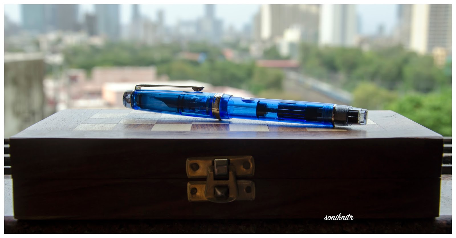
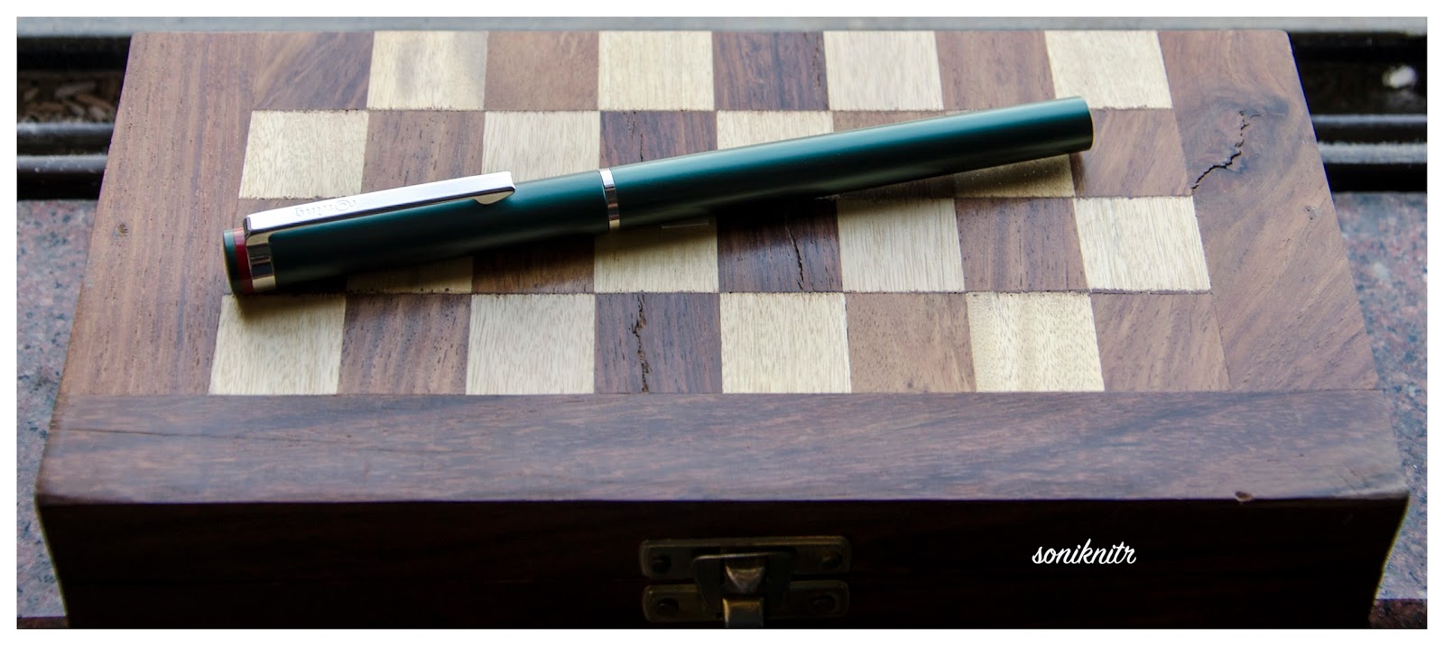
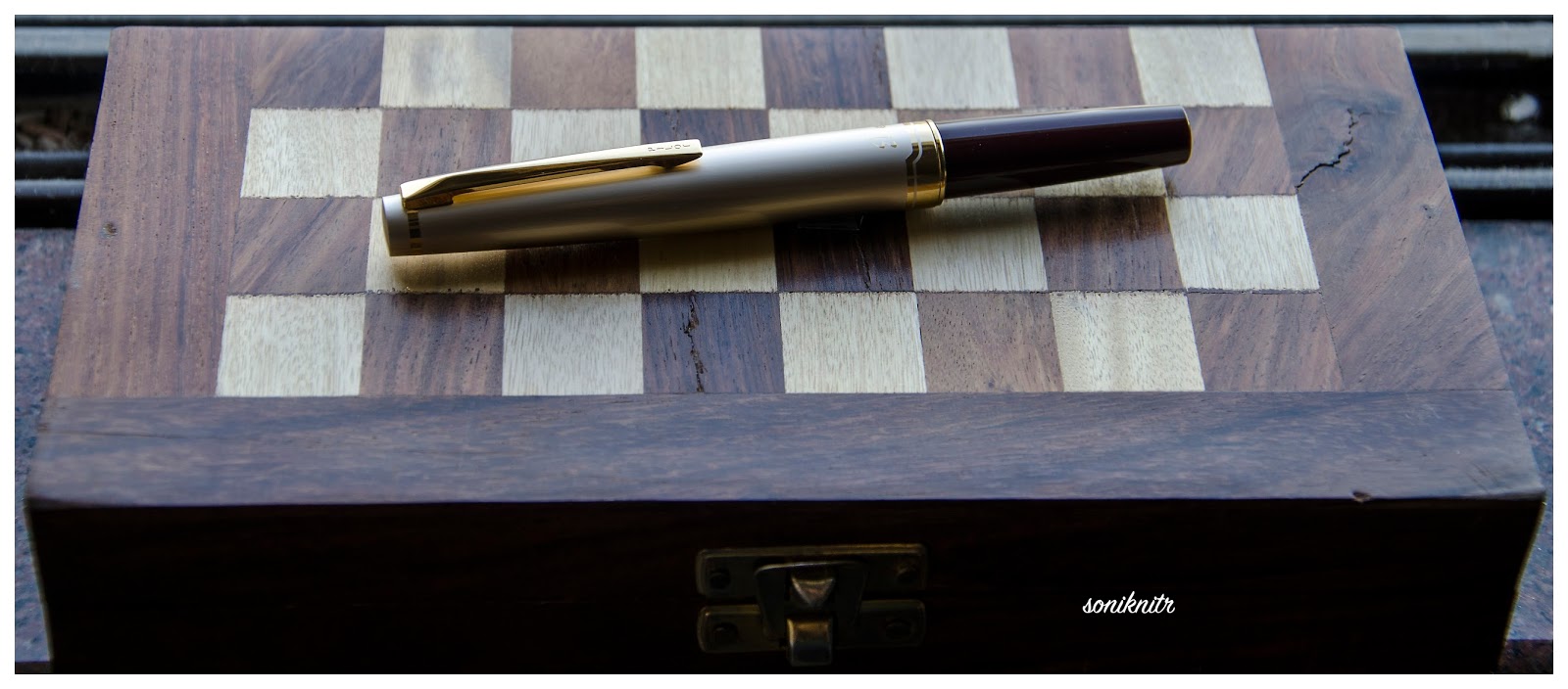
Pelikan launched the Souverän m625 model in 2006, which constituted of a dark blue resin barrel with rest of the visible hardware - i.e cap, piston knob and grip section, carved out of sterling silver (92.5% silver + 7.5% copper giving the required strength while preserving appearance of the noble metal). It was later followed by an aubergine model and a red model with two variations in the cap section. These had a 18k rhodium plated gold nib. Later, they also released a limited batch of m625s with a red barrel and a 14k nib, for the Asian market.

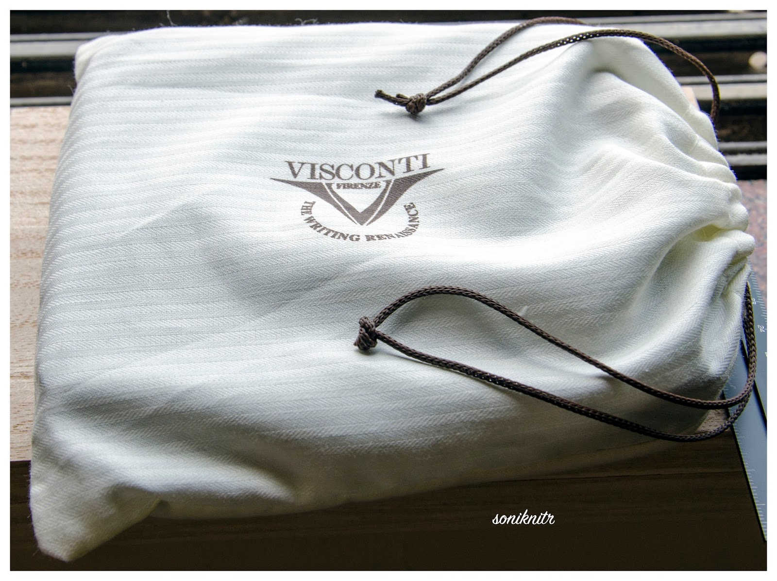
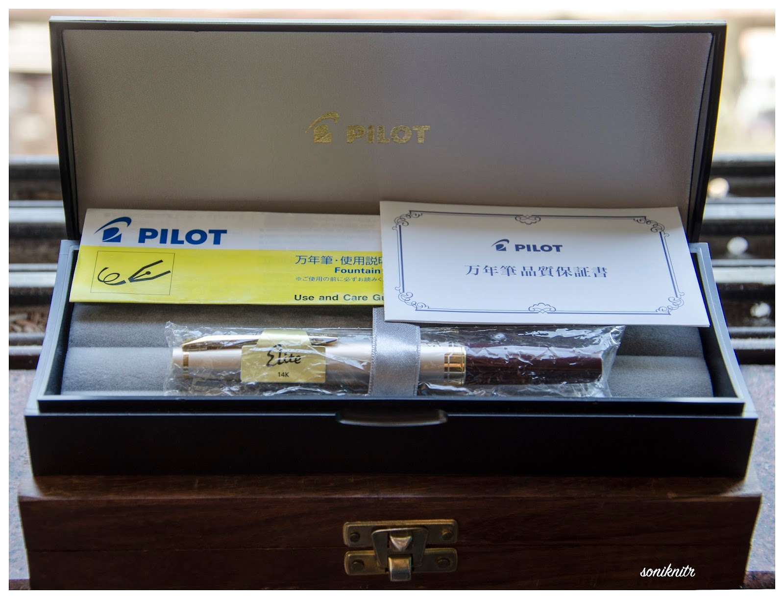
The pen comes in a standard G15 gift box, essentially the same packaging as all the other standard souverän models.


DESIGN (6/6)


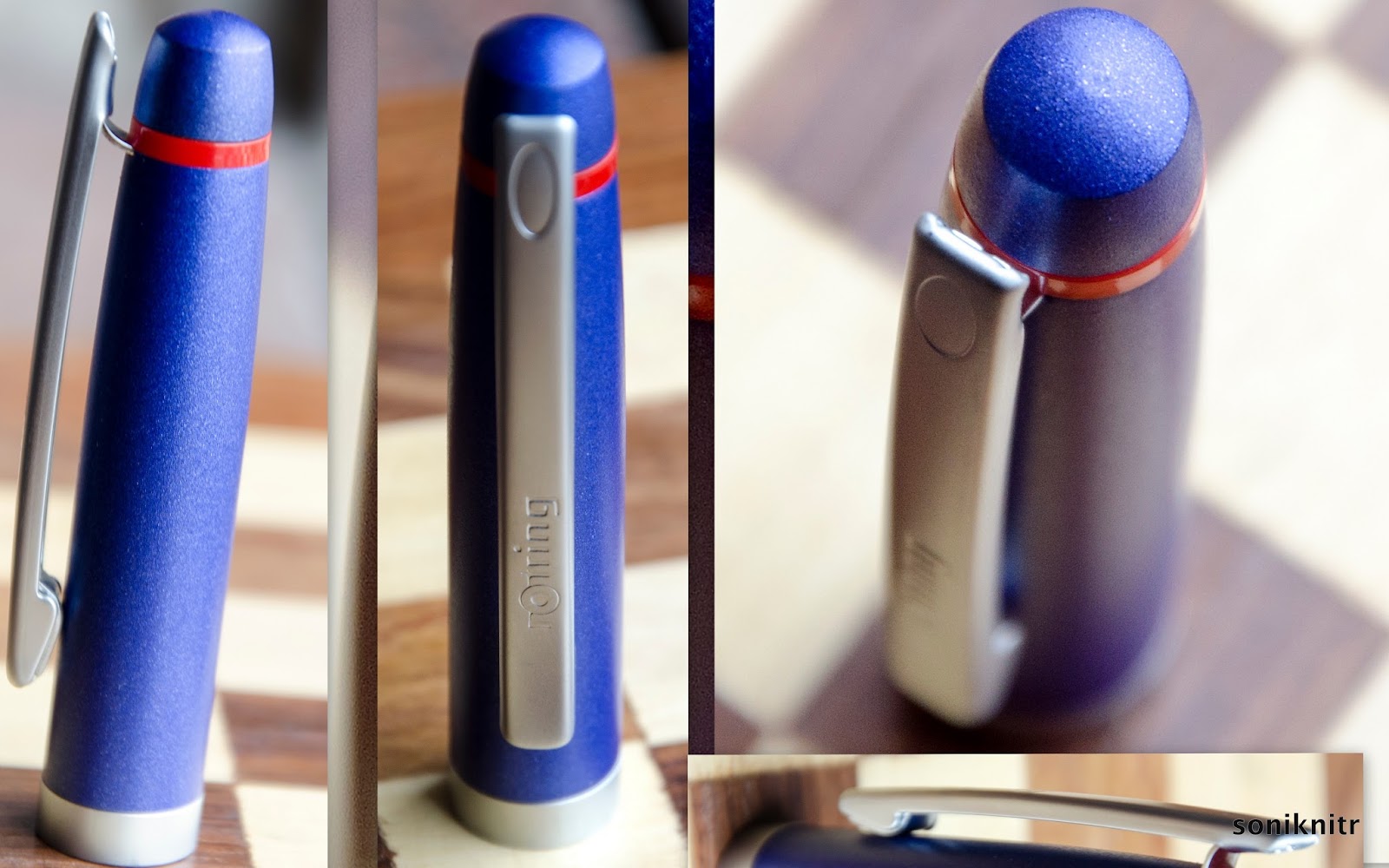
It's an amazingly stunning pen encompassed in a standard souverän series design. Closed, the sterling silver cap and the piston knob dazzle with ambient reflections, while the barrel awaits light to bedazzle you.

Once exposed to the visible spectrum, a play of light reveals the inside mechanisms like a demonstrator. And it's definitely more spectacular to the eyes than it is to the lenses.
The barrel is made up of high grade translucent resin and is resistant to scratches in course of normal use. There is also a thin palladium coating on the sterling silver parts to avoid staining of the pen with time. This was confirmed by the Pelikan team.
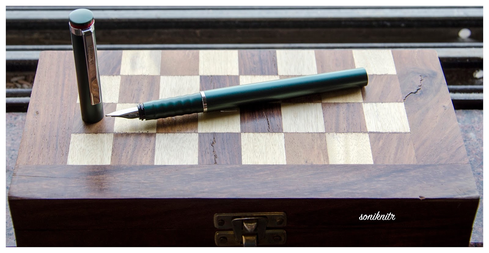
On unscrewing the cap, you will instantly notice a resonance in design with a glittering grip section wholly carved out of sterling silver, along with a rhodium plated nib. So there is either reflection or refraction of ambient light, rendering the m625 with its characteristic trait. The silvery metallic grip is quite comfortable to hold and does not feel slippery, and it adjoins the barrel with threads for securing the cap.
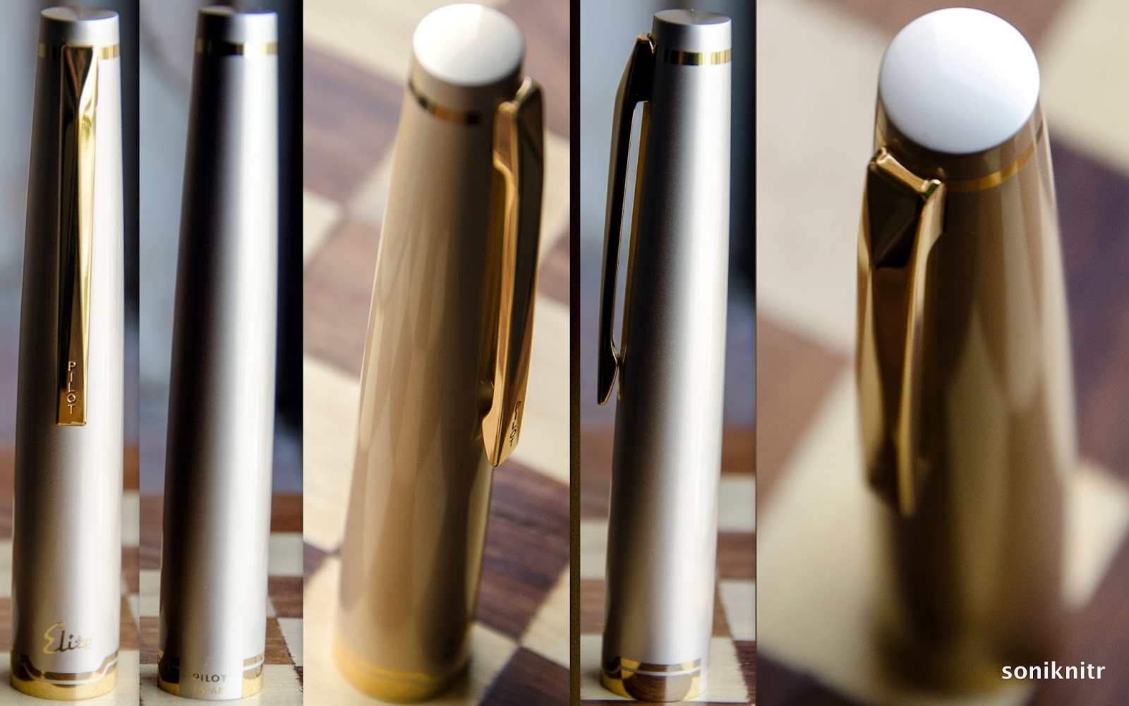
Twirls engraved around the sterling silver cap run on its surface gleaming with all possible proximate imagery.  A few swirls end near the middle, where Ag 925 is etched in between, granting a somewhat finality of trust to the glitter show.The logo on the finial is the one embraced by Pelikan post 2003, that of a mother pelican and a chick,   in a brushed palladium finish. At the base, imbibed are the words PELIKAN SOUVERÄN GERMANY, which is common across the range of souverän series. The absence of any differential aesthetics in the cap drives the inherent singularity in appearance.


FILLING SYSTEM (6/6)


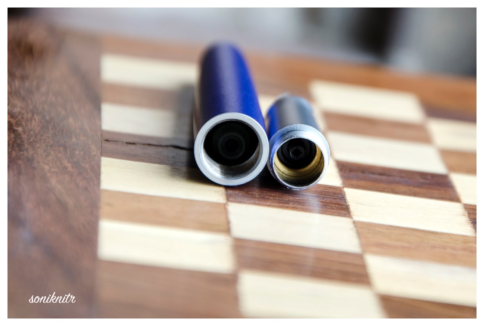
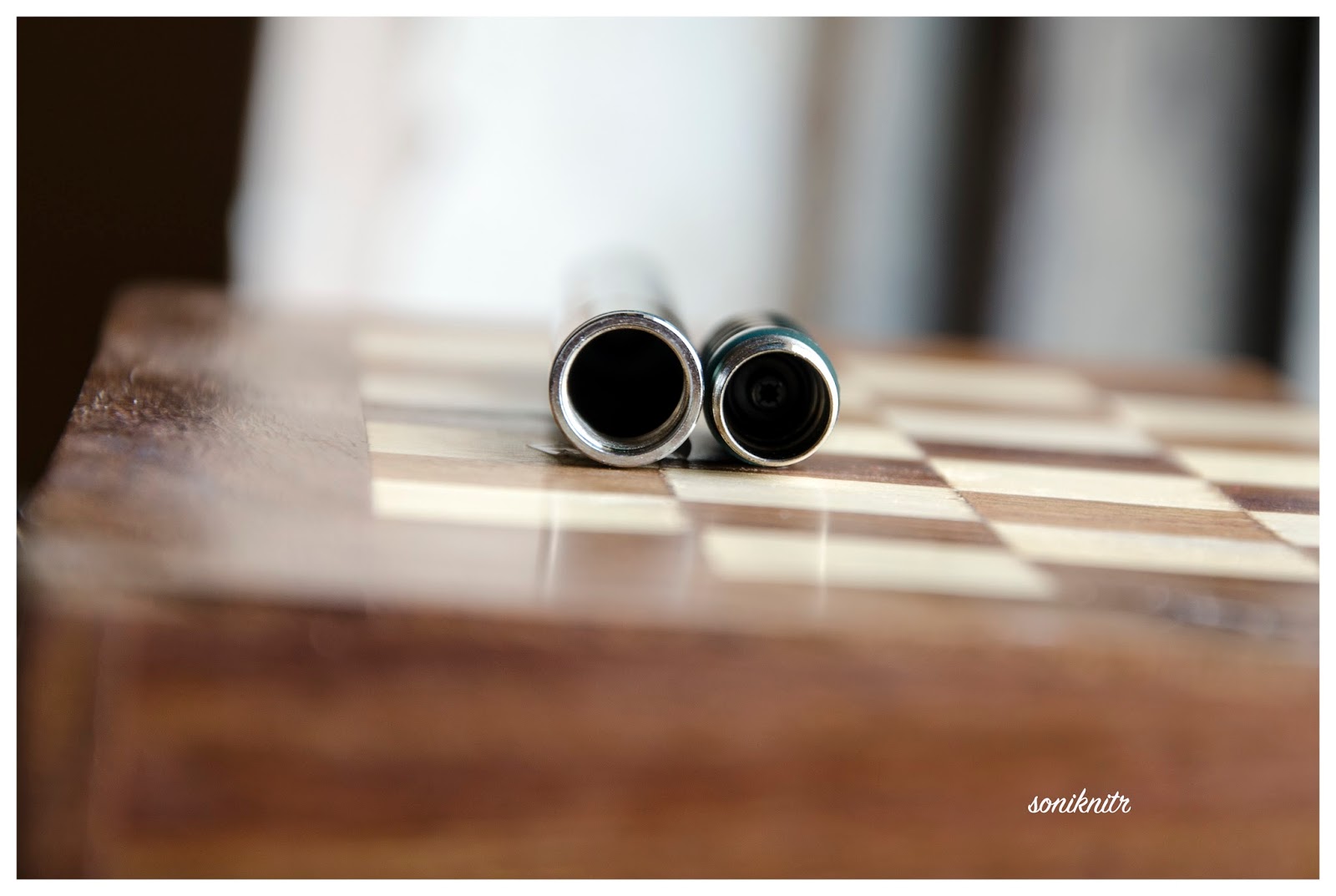
A piston filler with a sterling silver knob surely distinguishes the m625 from other models in the range. Apart from enchanting looks, like any other pelikan, it's an easy and hassle-free mechanism. 
The piston end unscrews with three to four rotations and ink is sucked in, with quite a gush, once the piston is screwed back on. And of course, you can observe the entire thing in action.


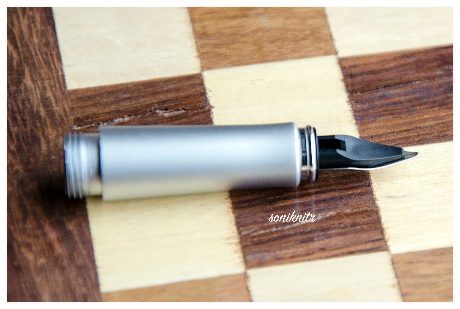
NIB (6/6) – ALL THAT MATTERS


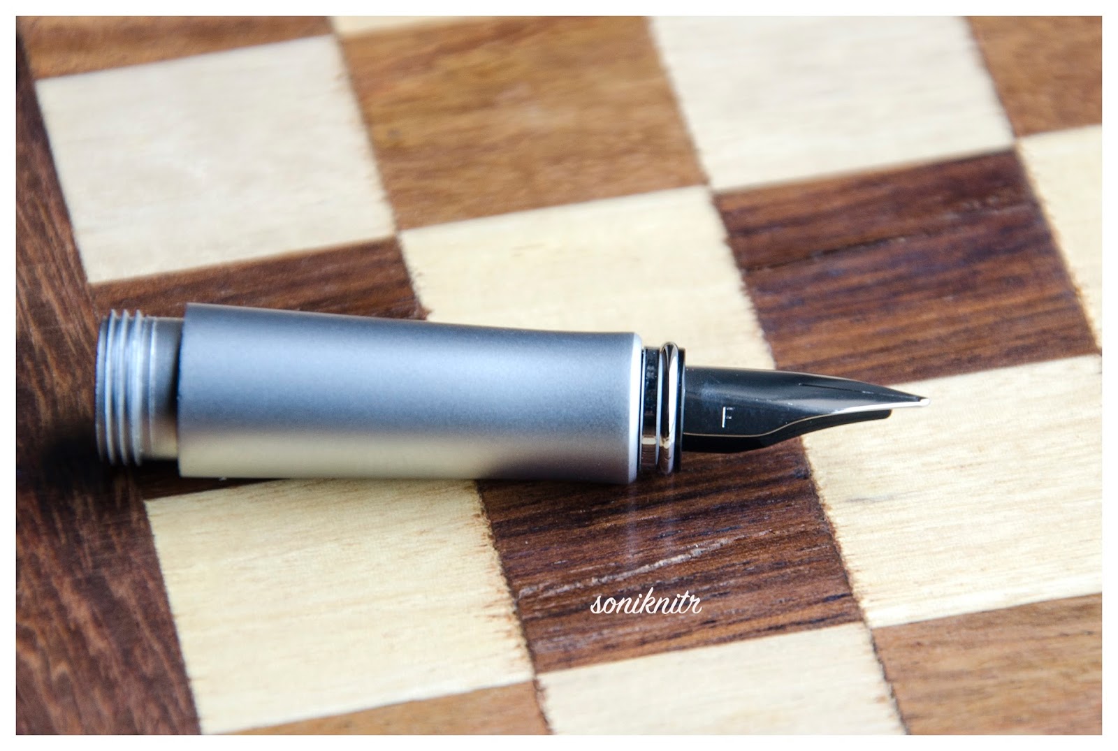
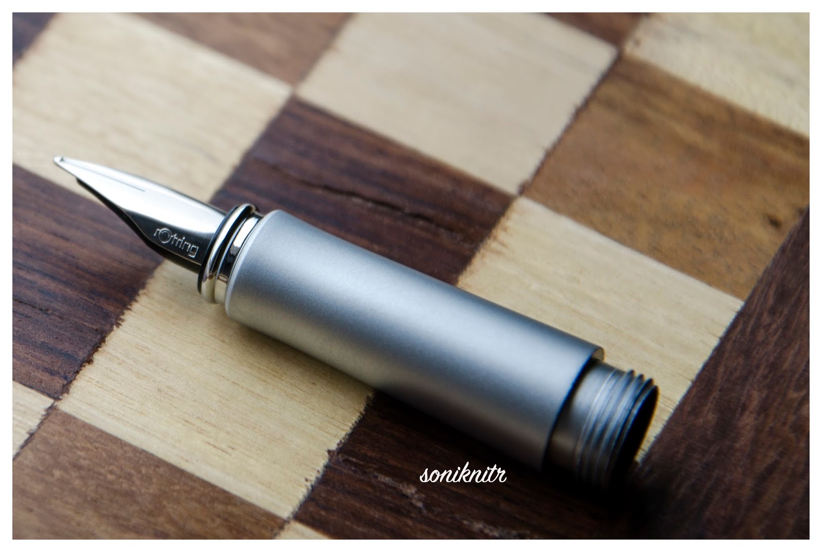
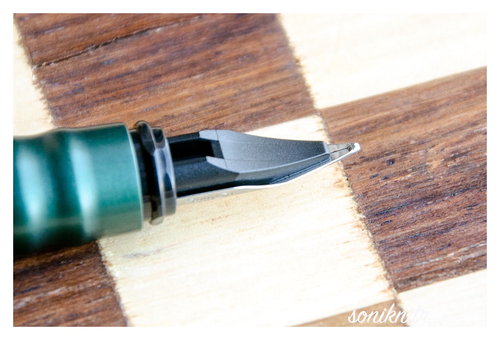
The dazzling rhodium plated gold nib with an usual iridium tip is tested by hand, and it comes in four main sizes – EF, F, M & B along one special width – BB (extra-broad). Like all its cousins, the nib is exquisite and efficient. With a screw fit mechanism and a standard m6xx feed, the nib-section is an ensemble of efficiency as well as artistry. And this silvery white finish does converge with the sterling silver grip in terms of both glitter and glimmer. 

The tail end specifies the nib-width and composition (14 C, 58.5% Au) of the gold-alloy used. Three arabesques diverge along the shoulders of the nib with two of them converging near the breather hole. The third arabesque runs across the tines towards the shoulders ending with the tail end of the nib. There is of-course the dazzling white mother-baby pelikan logo, resting above the tail. This one is an extra-fine nib and writes smoothly out of the box.
A black plastic feed (earlier ones had ebonite feeds) with closely spaced fins allows a good buffer capacity to hold ink with ambient pressure and temperature fluctuations.


PHYSICS OF IT (5/6) – RELATIVELY SPEAKING


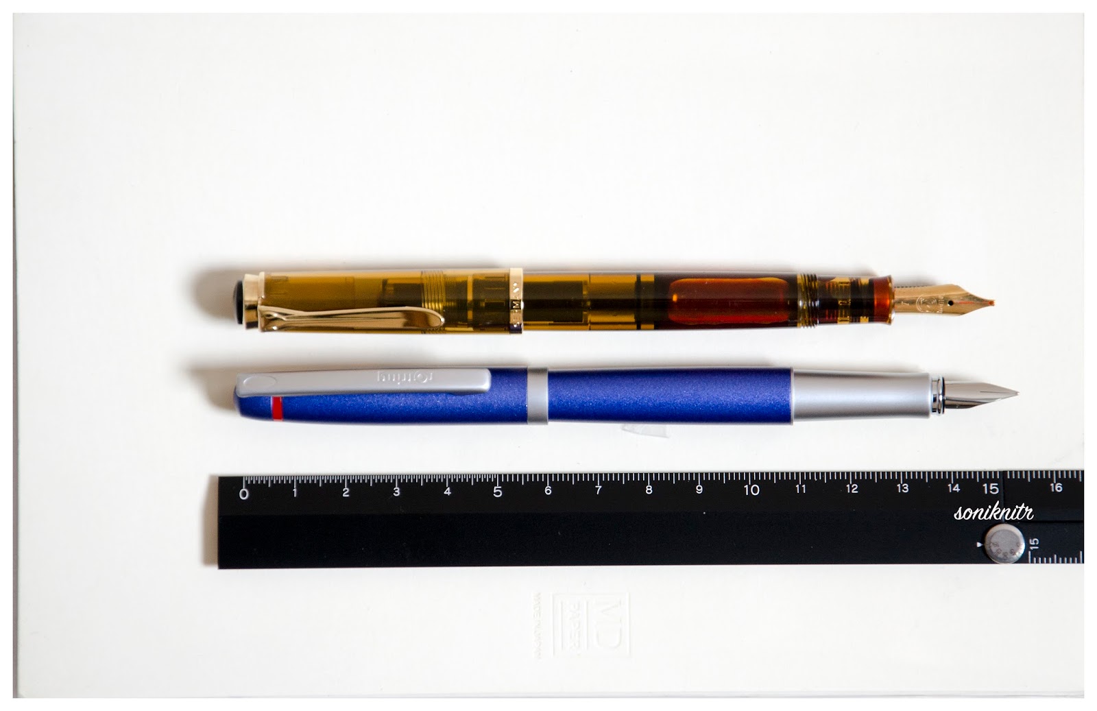
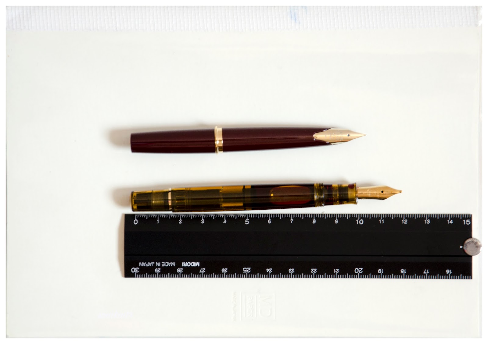
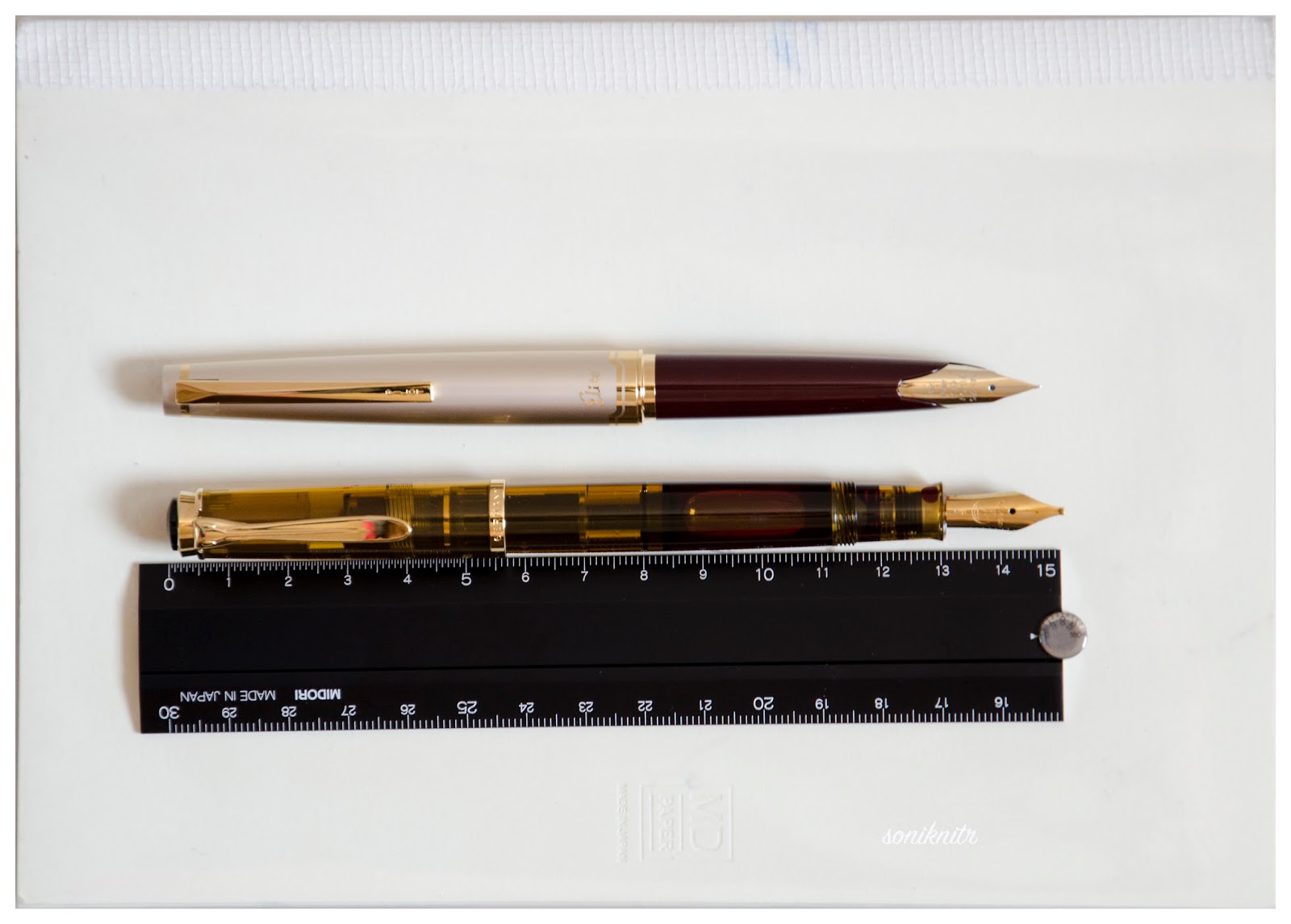
It does give a comfortable feel to write with the pen without posting the cap. The overall capped length is around 13.3 cm. The total weight of m625 has a significant contribution from the cap, which is otherwise quite well-balanced. And yes, a substantial cap does make the pen very top-heavy if posted.


Uncapped Length ~ 12.4 cm
Posted Length ~ 15.4 cm
Nib Leverage ~ 2.3 cm
Overall Weight ~ 34 g (Cap Weight ~ 17.5 g)

While not posted, a length of 12.4 cm is quite comfortable for writing because of a thicker girth and a substantial weight, mostly due to the metallic grip and piston-knob sections, eventhough the piston mechanism is made up of plastic rather than brass. (common across m6XXs)


ECONOMIC VALUE (4/6)


Although the m625 retails at excess of USD 700, it is available at lower street prices. I was able to get the pen at a good discounted price in an online action at the bay. I would not undervalue the rating by much, because in the end, the m625 seems more of an art rather than science. As isn't it why all of us buy, discuss and share experiences with fountain pens all the time ?

OVERALL (5.4/6)


I adore the distinct red translucent design of the m625 which is embraced with the glistening contours of sterling silver. This pen is blessed with a smooth extra-fine (EF) nib which delivers a thin but a very wet line. The line width closely resembles a Pilot 14k-FM nib. For a relatively dry Pelikan Royal Blue ink, it takes around 12-13 seconds to dry. I could not find any line variation with horizontal and vertical strokes for this one. And yes, nib's a nail too when it comes to flex.
Thank you for your time. You can find some more pen and paraphernalia reviews here.

Rhymes of the Parker Sonnet (A Review)

$
0
0
It is often said that the Parker Sonnet, was originally designed to succeed the elegant simplicity of Parker 75 pens. The 75-series had already run successfully for over two decades. With a classical yet distinctive Arrow clip, the Sonnets were to carry this legacy through the millennial year and beyond. Geoff Hollington, a London based designer was tasked to make the sonnet rhyme and in due course of time he came up with eighteen different designs for Mark 1 Sonnets, which were successfully released in 1994.  You can find a detailed bible on anything and everything about Parker here.

THE LAQUE FIREDANCE

My Dad had got the lacquer firedance fountain pen back in 1996-97. It was during my schooling years when I had a Camlin Sleek and a Flair Success (a pelikan lookalike) as my grail fountain pens. Those days, it was somewhat mandated (though not strictly) to use fountain pens in government schools, while gel pens had just begun their proliferation, among the private ones. Needless to say, my greedy eyes were fixed on the laque firedance (and a Camlin Premier) from the moment I laid my eyes on the pen. I never knew for years, that it had a gold nib, which was why I was not allowed to carry it to school. 

Luxor India still sells this pen in its online shop, at a price close to $ 100, as I write this review. 

DESIGN (5/6)

The firedance has a mottled lacquer pattern in dark red and black with sparking golden trims. It’s Mark I and a part of the first eighteen sonnets released in 1994, with a distinctive golden arrow clip. 


A golden dazzle preludes the sonnet from the finial end running along the arrow shaped clip before converging with the marbled arabesques of red and black, with a final shimmer from a minimal cap-band. The clip starts with an arrow head before transforming into a slender shaft towards the broader vanes, ending up with the finial rings. Some of the Mark II Sonnets released in 1998 came up with a much broader cap band, which can go well or worse given  your taste.  


On pulling the cap off (yes it’s a snap-on cap), you can notice the golden rings at the start and end of the black plastic grip section. The final symphony is of course played by the usual suspect - the 18k monotone nib glistening at the end of the grip.


The cap mentions a few things in a subtle golden font, the name PARKER SONNET, Parker’s traditional arrow through an oval logo and the date of manufacture, IY  here refers to the year of 1996. In some of the sonnets, you can see the country of manufacture embossed too. (usually I have seen FRANCE)

Further to this, you can observe a unification of design at finial ends of both cap and barrel. A simple black disc does mark the finality in design at both ends of the sonnet. 


FILLING SYSTEM (5/6)

On removing the barrel from the grip, you would instantly notice a gold plated metallic thread section, inside which the converter is plugged. With circular cross sections, the parts make an easy fit. A traditional cartridge-converter filling system with a Parker Deluxe Converter gives you an ink-capacity of around 0.5 mL, which might seems limited for extensive writers.


NIB - ALL THAT MATTERS (4/6)

The nib comes in four different nib designs (18k two-tone, 18k monotone, gold-plated steel and steel) across five stock widths - EF, F, M, B & BB (and special widths of OB & I). The firedance has a 18k monotone nib which looks compact and is efficient.

 The tail end of the nib specifies the composition (75% Au) of the gold-alloy used with the traditional diamond hallmark of P-Arrow-P on the left. PARKER and 18 K imprints rest on the body, while an arabesque decor runs along the inside tines towards the shoulders of the nib, encompassing the circular breather hole in between. There is an outer curve which encloses  the nib aesthetics. This one is a medium nib and lays a wet line with a hint of feedback.


Thin fins constitute the feed which along with the nib screws back into the grip section. There is the nib size mentioned in a triangular region at its end.


PHYSICS OF IT (4/6) – RELATIVELY SPEAKING

With a cylindrical lacquer coated metal body, it does give a good feel of length, albeit with a bit of imbalance, while posted. The overall weight of the Sonnets has a significant contribution from the cap. The posted cap might leave you with a dragging feel of top-heaviness.
  • Uncapped Length ~ 12. 3 cm 
  • Posted Length ~ 14.3 cm 
  • Nib Leverage ~ 1.9 cm 
  • Overall Weight ~ 20-25 g

A girth of 1 cm at the grip might seem kind of average but it does match the overall design. 


ECONOMIC VALUE(6/6)

It retails at around USD 100-105, and might be available at lower street prices. It seems to be a good buy, given the unique make of a lacquer coated pen with a 18k gold-nib. However, you have to be aware that there are a lot of Chinese fakes flooding both the online and offline markets, some of which could be easily identified from the diamond hallmark (P-Arrow-P ) on the nib.

OVERALL (4.8/6)

This 18k nib has a wet flow, with a hint of feedback. The nib is flexible and lays a broader line with a little pressure. There is no significant variation among the horizontal and vertical strokes. These wet lines take almost 7-10 secs to dry with a traditional pilot blue-black ink on MD paper.


Thank you for going through the review.

More pen and paraphernalia reviews here.

In A League of its own : The Pilot Custom 823 Review

$
0
0
The Custom 823 pens have always been highly captivating demonstrators from Pilot Corporation (Japan), sporting the second largest nib (Pilot#15, Namiki#20 nibsize), with a vacuum plunger filling mechanism. The model number 823refers to the price and year, of launch, although in a slightly intricate manner. Since this pen was released in the year of 2000, 82 years after the company’s inception (i.e. 1918), it carries the first two digits of the model number as ‘82’ and the last digit which is ‘3’ refers to it launch price of JPY 30,000 (3 X 10,000).

The Custom 823 (for the Asian market) comes packaged in a standard pilot gift box (Z-CR-GN) which might not draw much attention, quite unlike the pen. The US merchandise comes with a silver sateen lined gift box with a complementary (hey! not really folks) bottle of Pilot/Namiki Ink-70 (Blue). The pen of course is a hot star. A golden label with a model number and nib specs is tagged to the clip. The box carries a user manual for a Type P fountain pen, which does mention keeping the knob slightly unscrewed (at a 2 mm distance) relative to the metal ring, while writing.


DESIGN - THE AMBER DEMONSTRATOR (6/6)


The Custom 823 comes in three standard designs of transparency - Amber, Smoke and Clear resin, all with gold plated trims. The resin material seems substantial and feels heavy. A silver trimmed version may be a nice thing for many fountain pen nerds including myself. I went for an Amber one with a medium nib and find it quite challenging to resist getting another Smoke version, with recently slashed prices in Rakuten/Ebay. 


The Amber demonstrator given its lightness, is capable of bedazzling you even with a tiny bit of moonlight. A golden dazzle along the three bands and the clip, subtly delivers the rest. The finials at the cap along with the piston knob conclude the design with a rather brownish opacity.


The cap feels substantial and unscrews with one and a half turn, revealing the elegant yet simply designed pen. The grip section is moulded from the same brown resin as the cap-final and the piston-knob, and another golden ring segregates brown grip from rest of the body. The amber demonstrator does reveal the steel rod with a plunger seal mechanism.


The cap does mention a few things etched across the broader of the concentric golden bands, including the model name CUSTOM 823 and PILOT MADE IN JAPAN with six stars of separations.  A thinner band above renders some more aesthetics to the overall design. The clip  is tension fit and it encompasses a vertically embossed PILOT within its golden sheen.


FILLING SYSTEM (6/6)


The brown piston knob unscrews from the golden ring till an end stop, post which the plunger unit can be pulled out. The rod is made of stainless steel and is resistant to most of the commonly used inks. For IG (Iron Gall) and Pigment Inks, care must be taken to clean the pen several times, to prevent clogging or deposit accumulation inside the ink passages. 

The pen fills to more than two-thirds its capacity, once the nib is dipped in ink and the plunger is pushed back in. This can result in an instant gush of ink inside the barrel with a comfortable volume of ~ 1.4 - 1.5 mL, which could last for several days. Though getting some more ink into your pen is quite possible.

Cleaning the pen is a similar ritual accompanied with some shake and I suggest you do it on a regular basis, for the ink stains if left may look ugly with time, and might require a light ammonia solution to go-off.

And as mentioned in the manual, while writing with the pen, you would need to keep the piston-knob slightly unscrewed (at a 2 mm distance) relative to the golden ring. This will displace a conical valve seal below the piston seal to allow passage of ink to the feed. Given the high ink capacity of these pens with plunger type filling mechanism, this has been done to prevent ink-leakage. And this is a nice thing to have, if you intend to carry the 823 in a flight.


For a rather crazy and complete fill, you do have a workaround. With the nib pointed up, you can pull out the plunger of a partially filled 823 and then by slowly pushing the plunger inside, you would get the air-gap between the inverted ink-levels and the visible end of barrel-section minimized. Once the inverted ink-level reaches the visible end of the barrel, you can submerge the nib in the ink bottle and push the plunger in. Voila! Done. This process may result in some ink escaping to the threads of the piston knob, but again you can repeat the same process with water/cleaning solution and shake a little to wash it off. 

NIB - ALL THAT MATTERS (6/6)


The nib is friction-fit and comes in a standard 14k monotone design across three stock widths - F, M, B (and some specially ordered custom widths of FA and WA). The nib has a standard pilot design.

 The tail end of the nib specifies the month and year of manufacture. An elongated hexagonal imprint separates the design from the outer shoulders and tines with an arabesque decor running inside its circumference, encompassing the circular breather hole in between. 


The branding and nib specifications of PILOT, 14k-585 (58.5% Au Alloy) along with the nib size and width, which are imprinted below the breather hole.


A standard bluish grey plastic feed with thin fins and a decently sized feeder hole delivers the amazing ink suction.


PHYSICS OF IT (6/6) – RELATIVELY SPEAKING


With a transparent resin body in form of a traditional cigar shape, it does give a comfortable feel of length. The cap itself weighs 10 grams which makes it top heavy if posted. The overall weight of the 823s have thus a significant (one-third) contribution from the cap. There is then a comfortable grip section with around 1.1 cm diameter. 

  • Uncapped Length ~ 13. 2 cm
  • Posted Length ~ 16.4 cm
  • Nib Leverage ~ 2.4 cm
  • Overall Weight ~ 29 g

A capped and uncapped comparison with few of the standard large pens like Visconti Homo Sapiens Maxi, Pelikan m805 and MB 146 is posted below for your reference.


ECONOMIC VALUE (6/6)


It retails at around USD 288, and as usual it’s available at lower street prices towards a band of USD 200. I had got the pen at a cost of USD 220 at that time, which I thought was a good bargain. This year Rakuten sellers made it look lamentable by selling 823s at less than USD 190, inclusive of shipping!

OVERALL (6/6)


This 14k nib has a wet flow, albeit a hint of softness like the custom 74. The nib is springy and lays a somewhat wider line with pressure. There is no significant variation among the horizontal and vertical strokes. These wet lines take almost 15 secs to dry a Sailor Jentle Sky High on MD paper.


Thank you for going through the review. Hope you had a good time.

More pen and paraphernalia reviews here.

The Visconti Dreamtouch 6-Pen Case

$
0
0
I was looking for a quality pen-case for quite sometime, which could also serve as a handy storage of my fountain pens, outside their hefty boxes. Existence of nice fountain pens, necessitates invention of great fountain pen cases. I do use a Pelikan 3-pen case to carry my daily fountain pens, but I required something more secure, which can double up as a travel companion, if I ever intend to carry more than three pens at a time. The Dreamtouch leather series were launched sometime in 2012. For the leather pen cases, Visconti offers 5 variants in an ensemble of a compact and unique design, housing 1/2/3/6/12 pens.

PRESENTATION


As usual, there is a white Visconti fabric pouch, inside which the case rests once you take it out of the cardboard box. It ensures that the leather remains intact and unscathed before use.


DESIGN & BUILD (6/6)


The outside is made of aniline-calfskin with a clean and precise workmanship. Aniline leather making techniques preserve the natural surface of hide and render a soft natural feel of the same. The flip side is they do indeed carry the natural porosity of skin. When you look at the threads and feel the case you would instantly know, that you have landed upon great workmanship.


Then at the top of the flap, there is the V logo inside an ellipse, which is made of chrome plated metal. It seems minimalist aesthetically, but it does succeed in drawing your attention. The zip looks flat and compact, converging with the geometrical dimensions of the case. You will neither find the case too pliable nor you would find it too hard. A very compact case indeed!


The rear-end is plain and coveys volumes instead.


The flap converges with the overall flat design quite well.


The slider is chrome plated metal and sports the same logo which is present on finials of Visconti pens. The name VISCONTI lies within a mirrored V


The back-side sports an embossed VISCONTI with the name of its birthplace, the renaissance town FIRENZE


PHYSICS & PERFORMANCE (5/6)


The 6-pen case weighing around 150 grams and is quite light and easy to hold. It can hold a pen upto 15.5 cm of length. A thicker pen will of course displace the divider by a tiny bit. The flat design of the case, makes it a convenient storage box. I just love the compactness of this case.

Length ~ 16 cm
Width ~ 14 cm
Depth ~ 2.7 cm

A 15 cm scale can completely rest inside with some additional leg-room.
You can observe that the dividers are placed at least 2.3 cm apart, which makes it capable of housing most of the pens. The inside linings are made of black velvet, a touch would reveal it's quite dense and should protect your pens well. One downside is that all the pens will not fit snugly inside these slots and there are chances of bumping inside it, in case you are travelling.


The finial of a rather large pen like an Izumo (>16 cm) can become exposed to the zipper material. Had it been a metallic finial with a flat top (say Pelikan), there are chances of scratches, due to lack of any additional protective lining on its insides. Although the zippers have plastic teeth, the slider with its metallic clasp still has to traverse along these lines.

From left to right : Pelikan m605, m805, Platinum Izumo Tagayasan, MB146, Pilot Custom 823 and a Visconti Homo Sapiens Maxi.

A dimensional comparison with a Pelikan TG32 (black/green) 3-pen case


ECONOMIC VALUE (6/6)


Although the 6-pen case retails in the market at around USD 120, I was able to win this one in an auction, at around USD 77. From time to time, I do find multiple auctions for these cases running on the bay.  I feel that's a good price for any aniline leather product.

OVERALL (5.7/6)


Overall, I do feel that the 6-Pen Dreamtouch case has been a nice buy, custom made to my requirements of compactness and aesthetics. It is subtle yet elegant at the same time. I would keep the large pens inside their boxes.

More pen and paraphernalia reviews here.

A Review of the rOtring Freeway

$
0
0
Rotring is a German company that never seems to need any introduction. Just for the sake of this post I am writing a few lines of history. It was started in 1928 with a tubular tipped stylographic fountain pen commonly known as Tiku and was incorporated as Titenkuli Handels GmbH. Later in the 1984, the calligraphic ArtPen was introduced, which was followed by the more famous and most sought after 600 series fountain pens (the architect’s fountain pen). There were a few changes in name in between and you can find their historical timeline here. In 1998, it was taken over by Sanford US, a part of Newell Rubbermaid Inc which also owns brands like Parker and Waterman. Rotring stopped manufacturing fountain pens soon after this acquisition. And yes of course, rot ring literally translates into red ring, which can be seen in almost all its writing instruments.

The Freeway was one such pen which was released when the company had already started diversifying into writing instruments. It is equipped with a rotring standard steel nib. A corresponding rollerball, ballpoint and a mechanical pencil were also released. 

DESIGN - THE BRUSHED METALLICS (5/6)


The Freeway comes in four different colours, all in matte finish - blue, ruby red, silver and black. 


An aluminium body renders substantial weight to this pen. The pen has a cigar shape with a rather conspicuous red ring at the finial. 

Once you pull the cap, it does come off with an audible click, and you have a beautifully brushed metallic grip section. The grip section is slightly tapered and at the end rests a stainless steel insert along with a steel nib.
The cap is substantial with a snap-on mechanism. A tension fit clip starts with the trademarked red ring at the finial. It has an engraved ellipse (no idea why!) with rOtring branding below. I had purchased a few freeways over a period of time and one of them had a slightly wiggly clip. A satin chrome trim gives the cap band some aesthetics.


The colours are really attractive but they can fade, come off over a period of time.

FILLING SYSTEM (4/6)


Nothing spectacular here as it’s an international cartridge converter system. A brass insert inside the section houses the feed system. The construction is simply solid. A Schmidt or rotring converter fits quite snugly with the freeway section vis-a-vis other standard international converters. 

NIB - ALL THAT MATTERS (6/6)


The nib is made of stainless steel and comes in a standard rotring design. I came across only F & M widths for the freeway. I never found any other nib widths for this pen, though the same nib had a wider variety of widths for the 600. All the nibs have been wet and smooth.

A no-frills design of the nib sans any breather hole gives it a characteristic industrial look, besides the metallic parts of the pen. 

The branding and nib specifications are imprinted on either sides of the nib.

A standard black plastic feed sans any fins and a big feeder hole define the minimalistic design. 

PHYSICS OF IT (4/6) – RELATIVELY SPEAKING


The pen feels substantial by itself but posting it makes it difficult to wield. It might feel a bit short of length. 

  • Uncapped Length ~ 12.5 cm
  • Posted Length ~ 15.5 cm
  • Nib Leverage ~ 1.6 cm
  • Overall Weight ~ 35-40 g
Capped, uncapped and posted comparisons with a m200 runs below for your reference. 


ECONOMIC VALUE(6/6)


I have no idea of its original retail price. I had bought the first pen at a cost of USD 6, and the subsequent ones at even lower prices! Since it has been discontinued, a lot of offline pen stores in Mumbai carry at least a few pieces of the Freeway and the Espirit

OVERALL (5/6)


This steel nib is a winner and is very smooth with a wet flow. The fine nib is stiff and does not have any line variation among the horizontal and vertical strokes. These wet lines take almost 35 secs to dry a Pilot blue black ink on MD paper.

Thank you for going through the review.
You can find some more pen and paraphernalia reviews here.

REFERENCES


A Review of the Platinum Izumo Tagayasan with Matte Finish

$
0
0
The Izumo series was launched in 2010 to celebrate the birthplace of Platinum’s founder Shunichi Nakata. The Nakata surname of course reflects in all Nakaya nibs. Coming to Izumo, the Izumo province is located in the eastern coast of Japan and is famous for its political history as well as making traditional Japanese paper out of vegetable fibres (a sample of which is also included in a paper roll). The two variants of Izumo pens are Urushi-on-ebonite and Wooden versions. I am reviewing one of the wooden versions here. Some of the other versions have been rather marvellously reviewed by Hari1(had got mine on his recommendation), Hari2, & atomic_doug at FPN. 

This Izumo is called Tagayasan which literally translates into Iron Sword Wood (鉄:Iron 刀:Sword 木: Wood). More on this later.

PRESENTATION


The pen comes in a wooden box (IZU4000061) made of up Paulownia wood encased inside a handmade paper box. The box will itself feel very light which is characteristic of this wood along with high resistance to deformation, and it’s also used to make chests and boxes in Japan. This box also used for Nakayas and a few other premium pens of Platinum (Urushi Maki-e) with an RRP of JPY 50000 or greater. 

Once you open the satin lined top cover, you will find a green kimono encasing your Izumo, resting along with a standard platinum converter, a cartridge (though a complementary box was included by the seller), a paper roll made of traditional Japanese paper (Kiku) and a few other cards for maintenance & use. The one important out of them warns you against posting the cap. You will see later that there is a metallic insert for threading the cap and it might chip off the barrel wood, if posted. 


DESIGN - THE WOODEN CIGAR (6/6)


The Izumo Tagayasan comes in two finishes : Matte (PIZ-50000T #20) and Gloss (PIZ-50000T #21). The word Tagayasan in Japanese refers to a wood which is as hard as iron, and to my delight, I found that it was produced in India. The scientific name is Dalbergia latifolia and it’s more commonly known in India is Shisham or Bombay Black Wood. As the wood is hard, durable and resistant to termites, it’s used in India to make premium furniture. 

The build is remarkably sturdy and for a wooden pen it’s heavy and quite comfortably so. You will find this to be a large pen and initially I was concerned about its dimensions. The wood has a dark brown appearance with still deeper streaks running horizontally across the length of the pen. The golden gleam coming solely from the clip supplies the pen with a simply amazing contrast. 

Doesn’t the pen look like a marvellous piece of art? I salute the Japanese craftsmanship behind this handmade pen.

The cap feels substantial and unscrews with one and a half turns, revealing a stunning two-tone nib. The threads of golden glitter mark start of the grip section. The tapering of the section in someway ensures that your grip remains least affected by the metallic threads. Towards the nib a golden trim ensures the aesthetics remain singularly complete from top to bottom.

The finial is in the shape of an elliptical dome and quite deftly conceals the clip-joint. The dazzling tension-fit clip is plated with gold and has some resemblance with a traditional Japanese double edged sword called Tsurgi or Ken. It sports the brand name of PLATINUM within a dome of etched squares. There is a smaller sculpted impression below mirroring the sword in the green kimono. The metallic thread insert inside the cap render the pen unsuitable for posting.


FILLING SYSTEM (5/6)


As a cartridge converter filler, the supplied convertor is limited by a volume of 0.6 mL although platinum cartridges have an advantage with capacity of 1 mL or more. The Izumo also takes in proprietary converters and like other Platinum pens and there is an adapter available for international cartridges/converters, whose production is currently stopped. 

The proprietary converter does look good with its golden trims, but again you can see it only when you are filling up ink. 

The barrel unscrews from the grip section with four turns revealing the gold accented metallic thread section. The wooden barrel carries the opposite threads with a similar metallic insert, eliminating any chance of internal chipping of wood. The feed does draw ink even when the nib is not fully immersed inside ink.


NIB - ALL THAT MATTERS (5/6)


The nib/feed section is friction-fit and comes in a 18k two-tone design across three stock widths of F, M & B. I like the simple design of these nibs.

Above the tail lies the brand imprint of PLATINUM specified with nib type i.e PRESIDENT (or 3776) along with nib-composition (18 K) and width (B). A hearty breather hole lies above the imprint. Three bands of rhodium decor run amidst the body and shoulders as an enhancement. These bands are limited to the tines. The nib lays a moderately wet and smooth line with a characteristic stiffness. I would have personally preferred a bigger nib given the price point of this pen. 

The black plastic feed for the President nib has closely spaced fins and even with the cap open for a while, it does not take any effort to lay a nice and wet line.


PHYSICS OF IT (6/6) – RELATIVELY SPEAKING


A comfortable length and weight ensures that the cap doesn't need to be posted while writing. With a cosy girth of around 1 cm, it poses absolutely no problems with extended writing times.

  • Capped Length ~ 16.5
  • Uncapped Length ~ 14 cm
  • Nib Leverage ~ 2.4 cm
  • Overall Weight ~ 38 g
Capped and uncapped comparisons with a pelikan m805 run below for your reference. You might be already noticing the giant cap with an elliptical dome finial, which contributes rather lavishly to the length of the pen.

Uncapped the Tagayasan is about 1 cm longer than a m8xx, making it a comfortable wooden companion. The threads at the section are located necessarily at an upper region of the section, which does not interfere with my grip, given the section taper. 

ECONOMIC VALUE (3/6)


The Izumo wooden versions - Tagayasan retail around US$ 600, though they are available at much lower prices around US$ 400 with known Japanese shops like Engeika or Rakuten. I expected a bigger nib at this price point and I do have a sinking feeling that the usual President nib does not do complete justice either to this pen or its price point.

OVERALL (5/6)


This stunning 18k nib is smooth but not buttery, with kind of a controlled glide. It’s blessed with a moderately wet ink flow. There is a subtle bit of line variation, the horizontals being a tad thinner than the verticals. The nib is as stiff as a nail. Though, there is a hint of softness with this nib. 

Even being a wet writer out of the box, this Broad nib puts a line which takes around 30 seconds to dry on MD Paper. Ink used was Platinum Blue Black cartridge. 


REFERENCES


Thank you for going through the review.
You can find some more pen and paraphernalia reviews here.

Heisenberg’s Paradox

$
0
0
A German theoretical physicist known by the name of Werner Heisenberg, sometime in 1927 espoused one of the primal principles of life, the unparalleled axiom of Causality, in the sphere of sub-atomic matter. And he was finally seen walking out with the Nobel Prize for Physics, that too, within half a decade. Though it was not as easy as it seems here. You do not get awarded with a Nobel Prize for doing nothing, for that you do have Annual Awards at your workplace. 

Coming back to Heisenberg, for a lazy mind like myself, there is a prevailing inclination to think, “Why on earth or hell, do I need to know the speed or position of a particle, which I can’t even see in this or any other lifetime!” and maybe “You little quark, to hell with you.” And as for the latter, my guess is that, my boss thinks the same of me. The theory is causal both in its nature and intent. To measure the position of a particle, you have to affect its speed (you hit it with a photon and God knows what else) and thus the speed you would measure would be the post-collision one. The cause in question is locating the particle and the effect is a change in its velocity. 

                       Newton had applied this philosophy in his third law of motion and mango people like us knowingly or unknowingly apply this principle daily in our lives. Especially in Mumbai, auto-wallahs and taxi bhaiyas can be hailed as supreme masters of Newtonian physics. By applying any or all of his three laws sometimes simultaneously in any given interval of time (also called delta t), these Newtonian masters register a yet greater rate of application than their own respiration rates. Had they studied these laws a bit further upon, they would have most probably ended up in some lonely cubicle, applying the same set of laws but in a different manner with a perhaps higher degree of sophistication like silent incantations under breath, commenting and liking blogs without any legible content and sometimes even daring to dream beyond IIMs, thanks to ponytail. And in the latter case, the general populace and more importantly their kinfolk would have been mercifully spared from the Effect set, promptly replaced by their bosses and by people who do not have to sit in cubicles but have the long nose to make others sit. 

Even at-first perplexed freshers from various graduate and post-graduate streams, who chose the haven of Bollywood over lesser known cities, to catch one glimpse of a certain Bollywood diva,imbibe these laws pretty quickly. They would be seen in local trains, deftly whistling and kissing around (only flying ones, stationary ones can still land you up at the nearest police-station), which is usually taken as a semaphore for letting sub-atomic movement in a crowd. The intensity read desperation and the cadence of whistling/kissing can be directly proportional to the time by which one thinks one is late to work. Therefore at most of the workplaces, the early bird award usually goes to the person arriving at office just before noon, which otherwise cannot be shared with the office boy. Going by departments, it seems that the HR department (barring a few losers who have a quite pervasive presence across continents) follows the laws of thermodynamics rather than the laws of motion. Here the exception is the absence of any effect but a whole lot of causes. Yes it does defy many laws, but you see causes engender further causes and it goes on and on. People who are usually so busy, that it becomes difficult impossible for them to locate even themselves in their own cubicles after 5:00 pm. And they share the lion’s share of organizational work. Organizational Change and Development, Leadership Programmes and all such gingerly designed programmes take bulk of their working hours both in designing and implementation. In consonance with the zeroth law of thermodynamics, these designs remain in equilibrium with each other and also with their heads, probably later with their graves too. If one of those designs on a rare occasion tries to spout itself out, it’s made to delve into another form of energy as per the first law of thermodynamics. It’s called process improvement and it’s cost can exceed the next five years of remuneration of the entire department.

There is yet another department which closely resembles the thermodynamics department but is elementally very different. Even Erwin Schrodinger’s equation with all his partial derivatives, cannot completely explain the laws governing this one. For they are neither particles nor waves. They are admin. From your flights abroad to your flights to the loo, they cover the entire spectrum. They research on your telephone calls, coffee, conveyances and even the amount of tissues that you could have used in the loo. Given these grounds, most of them would have got a Nobel Prize for welfare economics. They manage costs, not just the checks and balances but the allocations and de-allocations too. You would probably have loved them too.

Love thy neighbour and thy colleagues even more.

The Pilot Custom Heritage 92 Review

$
0
0
I am not sure whether you too will get a Custom Heritage 92 (CH92) after falling intensely in love with a Custom 74 model. Many reviews do reveal this graduation of Pilot Love. Although my love for pilot pens can be absolutely blamed on genes. Initially, the CH92 were released as clear demonstrators around October 2010, sporting a #5 rhodiated nib. Since it was 92 years after the company’s inception (i.e. 1918), it does carry the first two digits of the model number as ‘92’ and the third digit which is by default ‘1’ usually refers price at launch of a pilot pen (i.e 1 X JPY 10,000).  However, there is a minor deviation here, the price at launch was JPY 15,000, since the Custom 74 was already priced at JPY 10,000. The coloured versions were released two years later in 2012. 

The CH92 (for the Asian market) comes packaged in a standard pilot gift box (Z-CR-GN) which may not be able to draw any attention, but the pen definitely does. I just fell in love with the ocean blue colour. The simplistic yet elegant design sustains the traditional functionalities in a modern garb. Definitely with the times, the ‘asa-gao’ ocean blue transparent body says everything about itself. Asagao refers to a bluish flower which is more commonly known as Japanese Morning Glory.  It also comes in Sunset Orange (Yu-yake), Smoke (Kirisame) colours. The box carries a user manual for a Type S fountain pen. 


DESIGN - THE COLOURED DEMONSTRATORS (6/6)


The CH92 comes in four standard designs of transparency - Blue, Orange, Smoke and Clear resin, all in silver trims. The resin material feels strong though not substantial like the Custom 823. Initially I went for the Asa-Gao Blue with medium nib which wrote beautifully, and I could not resist getting another. The second one was another Asa-Gao then a Yu-Yake Sunset Orange.


The demonstrators given their lightness, are capable of refracting even a tiny bit of light, while a silver shimmer running across the centre band along with the clip creates a photogenic contrast. The smoky finials at the cap along with the piston knob conclude its design.


The cap is light and unscrews with little more than a turn, revealing the dazzling nib. The grip section is moulded from the same smoky transparent resin as the finial (cap) and knob, with a metal ring segregating, the grip from the barrel. The transparency does reveal the inside works of its piston mechanism.


The cap does mention a few things etched across a lower centre band, including the model name CUSTOM HERITAGE 92 and PILOT JAPAN. I somehow miss the stars in the other custom series pens. An apparently segregate band above (although its part of the centre band only), renders some differential aesthetics to the overall design. The clip is tension-fit and has the shape of the double-edged Japanese sword Tsurugi.


The subtle gradient created by the transparent body, along with the smoky black grip, finial (cap) and piston-knob sections converge the rhodium sheen to render a well-orchestrated symphony of colours. No component individually would seem as stupendous as the complete pen.

FILLING SYSTEM (6/6)


A small but remarkably efficient piston knob unscrews from the metal ring to a quick end stop. And it does go the distance when the knob is screwed back on by filling the barrel upto a volume of 1.2 - 1.3 mL. The outer connector of the piston mechanism consists of a metal unit fastened to a inner plastic unit, and it can be disengaged with a TWSBI wrench (7mm) as shown here by Hari. This  helps add weight to pen and ensures that a metal wrench meets metal and thereby does not cause undue damage.
Cleaning the pen is a similar ritual accompanied by some shake. If there is some remnant ink left at the end of grip section, it’s an easy clean. You can repeatedly fill and flush the pen with the grip section dipped inside a bowl of water, or you can just remove the friction fit nib-unit and clean the insides with a soft damp cloth.


NIB - ALL THAT MATTERS (6/6)


The nib is friction-fit and comes in a standard 14k rhodiated design across four stock widths - F, FM, M & B. The nib has the standard pilot design.

 The tail end of the nib specifies the month and year of manufacture. An elongated hexagonal imprint separates the design from the outer shoulders and tines with an arabesque decor running inside its circumference, encompassing the circular breather hole in between. 


The branding and nib specifications of PILOT, 14k-585 (58.5% Au Alloy) along with the nib size and width, which are imprinted below the breather hole.


A standard bluish grey plastic feed with moderately spaced fins and a decently sized feeder hole delivers the amazing ink suction.


PHYSICS OF IT (5/6) – RELATIVELY SPEAKING


With a translucent resin body in form of a truncated cigar, it does give a comfortable feel of posted length. The cap weighs 8 grams. It’s a comfortable grip section with around 1 cm diameter.  Un-posted, its gives a lacking feeling of both length and weight. 

Uncapped Length ~ 12 cm
Posted Length ~ 15 cm
Nib Leverage ~ 1.9 cm
Overall Weight ~ 20 g

Capped, uncapped and posted comparisons with a few similar pens like the Custom 74 and the Pelikan m605 go below for your reference.


ECONOMIC VALUE(6/6)


The CH92 retails at around USD 220, and as usual it’s available at lower street prices towards a band of USD 130-140. I had bought the first pen at a cost of USD 130, and the subsequent ones at lower prices. Since pilot has stopped production of these coloured versions for some time now (as per two Japanese retailers), online retailers are selling off their leftover stock quite cheaply, getting as low as USD 110, to clear off old stock. May be Pilot is coming up with a new piston filler, who knows!

OVERALL (5.8/6)


This 14k nib has a smooth and wet flow. The nib is sturdy and does not have any line variation. It may lack the bit of softness and spring of a Custom 74 nib, but that’s purely my experience. There is absence of any significant variation among the horizontal and vertical strokes. These wet lines take almost 15 secs to dry a Visconti Blue Ink on MD paper.


Here are the adorable articles on Pilot CH92 which I referred: Hari & Losepus
Thank you for going through the review. Hope you enjoyed it.

More pen and paraphernalia reviews here.

Another Himalayan Trip

$
0
0
BOM-NDLS-KLK-SML-DEHURI-MANDI-REWALSAR
This Saturday afternoon was not a lazy one after all. We had to pack our bags with necessities other than food, enough to last at least for ten days, board the evening flight to the capital and then, embark the northerly journey.  The flight arrived later than scheduled at Delhi Airport (T3) and there was a connecting train (HWH-KLK Mail) to catch from Old Delhi Station (Chandni Chowk) within an hour. Thanks to Aerocity Metro and some quick decisions, we could dodge the big queue in NDLS (Delhi Metro) to arrive at Old Delhi-Chandni Chowk, from where there was this train to Kalka (Haryana). As usual for Indian Railways, HWH-KLK Mail was not so express after all and it did arrive two hours late entering the station like a sloth. It took six to seven hours to reach Kalka, from where there runs a toy-train (narrow-gauge) to Shimla. However, being unable to book two tickets in any of the connecting toy-trains, we had to content ourselves with a cab till the Mall road in Shimla. The cabs till Shimla usually cost around 1500-1800 rupees for 90 kms, but one has to check with hotel reception about the proximity point where the cab can drop you, else there might be a longer climb uphill on foot. DSC_0231The advantage was that a cab can save around two and half hours from the journey time. The toy-trains run in excess of five hours to reach the point from where one has to take a taxi and then a public lift to reach the mall road. Cars are not allowed until certain points in Shimla. However, the cab ride from Kalka to Shimla with two brief tea-breaks took us through scenic mountains, copious amounts of unadulterated air, a bit of drizzle, a surprisingly speeding yellow Nano ascending through the mountain roads  and lush green slopes everywhere else. An ensemble of motley of colours of the trees did fill our hearts with wonder. Having booked our stay at a hotel we found it quite frequented by British tourists. The climb towards the hotel was a bit steep till the ground level from where one has to take a lift till the 4th level, where the reception was located. The people at reception could understand our fatigue due to the arduous journey and promptly took us to the waiting room, till our allotted room was checked-out and cleaned.
Shimla
After breakfast and a brief nap, walking along the mall road sometimes climbing a few uphill diversions, we reached the ViceregalLodge, Shimla. DSC_0288The walk took us around an hour and a half through many army cantonments, shops, buildings and streets. Passing the market places, The Gaiety Theatre, The Town Hall, it seemed as if we have waded right through history, as in Rudyard Kipling’s stories. The Viceregal Lodge did house the Viceroys of British India, Mountbatten being the last. The Shimla Agreement was signed there. It looks splendid in size, construction and design perhaps since the British era, with the tri-colour fluttering above it instead of the Union Jack. Next was a guided tour through history, inside the giant mansion and we were introduced to walnut ceilings, 100-year old piano, ambitiously high chairs of the Viceroys among other things. The German switches and the wax-sealed fire-sprinkler system are said to work till date, since the 1880s. The architectural flamboyance seemed to be centred upon English Renaissance intertwined with the construct of Castles of Scotland. Interior designs of the mansion constitutes of dark Burmese Teak supplemented with walnut and cedar wood. As the tour-guide told us, post independence it was renamed to Rastrapati Niwas (Presidential Residence) and later made IIAS (Indian Institute of Advanced Study) dedicated to academic research in the field of humanities and sciences. However, the most difficult part was of course the return walk. With some dinner, I did drop dead on bed and didn’t wake up until 9:30 am on the next morning.
This was the second day at Shimla and the plan was to go downhill to buy some woollens in the chilly Shimla wind, for we did not carry any. Then we took a local tour to nearby Kufri Valley and other places. It was around 15 kms from the Mall Road. Booking an independent cab cost us 600 rupees, instead of taking the local bus tour. DSC_0311Realizing that a lot of money could be saved and the independence of choice of places and duration of visit, made us take a cab. We paid short visits to Kufri, Fagu Valley and a local zoo near Fagu. While climbing up a small mountain in Kufri, it gradually unveiled a sequence of mountains till the snow-capped Shivaliks, with a splendid assortment of vibrant wildflowers down the green valleys. The white snow-caps, were preceded by brown mountain ranges with minimal vegetation and in turn ran the green ones with dense vegetation of pine and cedar trees, like the one on which we were standing. Clouds could be seen drifting beyond the valley, kissing the snow-caps as if the mountains were breathing white smoke. Taking some snaps we then took the car towards Fagu valley, the actual spot being at a distance 3.5 kms upslope, off the main road. Either you can brave the muddy terrain of 3-4 kms on foot, else you take a pony ride. Two ponies cost us around 800 rupees, but the ride through mud and mountains was worth it. The only intimidating part of the pony ride was that these Himalayan ponies preferred ledges in the mountain slopes rather than the main road. So, if you come back alive, you might be able to fight acrophobia with panache. 
Once we reached the top, there was a plethora of activities going on starting from sliding down the rope-way, photo-shoot with garments custom to hill-folk, taking ‘On the Yak’ pictures while holding a unloaded airgun (which some even held in a sniping stance) on awfully bored animals with minimal emotions to walking down quietly up and down the slopes and taking pictures, which we did. It was amusing to watch people posing for a world-war soldier portrait on the back of a yak, sometimes with that of a sniper’s eloquence. Had people really done this in the past wars, the side that would have used yaks as transport would have definitely lost.  In a span of an hour with some maggi noodles, it was time to return downhill, again on those two ponies. The ride was like intermittent jumps on the ledges and it seemed that the ponies were more eager to come downhill than us. After the bumpy ride, it seemed like Petrificus Totalus, a full body bind curse of Harry Potter eminence. The village boy handling the ponies shouted, “Keep leaning backwards, else you might reach downhill before your pony.”
Later on, there was a nearby zoo (in Fagu valley) having some Himalayan deer, leopards, bears (both black & brown) and pheasants among others. It was on our way back to the Mall Road, when we went through the famed Lakad Bazar of  Shimla, where beautiful handmade wooden-crafts are available at throw-away prices. Once these reach cities like Mumbai, the decimal point usually erases itself. From there, we went to Ladakh handloom & khadi shop where varieties of shawls, stoles made out of Pashmina wool were available at quite decent rates. The salesman explained some rent-a-blanket with exclusive gifts concept to us and showed us a few newspaper articles on the killing of the Chingu goat, the goat that rears pashmina wool. We got a stole with some pashmina wool in it and thankfully post the pashmina ring-test. Somewhere else, having heard the concept of rent-a-blanket being fraudulent and fake, so we didn’t want to take a chance on it. Then it was time to go back to the hotel and get some rest for an eventful morning, for the next destination was a remote village in the Himalayan valleys.
Tirthan Valley
A very hasty breakfast, a hurried cab-ride to the bus-stand with only 30 minutes to spare, and finally boarding the bus that kind of has a precise departure time the country, got our day started. It was a Tata AC bus run by H.R.T.C. The drive was northwards to a place 20-25 kms from Mandi. The way to the village Dehuri, was connected by a side-road near the tunnel of Aut, which is incidentally the longest road tunnel in India (NH-21, 3 kms).  The bus journey lasted around 8 hrs through places like Bilaspur, Sundernagar, Mandi and Pandoh with a fleeting tiredness perhaps induced due to the freshness of pure-air. Then, from the start of the Aut tunnel, we took a tourist vehicle which was booked by the Riverside Resort at Tirthan Valley. The journey made us muse through everything associated with the wild mountains and valleys – the mountain goats, the cow-herds, the fire-wood collecting girls with their big straw baskets, the quiet landscape, the gushing crystalline water of Tirthan river below and finally we could believe our luck. Everyone seemed to be at peace carrying our their chores with a pleasant smile, even the Sun was gentle and the wind was kind. Amazing is the illusion of success, which can turn even kindred spirits into demons of avarice and vanity. After around two hours, we reached the resort right in the lap of Himalayas in the middle of nowhere but mountains. Between the resort and the road, surged the pristine water of Tirthan river, and the two sides were connected by a rope-way carrying a small basket. Manually operated through nylon ropes and iron loops from both sides, the basket could carry at most one adult person at a time. DSC_0533The slow but gradual basket ride, the chilling breeze, the  flood of swift pristine water below did stimulate a sense of unwavering calm.
Ropeway Travel at Riverside Resort

A fling of cheery weariness did creep in later, once we had satiated our mouths and hearts with soupy maggi noodles and spice-tea, sitting beside the gushing water of Tirthan, a sound resonating with innocence. The faith of Hill-folk on the Hindu Trinity of Brahma, Vishnu & Shiva pervades the entire atmosphere, right from those images in buses to the numerous small temples among the hills, and perhaps the basis of entire lives of these men and women.  And these people do seem quite resistant to ageing without using any of our anti-ageing creams.
                  The caretaker along with his wife managed the resort. We had delicious home cooked dinner prepared by Bhuvan’s wife. Night had crept in silently, our tired muscles got relaxed into a world of dreams, when the outer world had already painted an exquisite portrait for our eyes.  Next morning, we decided to take a trek to a nearby waterfall, which would be around 4-5 kms uphill. With a comfortable pace, one can reach the waterfall in two hours. Quite surprisingly a mountain dog followed us at first and then afterwards, led the way to the waterfall through a major part of the trek.DSC_0475 As we climbed up towards the source of the waterfall, the village settlements diminished gradually unveiling clusters of amazing settlements which vividly complemented the scenic mountains, the background view of Jalodi snow caps, the curvaceous roads and intermittent herds of white furry goats and sheep. Various birds like Himalayan swifts, russet sparrows would materialize and vanish instantaneously, leaving their twitters echoing among the trees.

DSC_0529Sometimes we had to cross a series of houses by narrow plain dirt roads, sometimes jump between ledges to go uphill. The views seemed to be taken right out of an artist’s canvas, the colours seemed to be vibrant and the pristine air dismissed tiredness without much pomp. DSC_0497As the images would say for themselves, you might  end up yearning for a house among these mountains. Once we reached the waterfall, spending some time on the nearby rocks silently gazing at the radiant flowers, the fall of the stream and listening to the sounds of those little birds, evoked a sense of longing for the life in the hills. Then around 3:00 pm we started our descent and reached the resort in an hour. Energy is one’s friend during ascent but when one descends down the slope, one has to adopt caution. Once we reached the resort, lunch was served which included home-made chappatis, yellow dal, aloo-gobi fry. Aloo-ke-paranthe breakfast was perhaps the best thing one could have up there. Meanwhile, it had already started to drizzle with a chilling breeze and a greyish shade started enveloping the area. For the next morning, we had a cab-booking till Mandi and Rewalsar, post which we had to reach Chandigarh or Kalka. (The cab cost till Rewalsar was Rs.2500)

Rewalsar
A three-hour journey from Tirthan Valley began with an ineffable coloured chaos among the white-studded mountains along the breezing sound of the meandering river Tirthan. Rain had stopped and the Sun had started taking steady command. Passing by places where an occasional waterfall complemented the mountain-decor, series of lively houses stepped up along the mountains, we finally reached Mandi in two and half hours. Rewalsar is a hill city at a scaling of 24 kms from Mandi. The whole city is like a fort built around a lake known by the name of Tso Pema LotusLake which is abundant with both fishes and reed. There are three Buddhist monasteries, Temples of Lord Krishna and Lord Shiva and a Gurudwara among the hills surrounding the lake. The lake is said to be mystically created from ashes when the great teacher Padmasambhava also known as Guru Rimpoche among Buddhists, had been put through the flames of a pyre along with King Vihardhara’s daughter Mandarava. From the flames, he was seen dancing on a lotus flower that had emerged out of the newly-created lake along with Mandarava.DSC_0570 Guru Rimpoche’s spirit is said to reside in a tiny island of floating reed.  It’s said that wishes of the one who circles around the lake comes true, due to the grace of Guru Rimpoche. We found an ensemble of colourful Buddhist prayer-flags hung beside the lake, which are said to represent each of the Five Pure Lights. (Blue - sky and space, White - air and wind, Red - fire, Green - water, and Yellow – Earth). DSC_0566
Later, we entered one of the monasteries, but the doors were locked for lunch session. One of the monks compassionately opened the doors when he saw us waiting in front of the door, and thus allowing us to have a gratifying glimpse of the Buddha. Two monks were kind enough to explain us the forces revered in Buddhist philosophy, in an adjunct praying area. DSC_0573After having lunch at a local restaurant in the lake-town, we finally journeyed back to the town of Mandi through a majestic view of snow-clad Shikari Devi mountains dancing among the clouds.
From Mandi, we took a rickety H.R.T.C bus to Chandigarh at 4:30 pm which reached at around 1 am in Chandigarh bus-stand. And it was the end of our beloved Himalayan trip and time to come back to mortal senses.

Time and ‘Alka Aunty’ wait for none

$
0
0

It’s been quite a while now, in real terms say around nine hundred and forty six million seconds, since it all began. That is about the time I have been serving on this planet or it might as well be the other way round. spacecloudsstardustFrom the nine hundred and forty six million seconds, it takes a normal human being less than thirty one million seconds to understand the nature of life and its materialistic incongruence, once he or she is able to apply Pythagoras Theorem in school. However, for me it took around two hundred and thirty million seconds, which is about the time in which one would have reached Uranus starting on a normal space shuttle from Earth, cruising along at a constant speed of 28000 mph. That’s about 100 times faster than the Volkswagen groups’ Bugatti Veyron Super Sport (Originally French), the fastest production car till date. Production car means you can actually sit on its seat, supported by gravity on your bum, while its wheels are turning and travel from Mumbai to New Delhi in less than three and a half hours over a perfectly deserted freeway sans any potholes or bumps without seeing any death angels. The absence of potholes is completely theoretical since it would render around ten million citizens jobless, and many more contractors and city municipal corporations penniless at the same time. And as someone had said, even the moon is envious of potholes in Mumbai roads. Pardon me for my mathematical analogies, for my dreams most certainly pertain to John Von Neumann types whereas outside the matrix it’s a cubicle with a dizzy screen to stare at and do whatever I am told by an assortment of Weasels#.  And that dizzy screen is also my own laptop’s, since we had byod (brick bring your own device).

From the classical Indian context or say rather from the kaleidoscopic perspective of an Alka Aunty, a perfect life mandatorily constitutes of the following: Engineering from an IIT or NIT (by Alka Aunty’s exceptional mercy NITs were allowed to be on the list since 1990s via a special amendment) , MBA from an IIM (No other B-schools are approved by Alka Aunty within India, even if they feature within Top-10, MSc/PhD from the I-Bhee League was added later) OR a Hard-bard in US, an intra-caste marriage to a good-natured girl belonging to a decent family (Special approval may be sought for intra-caste love marriage against arranged ones), having kids who would always top from Pre-nursery to Post-Graduation and finally landing up with a aaMaNCee job, till death takes you apart. Pre 1990s, it was perhaps cracking the UPSC examination ending up with a high-profile government job instead of a MNC one, with other factors unchanged. Kids still had to stand first in each and every grade. All these things would be materially and spiritually fulfilling for the rest of one’s life. Social life in school should be pursued with like-minded people excelling in various fields and people aspiring to be a Dhoni or Sehwag (Tendulkars were alright though after he had won the Opel Astra[MoS] in Sharjah in 1998) neglecting studies lacking even the mild potential of a Gagan Khoda, are strictly untouchables. Boys looming behind girls are destined to end up as beggars or possibly lepers, in distant future and are worse than untouchables who have to be dealt with a poker-face insulting their intellect or rather the lack of it. This was about the idea.

This formulae is probably what Alka Aunty has seen succeed throughout her life. There might have been many others who would have been done things very differently and still would have done as well if not better in their lives. Limited to middle class towns, belonging to middle class families, these outliers or rather aliens like someone’s uncles’ sister’s son are simply ruled out by frame of reference, sometimes as myths and other times as lucky ones. Dinku has been voting for last ten years but is still living off his father’s pension at his father’s place, because he was hitting the cricket ball when he should have been reading books. And yes he could not equal Gagan Khoda forget a Sehwag or a Dhoni. Even worse, Dinku was composing love-letters to Dinki when he should have been solving quadratic equations. Dinki ignored those, thankfully to Dinku’s poor English and is now a successful and well-settled doctor. Had she not, she would have been selling vegetables after eloping with a vegetable seller on a bicycle which again would be a borrowed one, as her staunch father would have refused her any help. Though theoretically, she could have simply lived off Dinku’s father’s pension.

After performing the rituals one has to look higher up in Maslow’s pyramid for a challenging job. For someone like myself, both the person and the need is beyond comprehension. Something monotonous might require a change, but challenges beyond challenge is abominable. Long ago, our class-teacher asked the class to name of the tissue in the human eye where the image is formed. Amidst the chorus, one lanky bespectacled fellow firmly stood up and confidently answered it as “rectum”. The teacher almost fell off her chair in mirth, before correcting it as retina. That day he was probably written off from Alka Aunty’s books and possibly her alluring daughters’ too. Even that guy craves for a challenging job today, with incessant updates of his facebook status with thought-provoking latin maxims, either on world cup matches or during anything that is being broadcasted to two or more people. Even the concept of ambition is so abstruse, one frequently confuses with what someone wants to do and what others want one to do. My childhood ambition was limited to being a traffic cop, since you get to see all the cars from the front side. Gradually, giving in to my friends and relatives constant disapproval, I upgraded that to an engineer where I would still get to see those cars. Now, that was a secret till now. I am told that my next childhood ambition was to become a truck-driver, and my guess is that it might have been true. It must be fascinating to have a moving front view from a height of 8 to 10 feet. But it is not so fascinating for the people around me.

Lack of ambition for doing an MBA post engineering landed my friend in pre-marital affairs of a completely different sort. (Note - From Alka Aunty’s books, he is already written off) Although, post-engineering  he was doing great in his life in the US, he was bombarded with similar questions related to his ‘doing an MBA’ ambitions, whenever he met a prospect. The questions were either direct or carved out in utterly ingenious ways starting from, “my friend’s father’s uncle who is CEO of Y Company thinks that this world requires an advanced management degree to deal with todays business problems, so what is your opinion on that” to “all my other pretty friends are married to b-school grads, so will you please do it later ?”.  We learnt that this happened invariably when three conditions were met : (1) The prospective wife was very pretty (2) This was their second meeting (3) Third meeting never happened. So, his logical response should be to avoid meeting very pretty girls or just meet them for the first time and keep the memory. Being human, that too in the male format in late twenties, both were difficult and second response was possibly catastrophic. And in two to three weeks time, he would deluge himself with both gloom and Royal Stag, once he could see the engagement album of the earlier prospect in his facebook feed, till news of meeting the next prospect arrives. How did this happen ? Was it due mere lack of ambition for learning or simply a social cost ?

In contrast Learning seems to be the new buzzword to crack interviews. Even if you are sure that you are roughly ending up with a similar set of weasels, almost doing the same thing but with a pay hike, you have to emphasize on the steep learning curve the new weasels group would have for you,  ascending to newer heights of Weaselry. They all need a go-getter, self-starter ambitious little hog who would takeaway all the weasel work from them and yet stay motivated till the end.  What you do will perhaps never match with what you felt you were supposed to do.

Feeling mystified by ambitions, interest and social costs, most of us would keep thinking rather than working on newer things, keeping everything in eternal abeyance.

#- Weasel is synonymous with office workers who can/will project your work as their own, It’s a Scott Adams inventionhappy_weasel_day_th

Pelikan Souverän M 400 Review

$
0
0

BACK IN TIME


An 180 year old maker of fountain pens and their paraphernalia, coupled with the fact that your collection is rather incomplete without a Pelikan, was enough to provide momentum for my first purchase. Pelikan had launched its first fountain pen back in 1929. As for me, having already witnessed the writing finesse of a steel nibbed M 205, which I had to trade off, it was time to witness the real 14K Gold nib. And of course, these Swiss-incorporated German pen makers are credited with the genesis of piston filling mechanism with a differential spindle gear. It means that the piston knob is also threaded so that it unscrews a bit when the piston moves outward, thus delivering a greater ink-suction. Hungarian engineer Theodor Kovacs is credited with the invention of the original filling mechanism before selling off the patent to Günther Wagner (the man who established Pelikan) in 1927.

The M4XX is usually considered to be a logical next step to M2XX. As with the model numbers, there is a general increase in nib size & specs, in addition to overall dimensions, when you move from M4XX to M1XXX. Brass piston fittings in 8XX/1XXX series, render additional weight. The designs of the striped 400/600/800/1000 are pretty linearly recurring over the entire writing range except for several special editions. 405/605/805/1005s refer to the similar pens with silver accents, plated with noble metals (like Palladium or Rhodium), unless it’s a special or demonstrator model. The other model numbers refer to special/limited editions. One such alluring model is Souverän M 625 with sterling silver fittings (Ag 92.5%). And the green-striped M400 embarks the 1929 classical design with a translucent striped barrel. 

The logos have changed over the years starting from a mother pelican with four chicks to a one-to-one correspondence from 2003 onwards.


PRESENTATION


The pen comes in a standard G15 gift box, constituted of thick cardboard with dimensions in the range of 20 X 9 X 5.5 cm, in a top-bottom slider configuration. 


On opening the box, you would at once notice a white synthetic-leather pouch, secured by a brown strap with a plastic emblem, which mimics a wax seal. The pouch contains your pen and there is a separator holding the warranty and catalogue beneath.


DESIGN - THE STRIPED TRANSLUCENCY (6/6)


The m400 comes in five standard designs, four striped translucencies - Green, Blue, Red, Tortoiseshell White and one Classical Black with a Green Ink Window, across four different nib widths - EF, F, M and B although a custom grind is offered for a italic nib by some of the authorised sellers. The m405s now come in silver trimmed versions of Striped Blue and Black/Ink Window with monotone rhodiated nibs. Personally, I prefer the earlier two-tone nibs on them.


A touch would unveil the subtle craftsmanship associated in building the writing instrument. Through its light-weightiness, it apparently belies any effort for transforming thoughts into words. The black and green striped shaft has stood the test of time since the 1950s. The barrel made up of extremely smooth pelikan famed ‘cellulose acetate’ with its diamond cut contours, partially revealing the necessities like the piston end or ink level, while concealing the irrelevant ones.


Light and dark play differently with the barrels, which dazzles your eyes, rather than the lenses. 


The striped transparent sleeve gleams in gold with ambient light and these effects proliferate with sunlight. The golden radiance is matched throughout the pen starting from the famed finial and the pelican beak (clip) through the concentric bands in the cap, finally converging with the concentric piston rings. 


The cap feels light and unscrews with a single turn, revealing a dazzling two-tone nib. The grip reveals another knot of glitter, towards the nib end. The transparency does reveal the inside works of its piston mechanism.


Two concentric golden bands with a gold plated crown embossed with the pelikan logo, adorn the cap with a signature pelican beak-shaped clip (with a face!). The thicker one carries the brand imprint of PELIKAN SOUVERÄN GERMANY. A high degree of polish gives it a gleam which can coax the lustre of the gold plated bands. The logo on the finial is the one embraced by Pelikan post 2003, that of a mother pelican and its chick, gleaming in brushed gold or brushed palladium.


The significance of these bands is that somehow they seem to be intrinsically associated with the design rather than just differentiating the aesthetics. 


FILLING SYSTEM (6/6)


A piston filler with a sturdy knob is embellished with two concentric golden loops. Apart from their enchanting looks, like any other pelikan, it's an easy and hassle-free mechanism. The piston end unscrews with three to four rotations and ink is sucked in, with quite a gush, once the piston is screwed back on. And of course, you can observe the thing in action through the striped windows. A plastic spindle connector in the m4XX/6XX limits weight. M4XX fills upto 1.5 mL of ink. However, given the wet flow of the flock, it does not get a long time to use this 1.5 mL.

One thing to note here is that these piston mechanisms are not supposed to be dismantled using a wrench. In case of problems other than lubricating the piston seal, it’s better to send the pen to Pelikan Germany/Country Authorized Service Center. Pelikan does have an excellent customer service.


NIB - ALL THAT MATTERS* (4/6)


The nib/feed section is screw-fit and comes in a standard 14k two-tone design across four stock widths - EF, F, M & B. It has the standard pelikan design with the usual convenience of a screw-fit section.

Like all its cousins, the nib is exquisite and efficient. With a standard m4xx feed, the nib-section is an ensemble of efficiency and art. And this two-tone finish does converge with the golden/silver trims in terms of both glitter and glimmer.


The tail end specifies the nib-width and composition (14 C, 58.5% Au) of the gold-alloy used. Three arabesques diverge along the shoulders of the nib with two of them converging near the circular breather hole. The third curve runs across the tines towards the shoulders ending with the tail end of the nib, outside of which a golden decor runs along the shoulders across the outer tines, before converging onto the iridium tip. There is of-course the dazzling golden mother-baby pelikan logo, resting above the tail. 

This one in the picture is an Extra-Fine nib and writes smooth out of the box.

A standard black plastic feed (earlier ones had ebonite feeds) with closely spaced fins allows a good buffer capacity to hold ink with ambient pressure and temperature fluctuations.


*My first green striped M400, had a wet yet scratchy nib. No doubt, it drained my entire emotional elation all of a sudden, when I started writing with it. Upon close inspection with a 20X loupe, I found tines misaligned by a considerable extent. But still due to wet flow, it laid a broader line than a pilot 14k medium nib, concealing most of the scratchiness, unless I wrote a looped ‘r’ or ‘s’. The next day, taking the loupe I did spend two hours, routinely lifting the right tine from the middle with my fingernail to align it with the left, although it kept coming back with amazing flex. An hour and a half later, the loupe showed both the tines to be more or less aligned and yes the scratchiness was almost gone. But the inertia of scratchiness still carried on the back of my head. Finally, I sent the nib back for a free replacement. The next m40Xs were gliders right out of the box and needed no such effort. But I did expect a better QC from Pelikan.


PHYSICS OF IT (5/6) – RELATIVELY SPEAKING


It does give a comfortable feel to write with the pen with the cap posted. The overall capped length is around 12.5 cm. The total weight of m400 has a third of contribution from the cap and it feels very light without posting the cap. The pen does get some heft from the ink inside the barrel.

  • Uncapped Length ~ 12 cm
  • Posted Length ~ 15 cm
  • Nib Leverage ~ 2 cm
  • Overall Weight ~ 16 g (Cap Weight ~ 6 g)

Capped, uncapped and posted comparisons with its cousins - m605 and a m805 go below. A m20X with a steel nib shares the same measurements as a m40X.


ECONOMIC VALUE (5/6)


The m400 retails at around USD 300 - 400, though it might be available at lower street prices. I was able to get the pens at a good discounted price in an online action at the bay, however the subsequent custom duty was high. I would not undervalue this rating by much, because in the end, I do consider the pen a workhorse.


OVERALL (5.2/6)


These 14k nibs have a smooth and wet flow. The nibs have a slight bit of spring and softness in them, without any noticeable line variation. Being extremely wet writers out of the box, the Fine nib puts a line which takes around 40 seconds to dry on MD Paper (for the Extra-Fine one, it takes 30 seconds to dry a line-width falling between a pilot 14K Fine and Medium nib)


Thank you for going through the review. Hope you enjoyed it.

More pen and paraphernalia reviews here.

No Greek in the Pro Gear - The Sailor Pro Gear 2 (Sigma) Slim

$
0
0

PRELUDE


After bidding adieu to my only Sailor fountain pen - a stunning 1911 Profit Standard in Navy Blue colour, dazzling with golden accents with a broad 14k nib, I was constantly missing a Sailor. It was not that there was a dearth of good pens. For all good reasons, I believe that these Sailors are a great piece of workmanship as far as design, build and quality of materials are concerned. However, my romance with Sailor Pens was rather an one-sided affair, as far as their nibs were concerned. Not once but for five consecutive times, I had gone for a return. Thanks Raul & Engeika. With a strong feeling for a sixth luck since it corresponds to my birth number, the urge for a Sailor was getting bolstered with each passing day. And then, giving in to my temptation, I went for the newly launched Pro Gear 2 or Sigma ∑ Series, which kind of fulfilled my criteria of being a Sailor as well as having a two-tone nib.


THE SAILOR STORY


In 1911, Mr. Kyugoro Sakata, an Engineer from Hiroshima, Japan, was introduced to the fountain pen by friend, who was a British sailor. He was so intrigued by the design and function of a fountain pen that he started a company to craft fountain pens among others. In honour of his British friend, he chose to name the company as Sailor Pen. Henceforth, the Sailor nibs carried an imprint of 1911, the foundation year. Today, the Sailor pens come mostly in a classic cigar design (KOP, 1911) or a tapered cigar cut (Pro Gear), excluding a few like Reglus, Somiko among others.

In 2013, Sailor changed the classical Pro Gear design to appeal to modern tastes of the 21st century folks, at least this is what their marketing campaigns said. There was a visible change in design of the clip and the logo on the finial. And I admit, I never could find a connection of Pro Gear ‘Sigma’ with the eighteenth letter of the Greek alphabet. Finally when I asked Sailor, it seemed their intent was to create another luxury segment out of their already successful Pro Gear/ Sapporo Series, with an enhanced nib/design. The Sigma nomenclature was originally aimed for the domestic Japanese market. For the international markets, Sailor renamed it as Professional Gear II when Sigma did not gain enough foothold.


PRESENTATION


The pen comes in a beautiful blue gift box, packed with two black cartridges, a converter and a user manual. 


DESIGN - THE TAPERED CIGAR (5/6)


The Pro Gear II (or Sigma) Slim comes in two standard designs - Gold Accents and Silver Accents. They also feature a corresponding ballpoints and mechanical pencils. 


The build is remarkably sturdy without addition of weight. It is made up of PMMA resin or Polymethyl Methacrylate which was developed by a group of scientists in 1928. PMMA is easier to mould with heat. It’s actually transparent when synthesised from petroleum and therefore dyes are added to impart colour. Besides, it’s resistant to normal scratches with a hardness of around 4 in Mohs scale. So you would probably need iron or steel to make a bad enough scratch on it.

The pen is 0.6 cm longer compared to the Sapporo Slim, with an increased taper at either finials. The lustre of the pen is rendered chiefly by nickel-chrome plated accents (it’s not rhodium), though the resin does have a gleam of black shine. A thin layer of chrome plating over bright nickel coat makes the surface resistant to common corrosion by air or water. The rings at either ends along with the clip and cap bands deliver the dazzle. Apart from the thick clip, the pen does have an understated look.


The cap feels light and unscrews with two complete turns, revealing a grand two-tone nib. There is a loop of glitter coming from the metallic threads, which marks a start for the grip section.


The cap band carries an imprint of SAILOR JAPAN FOUNDED 1911 and has a thin loop just above it for the pure aesthetics part. The finial carries a distinct anchor logo within a dome of transparent acrylic. A much-debated anchor embedded inside its tension-fit clip, has also got wider proportions in terms of size when compared to the earlier clip.


FILLING SYSTEM (4/6)


As a CC filler, the supplied convertor is limited by a volume of 0.6 mL. It does give an advantage to frequent ink-swappers or you can use cartridges. The barrel unscrews from the grip section with eight turns with an usual metallic thread section for the grip. The resin barrel is directly threaded on its insides.

The nib and the font part of the grip have to be completely immersed inside ink, to get a proper suction.


NIB - ALL THAT MATTERS (5/6)


The nib/feed section is friction-fit and comes in a 14k two-tone design across three stock widths - F, M & B. Sailor does make absolute stunners here. The silver accented one carries a rhodium coated nib adorned with a band of gold and it's vice versa for the gold-accented one.

The tail end carries the brand imprint of Sailor with the traditional elongated S and the nib-composition (14 C, 58.5% Au) rests above it. 1911 and the Anchor logo are embossed above towards the circular breather hole. A band of golden decor runs in between the body and its shoulders which enhances the decor. The size H-M (Hard Medium) is imprinted on one of the faceted shoulders. The nib lays a wet and fine line writing quite smoothly for its sweet-spot. While writing, it does produce a distinct sound. A slight rotation changes the tip angle and makes it toothy. Between, I have never seen any Soft nibs from Sailor (S-M or S-F)!


A standard black plastic feed with closely spaced fins allows a buffer capacity of ink and even with the cap open for a while, it does not take any effort to lay a nice wet line.


PHYSICS OF IT (5/6) – RELATIVELY SPEAKING


The cap needs to be posted, else the pen seems to lack both length and heft. The grip section is about 1 cm thick and provides a decent level of comfort, while writing. 

  • Uncapped Length ~ 11.3 cm
  • Posted Length ~ 14.5 cm
  • Nib Leverage ~ 2 cm
  • Overall Weight ~ 17 g (Cap Weight ~ 7 g)
Capped, uncapped and posted comparisons with a pelikan m405 run below for your reference. The pelikan m4xx appears shorter when capped.


Uncapped or posted m4XX is a good 0.5 cm longer than the PG 2 slim.


ECONOMIC VALUE (6/6)


The Pro Gear Slim retails at around US$ 200, though it might be available at lower street prices. I was able to get the pen at around $ 145 from Engeika’s Indian arm. I feel that it’s a good value for money pen.


OVERALL (5/6)


This stunning 14k nib is smooth at a normal angles with a pretty wet flow. There is no noticeable line variation between the horizontal and vertical strokes. A slight rotation changing the tip angle makes it feel toothy and a little more change makes it scratchy. The nib is a H-M (Hard Medium) nib and is like a nail. There is a slight bit of spring and an absence of any perceptible softness with this nib. 

Even being a wet writer right out of the box, the Sailor Medium nib puts a line which takes around 15 seconds to dry on MD Paper. Ink used was Sailor Sky High. 


REFERENCES


Thank you for going through the review.

The Pilot Custom 74 Review

$
0
0
This one is my all time favourite pen and one of my first fountain pens with a gold nib. The Custom 74 (C74) was released as in 1992, sporting a Pilot#5 14k nib. I was planning to review it for a long long time but thanks to all the other pens, it never got the attention it truly deserves. The C74 was launched 74 years after the company’s inception (i.e. 1918), and as usual it does carry the first two digits of the model number as ‘74’ and the third digit is by default ‘1’ usually refers price at launch of the pen (i.e 1 X JPY 10,000). The demonstrators were released much later with the coloured ones specifically meant for the US market. I have always felt that the C74 along with the Custom Heritage 92 are the best starter premium pens.
                      The C74 (for the Asian market) comes packaged in a standard pilot gift box (Z-CR-GN) which is more of a protection than presentation and the pen also reverberates with this understatement.


DESIGN - THE CLASSICAL CIGAR (5/6)


The C74 comes in four standard designs of glossy resin - Black, Deep Green, Deep Red (or bordeaux), and Deep Blue, all in gold plated trims. The resin material feels strong though not heavy. There are also the clear and coloured demonstrators (blue, orange, violet and smoke) with silver trims and smoky finials, available at higher price points. I would personally prefer a piston-filling CH92 when it comes to demos. 


The cylindrical cigar starts with rounded off finial and a gold plated clip/ring syncing nicely with concentric cap bands before concluding with a golden dazzle at the end of the barrel. The glossy red resin shines moderately under light, preserving its business look. 

The cap is light and unscrews with little less than two turns, revealing a dazzling golden nib. The grip section is moulded from the same resin and a golden ring announces the beginning. 

But as usual the nib dazzles out from the rest of the pen. 

The two injection-moulding threads are somewhat visible at the threads of the barrel and grip. I would have preferred polishing them off, through there is little room for argument at this price point.

The cap with a rounded off finial preserves a classical look. A few things etched across a lower centre band include the model name of CUSTOM 74 and PILOT MADE IN JAPAN, separated by a *. An concentric narrow band above renders some differential aesthetics. The clip is tension-fit and has the shape of an inverted triangle, ending up with a golden sphere. PILOT is engraved vertically at the top. The design of the clip is reminiscent of Parker Big Red pens of the 70s.


FILLING SYSTEM (6/6)


The barrel unscrews from the section with four and a half turns. As you can observe the section has metal threading syncing with the resin threads of the barrel. You can also see one of the feeble lines of injection moulding on the outer threads of the barrel.

                   The pen takes all pilot converters CON-20 (0.9 mL), CON-50 (0.7 mL) & CON-70 (1 mL) along with pilot proprietary cartridges (0.9 mL). I have used the included CON-70 converter with this pen with a push button filling mechanism. Mind you, the ink bottle with have some froth during the otherwise fun filling exercise. 


NIB - ALL THAT MATTERS (6/6)


The nib is friction-fit and comes in a standard 14k design across four stock widths - EF, F, M & B. In addition to these four there are eight special widths available across SF, FM, SFM, M, SM, BB, MS & C. It’s comes rhodiated for the silver trimmed demos although the widths are limited to F, M & B.

      The tail end of the nib specifies the month and year of manufacture. It has a standard scrollwork where the elongated hexagonal imprint separates the design from the outer shoulders and tines, with a decor running inside its circumference, encompassing the circular breather hole. 

The branding and nib specifications of PILOT, 14k-585 (58.5% Au Alloy) along with the nib size and width are imprinted below the breather hole.

A standard bluish grey plastic feed with moderately spaced fins delivers a buffer capacity and a decently sized feeder hole gives a decent ink suction.

The only difference I find between the C74 nibs and the rhodiated nibs of the CH92, is on the softness front, which makes the C74 nib more delightful. 

PHYSICS OF IT (6/6) – RELATIVELY SPEAKING


I do not know why but the cigar shape of a pen does give an extremely comfortable feel to my hands. The cap weighs only 8 grams. It’s a comfortable grip section with around 1 cm girth. For my hands the un-posted C74 lacks a bit of weight rather than length. 
  • Uncapped Length ~ 12.5 cm
  • Posted Length ~ 15.5 cm
  • Nib Leverage ~ 2 cm
  • Overall Weight ~ 20 g
Capped, uncapped and posted comparisons with a few similar pens in terms of dimension and heft like the Custom Heritage 92 and the Pelikan m605 go below for your reference.


ECONOMIC VALUE (6/6)


The C74 retails at around USD 160 for the rhodiated demonstrator versions in the US, although the glossy resin versions sell at USD 100 or less, in Japanese shops like Engeika or Rakuten. I had bought the first pen a long back for close to USD 100 from Engeika’s Indian Arm - Pensindia. I do find the C74, a terrific value for money. 

OVERALL (5.8/6)


This 14k nib is the smoothest of all my nibs and it has a moderately wet flow. The nib is sturdy and does not have any variation between horizontal and vertical lines. This medium nib has an exquisite level of softness with a fair amount of spring which makes it phenomenal. These wet lines take almost 25 secs to dry a wet ink like Diamine Majestic Blue on MD paper. The grids are 5 mm squares.

Thank you for going through the review.
You can find some more pen and paraphernalia reviews here.

ADORABLE REVIEWS


Pelikan Souverän M605 Marine Blue Review

$
0
0
The M4XX/6XX are usually considered to be next steps to an M2XX. As with the model numbers, there is a general increase in nib size & specs, in addition to overall dimensions, when you move from M4XX to M1XXX. Brass piston fittings in 8XX/1XXX series, render additional weight to these pens. The designs of the striped 400/600/800/1000 are pretty linearly recurring over the entire writing range except for several special editions. 405/605/805/1005s refer to the similar pens with silver accents, plated with noble metals (like Palladium or Rhodium), unless it’s a special or demonstrator model. The other model numbers refer to special/limited editions like the one reviewed here which is the m605 Marine Blue Special Edition. Another such alluring model is Souverän M 625 with sterling silver fittings (Ag 92.5%).

DESIGN - THE MARINE TRANSPARENCY (6/6)


Light and dark can play very differently with this pen. The m605 marine has a darker hue of blue which is as elegant as the deep blue ocean and it’s capable of refracting even a tiny shimmer of light with the palladium coated silver loops dazzling in utter consonance. Absence of light makes it adorn an almost blackish blue hue.

As you can see this blue is remarkably darker than the blue shade of a Pilot Custom Heritage 92.

The entire pen gleams with a revealing blue and silver with ambient light and these effects do proliferate with sunlight. The radiance is matched throughout the pen starting with a silver gleam from the famed finial and the pelican beak (clip) through the concentric bands in the cap before finally converging with the piston rings. 

The cap feels light and unscrews with a single turn, revealing a dazzling rhodium plated nib. The grip reveals another knot of glitter, towards the nib end. The transparency does reveal the inside works of its piston mechanism.

Two concentric palladium plated bands with a dazzling silver crown embossed with the pelikan logo, adorn the cap with a signature pelican beak-shaped clip. The thicker one carries the usual brand imprint of PELIKAN SOUVERÄN GERMANY. The logo on the finial is the one embraced by Pelikan post 2003, that of a mother pelican and its chick, gleaming in brushed palladium. You can see the distinct outlines of the cap insert here. The bands have an intrinsic association with the design rather than just differentiating the aesthetics element. 


FILLING SYSTEM (6/6)


A piston filler with a sturdy knob is embellished with two concentric silver loops. Apart from their enchanting looks, like any other pelikan, it's an easy and hassle-free mechanism. The piston end unscrews with three to four rotations and ink is sucked in, with quite a gush, once the piston is screwed back on. And of course, you can observe the entire thing in action. A plastic spindle connector in the M4XX/6XX limits overall weight. M6XX fills upto 1.75 mL of ink. However, given the wet flow of the flock, it does not last for a long time.

             One thing to note here is that these piston mechanisms for M4XX/M6XX are not supposed to be dismantled as they are friction fit under heat. In case of problems other than lubricating the piston seal, it’s better to send the pen to Pelikan Germany/Country Authorized Service Center. Pelikan does have an excellent customer service.

NIB - ALL THAT MATTERS (6/6)


The nib comes in a rhodiated 14k design across four stock widths - EF, F, M & B. It has the standard pelikan scrollwork with the usual convenience of a screw-fit section.
              Like all its cousins, the nib is exquisite and efficient. With a standard m6xx feed, the nib-section is an ensemble of efficiency as well as art. And this monotone rhodiated finish does converge with the palladium coated trims in terms of both glitter and glimmer.

The tail end specifies the nib-width and composition (14 C, 58.5% Au) of the gold-alloy used. Three arabesques diverge along the shoulders of the nib with two of them converging near the circular breather hole. The third curve runs across the tines towards the shoulders ending with the tail end of the nib. There is of-course the dazzling mother-baby pelikan logo, resting above the tail. This one in the picture is a Fine nib and writes smooth and wet out of the box.

A standard black plastic feed (earlier ones had ebonite feeds) ensures a good ink buffer for the promised wetness and prevents hard starts.


PHYSICS OF IT (6/6) – RELATIVELY SPEAKING


For me, this pen is quite comfortable to write continuously, while posted. The overall capped length is around 13.3 cm. The total weight of m605 has a third of contribution from the cap and it feels light without posting the cap. The pen does get some heft from the ink inside the barrel.
  • Uncapped Length ~ 12.4 cm
  • Posted Length ~ 15.4 cm
  • Nib Leverage ~ 2.3 cm
  • Overall Weight ~ 18 g (without ink)
Capped, uncapped and posted comparisons with its cousins - m400 and a m805 go below for your reference. There is also a posted reference with two similar pens (in terms of weight and dimensions) from Pilot (CH92& C74) too.


ECONOMIC VALUE (4/6)


The m605 Marine retails at around USD 595, it does sound like a rather crazy spend. I have found it frequently auctioned on the bay with the final price dropping to 60% of RRP or even less. You can get a Pilot Custom Heritage 92 for USD 130 or less, although it will lack the finesse of a pelikan. I do consider the pen as a dependable workhorse.

OVERALL (5.6/6)


These 14k nibs are extremely smooth and have a very wet flow. The nibs are stiff & I absolutely love these nibs since I find myself quite ill equipped for flexible nibs. With a slight bit of spring and softness in them, there is absence of any noticeable line variation. Being extremely wet writers out of the box, the Fine nib puts a line which takes around 20 seconds to dry GvFC Moss Green ink on MD Paper. 

REFERENCES


Thank you for going through the review. 
You can find some more pen and paraphernalia reviews here.

The Faber-Castell Design Ondoro Orange Review

$
0
0
The Ondoro is another of my Faber-Castell Design (FCD) pens. These FCD steel nibs are common across the entire design product range - Basic, Loom, Ambition, Ondoro & e-motion and have been impeccable in my experience. My first pen from the design series was an Ambition. I feel that the Ondoro is structurally a much better pen, though it might lack a bit of aesthetic flair prevalent to the Ambition. Below is a link to this review on my blog:

                The Ondoro line comes with a fountain pen (with 4 different nib widths), a roller ball, a propelling pencil (0.7mm) and a ballpoint pen across three coloured resins - Orange, Black & White (now discontinued) and a wooden one (smoked oak) priced substantially higher.

PRESENTATION


The Ondoro along with the included converter was hand-delivered at my workplace by A.W Faber Castell India personnel, encased inside this moss-green cardboard box. This colour always reminds me of theAustralian Baggy Green Caps. The box has a slider where the pen is placed beneath a fabric band on a felted bed, along with a warranty card and a cartridge. Like the pen, the box does portray certain elements of minimalism.


DESIGN - HEXAGON & CHROME (6/6)


The pen seems to have an innate affair with geometry, structurally constituted of two overlapping hexagonal prisms - one orange and other chrome, with domed ends. Bold and minimalistic both in terms of convergence and functionality. The barrel is glossy while the cap is shiny chrome plated metal. Unfortunately the mirror finishes have a magnetic attraction for fingerprints. Faber-Castell calls the barrel material precious resin and it does feel qualitatively substantial.

The metallic cap snaps on and off the barrel with audible clicks. While putting the cap on, the hexagonal facets of the cap need to be aligned with the ones on the barrel. There is some metal at the end of the grip which actually is part of an insert for the nib unit. And there rests the shiny FCD nib. The barrel is designed to converge with the section subtly initiating a concave taper at the end of its hexagonal facets, leading to a comfortably concave grip section.

The finials at either end have smooth and convex domes, the one at the end of a barrel carries a engraved circle or an ‘O’. 

A mirror finish on the hexagonal chromed cap will attract your attention while you keep resisting your instantenous urges to polish off finger-prints, even after the slightest touch. The dome like finial is etched with Faber-Castell logo of two jousting knights and embossed there is a traditional statement preserving antiquity - Since 1761. The spring loaded clip is shaped like an arc with a concave end. It’s engraved with GERMANY on one side of its loading point. A plastic insert inside the cap gives the snap-on friction.


FILLING SYSTEM (6/6)


The rather small resinous concavity at the end of the barrel unscrews from the body, with seven turns and it disengages the section containing the nib and CC filling system. There is a mention of e3 on the metallic thread insert, it’s apparently a reference to their old manufacturing plants.

The insert for the section threads with the metallic insert in the resin barrel. 

The converter says SCHMIDT on the piston along with the brand imprint of FABER-CASTELLGermany on the metallic sleeve. It has a reasonably high capacity of around 1 mL, and the ink does last for quite a while! I usually am biased towards piston fillers, but I like the capacity offered by Faber-Castell or Schmidt converters. In case of GvFC Converters, there is no mention of Schmidt on the converters themselves. This converter will snugly fit many other pens. 

NIB - ALL THAT MATTERS (6/6)


The nib is made of stainless steel alloy with an iridium tip. The initially available nib sizes featured F, M and B nibs, though an EF was made available later. I went with an F sized nib. Right out of the box, this was a very smooth nib.

           The nib has a perforated imprint of dots which cover a third of its surface area. There is a subtle absence of any breather hole. The nib-size is embossed above the traditional Faber-Castell Design logo of two jousting knights near the tail.

The feed is standard grey plastic, with a big filler hole for ink suction, which incidentally is used across the GvFC Intuition & Classic Series.

Faber-Castell Design (steel) nibs are sourced from JoWo whereas the GvFC nibs (18k except Tamitio) are made by Bock.

PHYSICS OF IT (5/6) – RELATIVELY SPEAKING


Sans the cap, the pen measures around 12.4 cm, which is quite comfortable for me given the wide girth. The cap can be posted easily. While the posted pen exceeds a 15 cm scale, a steel cap of 17g does make it top-heavy. 
  • Uncapped Length ~ 12.4 cm
  • Capped Length ~ 12.8 cm
  • Posted Length ~ 16 cm
  • Nib Leverage ~ 1.9 cm
  • Overall Weight ~ 32 g (Cap Weight ~ 17 g)
Some capped, uncapped & posted references with a few pens like GvFC Intuition, Pelikan m205 and TWSBI 580 run below for your reference.

Terracotta is much redder than the orange in an Ondoro
 Uncapped the Ondoro almost matches a TWSBI 580
 Not posted!

ECONOMIC VALUE (5/6)


The Ondoro resin versions retail at around USD 125. I purchased it with a good discount, directly from A.W Faber Castell India, as there were some warranty issues with my other Faber Castell pen. I believe it’s a good value for money pen and given such a beautiful nib, which can defeat any other.

OVERALL (5.6/6)


This nib is moderately wet, runs fine and smooth. There is absence of any line variation among horizontals & verticals. The nib has got some spring and a touch of softness. I find the grip very comfortable to hold the pen, you might say a little bit of barrel weight could have blessed this one. I will definitely recommend this pen to you, if you are looking at the Faber Castell Design Series. 
                      
             Being a moderately wet writer out of the box, the Fine nib puts a decent fine line (finer than TWSBI F) which takes around 15 seconds to dry a wet MB Toffee brown ink on MD Paper.

REFERENCES


Thank you for going through the review.
You can find some more pen and paraphernalia reviews here.

A Review of the Omas Art Vision in Liquid Green

$
0
0
OMAS as you already know is a 90 year old Italian manufacturer of fine writing instruments and related luxury goods. Founded in 1925, it does carry the name of its founder, Armando Simoni. OMAS as it is, stands for Officina Meccanica Armando Simoni, which means workshop for machinery And initially from 1919 - 1925 this workshop had been producing parts and safety mechanisms for pens.. OMAS had launched its first fountain pen in 1927 and had also copied Duofolds for a while. The turning point for the company came in 1932 with the Omas Extra, a faceted celluloid pen. Today, OMAS is no longer a 100% Italian company as it was earlier, after international acquisitions, first with the French LVMH stake in 2000 and then a 90% controlling equity investment of the Hong Kong based luxury conglomerate Xinyu Hengdeli Group in 2007. 

                  As for the Arte Italiana Collection, the twelve faceted or dodecagonal pens were first launched in 1930s and they never got out of fashion over all these years. In Italy it’s called Faccettata, which is also representative of Greek Doric Columns. The Vision along with Milord and a larger Paragon belong to the same collection. They are still assembled in Omas boutique job shop one after the other, manually. The Vision comes in two distinct designs - Liquid Blue & Liquid Green limited to 331 pieces per colour. However these pieces are not individually numbered like the Ogiva Vintage runs. Liquid Blue comes trimmed with bright rhodium decor while Liquid Green is trimmed with dark ruthenium decor. The colours are inspired from watercolour shades.


PRESENTATION 


The Art Vision comes in a luxurious cardboard box encased within a silvery grey paper box. The heavy box is inlined with grey felt resembling the shades of steel grey. 

Once you remove the top cover, you can find the pen nesting inside a grey pen sleeve, placed on a custom made bed. The inside of the lid muses with the following motto customary to Omas:

Italian Creativity, 
History, 
Craftsmanship. 
The Pleasure of Writing.

Once you flip open the velvety separator, you would notice that there are two beds for two of your pens. Underneath rest the manuals and warranty card for this pen in a separate section. 


DESIGN - THE SONG OF DARK & EMERALD (6/6)


It’s the Game of Thrones playing in my mind or these colours of liquid green and dark ruthenium play a beautiful symphony of light and dark. These pens are made of Omas proprietary Cotton Resin which constitutes of blended cotton seeds and resin polymer derivatives. The cotton resin feels quite substantial and does reflect a luxury in its own terms of rendering hues.

The entire pen gleams with emerald tunes, entrapped within hushed darkness of ruthenium giving something that is not very common to this world of art. You can actually visualise the pen as a doric column which separated long ago and fell right into your palms. The clip gleams like an arc quite subservient to an emerald haze.

The piston knob concludes the structure with a raised dome. 

The cap feels light and unscrews with a single turn, revealing a dark ruthenium plated nib converging with gleaming shades of its metallic section. It reminds me of my gun-metal frames. The section starts with a dodecagonal structure (12 sides) stepping down for commencement of the efficient threads before tapering down to a comfortable grip section, before ending with a raised loop. These are the times when soulful geometry transforms into art. I did not find the grip uncomfortable or slippery and I hold the pen 0.4 - 0.5 cm above the nib.

Now in case you are wondering about palladium, rhodium and ruthenium icing, along with some silver cake, here goes a picture. The other one (m625) has a silver section, coated with palladium along with a rhodium coated nib. 

The clip acquires the shape of a convex arc before ending with a tender concavity. It has the OMAS classic roller disc (since the 1930s) which slips and secures the pen in your pocket. The finial has a dome like the piston knob and its polygonal planes define triangular precision finally being bethrothed to the famous OMAS O dazzling subtly in dark ruthenium. You can see the distinct outlines of the cap insert. The centre band is engraved with OMAS and ITALY at either ends, interlocked with an architectural pattern known as the Greek key or Meandros


FILLING SYSTEM (5/6)


The piston filling system has a sturdy but small knob and is embellished with what seems to be a single loop. The knob requires three turns for the piston to move to its end stop which reveals the loop to be a part of the piston connector. The piston is smooth and efficiently draws ink from the bottle. 

            The piston end does go down inside the metallic grip section of the pen while filling ink, which provides the additional ink capacity compared to the similar cartridge/converter model of the Milord models. The barrel along with the grip provides a decent ink capacity of 1.2-1.4 mL


NIB - ALL THAT MATTERS (5/6)


The nib comes rhodiated or rutheniated in 14k (Extra Flessible ones) or 18k alloys across four stock widths - EF (14k, Extra-Flessible), F (14k, Extra-Flessible), F & M and seven special widths - BB, OM, OMD, OBD, OBBD, Stub & Italic (untipped). 

This has a 18k semi-flex and comparatively responsive nib with the usual shaded geometries of the Milord/Paragon series. The size M is mentioned on the wings of the nib while the gold content is mentioned towards the tail. The content resides within an elongated hexagon. It’s kind of hard to describe the parallel hatching and geometrical patterns on the nib and you can see it for yourself. It has got some thick inclined hatching around the breather hole with OMAS branding residing in between the symmetry of it, and thinner lines of straight hatch and plains keep recurring as you move towards either of the tines. The nib is a darling to write with.

The heat set black ebonite feed has thinly spaced fins and two capillaries which ensure a good ink buffer and an extremely wet ink flow. Ebonite attract water (these are hydrophilic) as opposed to hydrophobic plastics which repel water, thereby wetting it more efficiently under the nib. Having said this, I find my plastic pelikan feeds even more efficient in this regard.


PHYSICS OF IT (6/6) – RELATIVELY SPEAKING


For me, this pen is very comfortable for writing without posting the cap. The overall uncapped length is around 13.2 cm, with a decent girth of more than 1 cm. Cap has heft and weighs a third of the total weight. The section is dark and metallic with the signature ruthenium coating although I did not find it slippery as such. The section feels quite substantial along with the cotton resin and I happen to grip the pen around 0.4-0.5 cm away from the nib. Its does feel a delight to write with, simply with the responsive nib. It’s a heavy and long pen to post and you may not prefer posting the Vision.
  • Closed Length ~ 14.5 cm
  • Posted Length ~ 17.7 cm
  • Nib Leverage ~ 2.4 cm
  • Overall Weight ~ 33 g (without ink, Cap ~ 11 g)
Capped and uncapped comparisons with a TWSBI 580 and a Pilot Custom 823 go below for your reference.


ECONOMIC VALUE (3/6)


The Visions retail at USD 495 and I am not sure if it’s a good or bad price since I do not usually find Omas pens selling at great discounts. I had a got a good, I will say steep discount from my longtime local distributor/reseller on this one. Since I have a lot of blue demos with rhodium trims, I rather went ahead with this song of dark and emerald. After the steep discount, the pen again could not make sure of value for money, but let’s not judge a piece of Art by monetary values alone! 

OVERALL (5/6)


These 18k nibs are extremely smooth, somewhat flexible with a very wet flow. A little pressure increases the ink flow and results in thicker lines. The horizontal lines are a tad thinner than the verticals. I am not allured by flex, partly because of my bad handwriting, but I can assure these are delightfully soft and springy nibs, the best perhaps for a long long time. Being extremely wet writers out of the box, the Medium nib puts a line which takes around 30 seconds to dry GvFC Moss Green ink on MD Paper. Go for the Vision, if you love this pen, substantial, differentiated & limited (331) with a befitting nib!

OTHER DEMONSTRATOR REVIEWS


REFERENCES


Thank you for going through the review. 
You can find some more pen and paraphernalia reviews here.

A short review of the rotring Esprit

$
0
0
For those of you who like slim and light pens, I the Esprit is a very nice pen. And it happily fits your MTN Pen holder. The Esprit was released as the next avatar to the numbered models, rotring 400 in this case. It was a finite displacement for the haloed red-ring from the section of 400 to its cap end, apart from the flattened ends. The fountain pen comes with a standard steel nib. A corresponding rollerball, ballpoint and a mechanical pencil were also released. The smaller sized telescoping Esprit Mini series came later and became Parker Esprit, soon after acquisition. Lamy CP1 pen does bear some common characteristics with the Esprit.

DESIGN (5/6)


The Esprit comes in anodised aluminium make with steel or plastic fittings. Till now I have seen two finishes of this - Tourmaline Green and Black. The minis came with a lot more colour options.

The pen is a slender cylinder with a lovely red ring at the finial. Once you pull the cap, it does come off with an audible click, and you have a ribbed metallic section. The grip section has a tapered end, and there rests the rotring steel nib.

The cap is light with a snap-on mechanism. A tension fit clip starts with the trademarked red ring at the finial. The clip carries the rotring brand name.

FILLING SYSTEM (5/6)


It’s an international cartridge converter system. The construction is good with a steel insert inside the section and another runs the threads for the aluminium barrel.

A Schmidt/FCD or rotring converter will fit snugly into the section vis-a-vis other standard international converters like Waterman. 


NIB - ALL THAT MATTERS (5/6)


The nib is made of stainless steel and comes in a standard rotring design. I came across only F & M widths for this pen. All these nibs have been wet and generally smooth.

         A no-frills design of the nib sans any breather hole gives it a characteristic industrial look, besides the metallic make of the pen. 

The branding and nib specifications are imprinted on either sides of the nib.

A standard black plastic feed sans any fins and a big feeder hole define its minimalism. 


PHYSICS OF IT (4/6) – RELATIVELY SPEAKING


The pen is light and slim. You can post the pen as well and it does not feel any more heavier than 15g. The grip section tapers away from the barrel cross section as it becomes relatively thinner. I feel that I am used to thicker sections for quite some time now.
  • Uncapped Length ~ 12.7 cm
  • Posted Length ~ 17.3 cm
  • Nib Leverage ~ 1.6 cm
Uncapped and posted pictures of the Esprit beside a ruler run below for your reference. 


ECONOMIC VALUE(6/6)


I have no idea of its original retail price. I had bought the pen at a cost of USD 12 off ebay. Since it has been now discontinued, some stationery stores in Mumbai carry at least a few pieces of Esprit or a similar looking 400 model. 

OVERALL (5/6)


This steel nib has a hint of feedback with a nice wet flow. The medium nib is stiff and does not have any line variation among horizontal and vertical strokes. These wet lines take almost 35 secs to dry a wet Diamine majestic blue on MD paper. And I find some of the fine nibs running as wide as the mediums. 

Thank you for going through the review.
You can find some more pen and paraphernalia reviews here.

REFERENCES


Pilot’s Pocket Pen: Elite 95S Review

$
0
0
The Elite 95S (or E95S in US) was released as Pilot’s 95th anniversary pen in 2013, sporting a Pilot 14k nib, which is larger than a standard Pilot#5 nib. The Elite S was originally a pocket pen designed by Pilot in 1968. The second run of these pens occurred in 1974. The 95S is more of a evolution of the Elite S fountain pen and as it was launched 95 years after the company’s inception (i.e. 1918) it does carry the first two digits of the model number as ‘95’ with the S and the third digit is by default ‘1’ usually refers price at launch of the pen (i.e 1 X JPY 10,000). It’s referred as the E95S in the US market due to copyright obligations.


                    The Elite 95S (for the Asian market, Model #FES-1MM-DR/B-EF/F/M) comes packaged in a standard pilot gift box (Z-CR-GN) which is usually more of a protection rather than presentation.

DESIGN - FOR YOUR POCKET (6/6)


The E95S comes in two standard designs of acrylic resin with a double anodised aluminium cap - Black, Deep Red (or burgundy) in gold plated trims. The acrylic resin material feels sturdy but light, I guess a defining feature for a light pocket pen sharing one dimension with your shirt pocket. You will definitely like the E95S if you like Kaweco Sport pens.

The tapered geometry starts with a flattened finial of a pearly cap (with a hint of red shade) with a gold plated clip syncing nicely with concentric cap bands and a differentiated ring from the section before it concludes with burgundy of the barrel. The glossy red resin shines moderately under light and creates a good contrast with the cap. This pen seems to preserve a vintage look both in terms of design and make. The cap is light and and can be pulled out quite smoothly, revealing a big dazzling gold nib.
The grip section is moulded from the same burgundy resin and a thick golden step announces its beginning as well as the end stop for posting the cap. But as usual, the nib dazzles out the rest. The posted pen gains considerable length and renders both beauty and a deep red contrast to the pearly finish of the cap. 

The snap cap with a slightly domed finial preserves a rather classical look. A few things etched across the lower band of the cap includes the model name of Elite on one side and PILOT & JAPAN on the other. Two concentric bands of golden paint render aesthetics to the entire pen, as the cap is quite significant for this pen. The spring loaded clip with an associate loop, has a rectangular top view with geometrical cuts. It’s engraved with PILOT vertically. The design of the clip is reminiscent of older Pilot pens. 


FILLING SYSTEM (5/6)


The barrel unscrews from the section which has a metallic insert carrying the necessary threads for syncing with the resin threads inside the barrel. One of those rare pens, in which the section is considerably longer than its barrel.

The pen takes only pilot CON-20 (0.5 mL) converter and pilot proprietary cartridges (0.9 mL) because of its size limitations.


NIB - ALL THAT MATTERS (5/6)


The nib is inset and comes in a 14k design across three stock widths - EF, F & M. The tail end of the nib specifies the month and year of manufacture. It has no other scrollwork apart from branding and nib specs. By the way, the productions are limited to 5000 pieces and that’s why you mostly see 413 (April-2013) as timestamp (or monthstamp) on these nibs.

     All branding and nib specs namely 14k-585 (58.5% Au Alloy), PILOT, along with the nib width & country of manufacture i.e JAPAN are imprinted below the breather hole. The tines are relatively short, given the longish nib. While this was not the best of nibs I had from Pilot, I have asked the seller for a replacement.

A partially enclosed or rather hooded bluish grey plastic feed with big feeder hole provides ink suction and a decent buffer.


PHYSICS OF IT (5/6) – RELATIVELY SPEAKING


This is a pocket pen and measures only around 12 cm closed. It is meant to be posted for writing and in addition to the length the cap does add some weight. Though the cap itself is quite light and weighs only 6 grams, the snap mechanism does make it a quick note scribbler. The grip is comfortably tapered ending with a longish nib.
  • Closed ~ 12 cm
  • Uncapped Length ~ 10.5 cm
  • Posted Length ~ 14.7 cm
  • Nib Leverage ~ 2.4 cm
  • Overall Weight ~ 17 g (without converter)
Capped, uncapped and posted comparisons with a Pelikan m200 cognac go below for your reference.


ECONOMIC VALUE (6/6)


The E95S retails at around USD 136 in the US, although it sell at USD 100 or even less, in Japanese shops like Engeika or Rakuten. I had bought the first pen from Engeika’s Indian Arm - Pensindia. It’s a definite VFM pen. 

OVERALL (5.4/6)


The fine nib has some feedback but is graced with a moderate flow. Although pilot does not associate any softness with these nibs, these nibs are quite springy and have a decent amount of flex, the leverage coming from their unique shape. The verticals can grow thicker with slight pressure. The nib has a moderate flow, taking less than 25 seconds to dry a wet Diamine Majestic Blue ink on MD Paper. The paper grids are 5 mm squares.

Thank you for going through the review.
You can find some more pen and paraphernalia reviews here.

ADORABLE REVIEWS


Pelikan M200 Cognac Review

$
0
0
I had bought the m200 cognac with its stock Italic nib to replace my old rotring ArtPen. I have to simultaneously admit that the only reason for going with an italic and somewhat flexible nib was to try it out and learn something new. The cognac was launched last year as a special edition and the dazzling golden hues allured me. These were quite vibrant compared to the earlier tones of a lighter Amber demo. 


DESIGN - LET’S DRINK TO THAT (5/6)


The m200 cognac shimmers in honey gold and its golden loops dazzle in absolute harmony. Lack of ambient light makes it adorn darker hues of brown. 

The cognac colours are remarkably darker and more vibrant than the amber hues of a Pilot Custom 823.

The radiance is matched throughout the pen starting with a golden gleam from the finial area and the pelican beak through the cap band before finally converging with the piston ring. When its an m400 the loops multiply into two.

The cap is light and unscrews with less than a complete turn which I like very much, revealing a slightly dullish golden nib. The gold plated steel nibs somewhat lack the lustrous enchantment of a 14k souverän nib, but again a 14k nib comes at a premium. The grip is simple and reveals interior threads of a screw fit nib. The section ends with a slight bump which is usually adorned by a loop in the souverän series. The transparency reveals the plastic piston mechanism.

A gleaming tassie decorated with a protruding plastic jewel painted with a golden pelikan logo adorns the cap with its signature pelican beak-shaped clip. The single cap band succinctly carries an imprint of PELIKAN GERMANY, which is common across the classic series. The logo on the finial is the one embraced by Pelikan post 2003, that of a mother pelican and its chick, in golden paint. You can also see the distinctive lines of the cap insert.

FILLING SYSTEM (6/6)


A piston filler with a smooth & sturdy knob is embellished with a golden loop. Apart from its looks, it's an utterly efficient mechanism. The piston end unscrews with three to four rotations and it draws ink quite quickly once the piston is screwed back on. The best part being you observe the thing in action probably through honey gold lenses. A plastic spindle connector in the M2XX limits its overall weight. A M2XX fills upto 1.5 mL of ink. However, given the wet & wide flow especially of the Italic nib, it may not last for a long time. I have found the 14k nibs of the same width running wetter & wider than the steel ones. 

           Keep in mind that these piston mechanisms for M2XX/M4XX/M6XX are not supposed to be dismantled as they are friction fit under heat. In case of problems other than lubricating the piston seal, it’s better to send the pen to Pelikan Germany/Country Authorized Service Center. Pelikan does have an excellent customer service.

NIB - ALL THAT MATTERS (5/6)


The steel nib comes in a classic m200 gold plated look across five stock widths - EF, F, M, B & I (1.1). Like all the pens in the classic series, the nib has standard pelikan logo with the usual convenience of a screw-fit section.

             With standard m2xx/4xx feed, the nib-section is easy to take out for swapping or cleaning. And this golden finish is meant to converge with the cognac glimmer of the pen as well as its gold-plated trims, although its shine is rather towards the dullish side of the golden spectrum. Below the circular breather hole it carries its brandname of Pelikan as well as an encircled logo of mother pelican with a chick. The nib started flexing its tines after some use and it was quite stiff at first. The nib is tipped.

A standard black plastic feed ensures a good ink buffer for the promised wetness and prevents hard starts. No skipping or hard starts in past few months, even if it is lying unused for weeks.

While cleaning the section area, I found some of silicone grease and water trapped between inner and outer walls. Initially I was scared at the thought of a crack, but thankfully the suspect crack-line seemed to move. There is a FPN thread on this.

PHYSICS OF IT (5/6) – RELATIVELY SPEAKING


It’s comfortable posted with a bit of heft and length, since the cap contributes more than a third of its weight. The capped length is around 12.5 cm. The pen does get some heft from ink inside the barrel. Incidentally, it weighs a gram less even when it shares all its dimensions closely with a m400.
  • Uncapped Length ~ 12 cm
  • Posted Length ~ 15 cm
  • Nib Leverage ~ 2 cm
  • Overall Weight ~ 14 g (without ink)

ECONOMIC VALUE (5/6)


The m200 Cognac retails at around USD 170 with the stock gold plated steel nibs. It is also available with 14k nibs from the m400 series. As with all pelikans, the pen is dependable and could be an everyday writer.

OVERALL (5.2/6)


The tipped & gold plated steel nib is smooth and it’s graced with a wet flow. The Italic nib was quite stiff in the beginning, but within a month of ‘light’ use, it started flexing its tines like wings of a bird, even under light pressure. Very springy of course, the horizontal lines run thinner for the Italic nib. There is a lot of ink laid by the italic nib, which take more than 1.5 minutes to dry a wet Diamine Majestic Blue ink on MD Paper. 
In case you are wondering about the quote, it's by Swami Vivekananda.

REFERENCES


Thank you for going through the review. 
You can find some more pen and paraphernalia reviews here.

The Pelikan Souverän M805 Review

$
0
0
To tell you the truth, I am heavily biased towards two of my pelicans - one is a M400 white tortoise, other is the blue striated M805. The M8XX usually considered to be the logical next step to M4XX/6XX, if some logic is still left. As with the model numbers, there is a general increase in nib size & specs, in addition to overall dimensions, when you move from M4XX to M1XXX. I also love the Souverän M 625with dazzling sterling silver trims (Ag 92.5%). Although the blue-striated M805 in a way alludes to the 1929 classical green-striped design with a differentiated version of the striped translucency. 

DESIGN - THE STRIPED TRANSLUCENCY (5/6)


The M800 comes in three gold-trimmed standard designs, two striped translucencies - Green, Blue and the Classical Black with a Green Ink Window, across four standard different nib widths - EF, F, M and B, although a tipped italic nib is available with a special edition. Sometimes a M800 Red also chips in. The M805s now come in silver trimmed versions of Striped Blue and Black/Green Ink Window now with monotone rhodiated nibs. Personally, I prefer the earlier two-tone nibs on these. There are several special editions of M8XX starting with the m805 demo, m800 brown tortoise, the recent m800 burnt orange which is creating a lot of fire these days, after the m805 Stresemann.

The M805 hints the subtle craftsmanship associated with building this writing instrument. It’s superb balance somehow ensures all the necessary weight and balance for writing. The barrels made up of highly polished pelikan famed ‘cellulose acetate’ with its diamond cut contours, partially reveal the necessities like the piston end or ink level, while concealing the irrelevant ones. I feel that this blue stripes reveal quite conservatively compared to the green.

The blue stripes innately reflect both light and dark while preserving a formal appearance of the souverän as the silver palladium plated trims continue to stand out. The translucency is subtle but useful at the same time to note ink levels.

The sleeve has deeply shining blue stripes and reveals itself with ambient light. It’s sleek and smooth to touch.

The white dazzle is matched throughout the pen starting from the famed finial and the clip, through those concentric bands in the cap, before finally converging with the dual piston rings. While the white tortoise plays with light with phenomenal efficiency, the blue stripes have their conservative thoughts about exposure!

The cap feels substantial and unscrews with a single turn, revealing a dazzling two-tone nib. The grip reveals another knot of white glitter, towards the nib end.

Two concentric white bands with a palladium plated crown embossed with the pelikan logo, adorn the cap with a signature pelican beak-shaped clip. The thicker bottom band carries the brand imprint of PELIKAN SOUVERÄN GERMANY. A high degree of polish gives it a gleam which can coax the lustre of the bands. The logo on the finial is the one embraced by Pelikan post 2003, that of a mother pelican and its chick, gleaming in brushed palladium. You can observe the staged pillar caps of M400, 625 and 805 glittering with light.

FILLING SYSTEM (6/6)


A piston filler with a sturdy knob is embellished with two concentric loops. Like any other pelikan, it’s imbibed within the system and is hassle-free. The piston end unscrews with three to four rotations and ink is drawn into the pen with remarkable efficiency without any fuss, once the piston is screwed back on. And of course, you can observe some of it live through the striped windows. A brass spindle connector in the M8XX provides weight and balance. Everything is glistening white as you can see the connector nut in the picture. M8XX fills upto 1.85 - 2 mL of ink.

These brass piston mechanisms can be dismantled using a 7mm wrench (TWSBI would fit). I don’t really find a need to do that unless there is a fault which can be addressed at home. For any problems, it might be better to send the pen to Pelikan Germany/Country Authorized Service Center.

NIB - ALL THAT MATTERS (6/6)


The nib/feed section is screw-fit and comes in a standard 18k two-tone design across four stock widths - EF, F, M & B. It has the standard pelikan design with the usual convenience of a screw-fit section.

                 Like all cousins, the nib is both exquisite and efficient. With a big feed, and a spread out nib it looks like a real delight. The silver of two-tone finish does converge with the white trims in terms of both glitter and glimmer.

The tail end specifies the nib-width and composition (18 C, 75% Au) of the gold-alloy used. Three arabesques diverge along the shoulders of the nib with two of them converging near the circular breather hole. The third curve runs across the tines towards the shoulders ending with the tail end of the nib, outside of which a golden decor runs along the shoulders across the outer tines, before converging onto the iridium tip. There is of-course the dazzling golden mother-baby pelikan logo, resting above the tail. This one in the picture is a Fine nib and writes smooth and wet. No complaints on out of the box smoothness. Some ink always manages to creep on the surface of this nib.

A big black plastic feed with closely spaced fins ensures a good ink buffer and dearly promises wet and smooth starts. Even with a dipped nib section, it can write a page.

PHYSICS OF IT (6/6) – RELATIVELY SPEAKING


The pen has got some heft in it but it is very comfortable for me unposted. The overall capped length is around 14.1 cm. The total weight of M80X has more than a third contribution coming from the cap. The grip diameter is around 1.1 cm. The cap threads are higher up the section and are non-obtrusive even for a higher grip.
  • Uncapped Length ~ 13 cm
  • Posted Length ~ 16.4 cm
  • Nib Leverage ~ 2.3 cm
  • Overall Weight ~ 29 g (Cap ~ 11 g) 
Capped and uncapped comparisons with some pens like Visconti Homo Sapiens Maxi, Pilot Custom 823 & a MB146 go below for your reference along with another family pic.


ECONOMIC VALUE (5/6)


The M805 retails now at around GBP 290, though it might be available at lower street prices. I do not feel this pen was an impulse buy for me, since I had carefully decided before getting to a M800/1000 level. I would not undervalue this rating by much, because I feel it’s one of the phenomenally efficient pens in this segment. It could be your daily workhorse or your part-time poet, does not matter!

OVERALL (5.6/6)


These 18k nibs have a smooth and wet flow. The nibs have a decent spring with an inherent softness in them although without any noticeable flex. Being extremely wet writers out of the box, the Fine nib puts a relatively thick line, which takes around 20 seconds! to dry a (Hail!) Iro Tsuki-Yo line on MD Paper. The pen feels extremely well balanced for my hands. (However, for Pelikan 4001 blue ink, it takes 30 seconds). These nibs do run a size wider than Japanese. Compared to this the M1000 tines will be much easier to flex, however I find the M1000 a bit unwieldy for my hands. 

Thank you for going through the review. 
You can find some more pen and paraphernalia reviews here.

OTHER REVIEWS & LINKS


Viewing all 64 articles
Browse latest View live